Team Behind the Design
Packaging Design Analysis
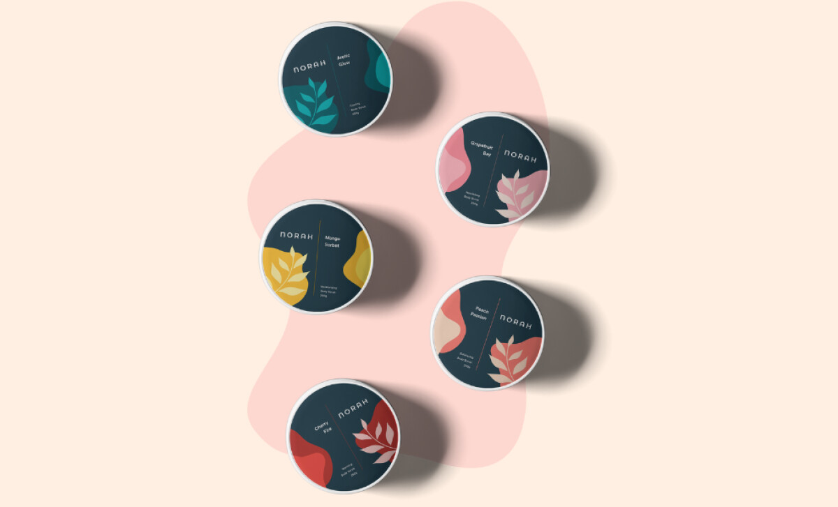
Successful fashion and beauty packaging designs rely on strong visual anchors and unified structure.
In Norah’s case, MORF uses expressive shapes and confident palettes to build an identity that communicates natural luxury across every SKU.
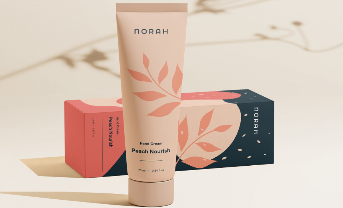
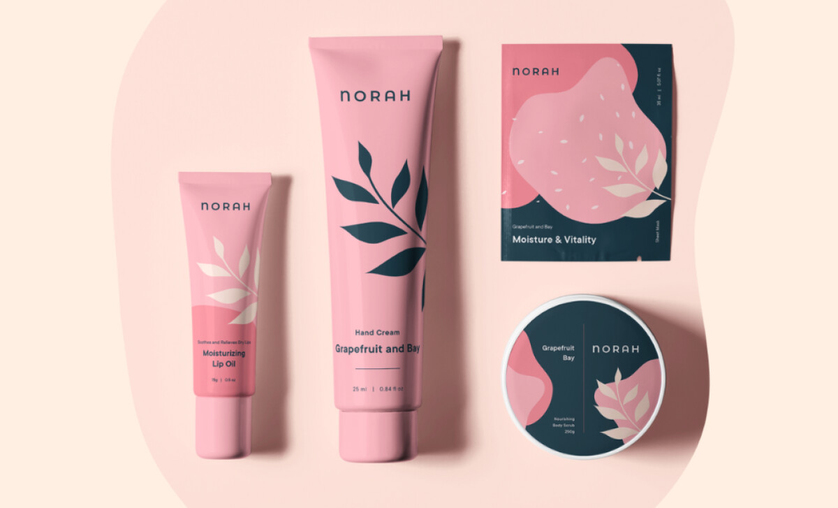
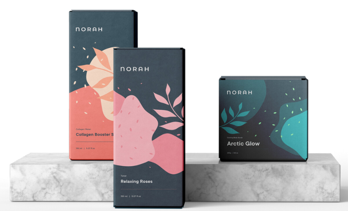
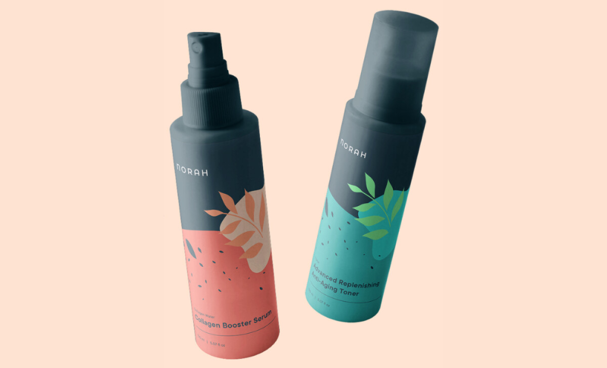
- Illustration & Iconography: I like how the abstract botanicals set the tone for the entire system. They feel expressive without leaning on literal ingredient imagery, which often keeps the identity from becoming predictable. This approach may help Norah stand apart in a category where natural cues can feel repetitive.
- Color System: The saturated color blocking gives each SKU its own personality. I appreciate how the palettes stay bold while still maintaining cohesion. This kind of chromatic confidence often elevates a brand into a more boutique, editorial space.
- Typography: The geometric sans-serif plays a supporting role, and that restraint works well. By letting the illustrations lead, the type helps deliver a clean, premium rhythm that’s consistent across boxes, tubes, and bottles.
- Material & Finish: The matte surfaces and soft-touch elements add a tactility that mirrors the brand’s organic positioning. I especially like the deep matte glass for the serum — it signals potency without breaking the visual system.
What Brands & Agencies Can Learn from Norah
Norah’s packaging shows how expressive illustration and bold color can sit comfortably within a clean, premium system, giving the line a modern feel that stays tight and recognizable.
1. Let Shape Carry the Story
Norah uses abstract botanicals to suggest natural beauty without leaning on literal ingredient drawings. This kind of conceptual illustration helps brands move away from common category tropes.
2. Use Color for Emotion and Clarity
The saturated palettes separate SKUs but also set the mood and signal purpose right away. Brands can use color this way to shape feeling and guide shoppers through a lineup.
3. Raise Perception Through Touch
Soft-touch finishes and matte glass add a physical cue that supports a premium read. Material choices like these shape how a product is judged long before the cap twists open.
About DesignRush Featured Designs
At DesignRush, we review hundreds of agency projects each month. The featured designs stand out for creativity, relevance, and execution.
Many go on to be recognized as winners of our Monthly Design Awards.
Explore more creative work here:
- Best Packaging Designs
- Best Website Designs
- Best App Designs
- Best Logo Designs
- Best Print Designs
- Best Video Designs
For a full list of design agencies and related services, see our Agency Directory.


