-account-photo_listing.jpg)
-account-photo_listing.jpg)


Our Jury has worked with Prada, Nike, Chanel, Google, and Apple.
Best Logo Designs
A logo is still a brand's most important pixel. These are the marks that got it right in 2026.
Best Logo Designs
4,200+ Submitted Designs- Advertising
- Agriculture
- AI
- Airline
- Alcohol
- App Company Logo
- Architecture
- Arts & Recreation
- Automotive
- Banking & Finance
- Beer
- Church
- Clothing Brand
- Coffee
- Content & News
- Distribution
- E-Commerce & Retail
- Education
- Engineering
- Entertainment
- eSports
- Farm
- Fashion & Beauty
- Food & Beverage
- Government
- Health & Wellness
- Hospitality
- Legal & Insurance
- Luxury
- Manufacturing
- Non-Profit
- Photography
- Professional Services
- Real Estate
- Restaurant
- Restuarants
- SEO Agencies
- Shoe Brand
- Small Business
- Software
- Sports & Leisure
- Startup
- Technology
- Travel
- Video Companies
- Weed/Cannabis
- Abstract
- Animated
- Artistic
- Bakery
- Black
- Black & Yellow
- Blue
- Bold Logo
- Brand
- British
- Business
- Circle
- Creative Name
- Dental Office
- Done by Freelancers
- Emblem
- Floral
- Geometric
- Glow
- Gradient
- Gym
- Icon
- Illustration
- Lettermark
- Logo symbols
- Makeup Brand
- Marathon
- Minimal
- Modern
- Monogram
- Multicolored
- Nature
- Negative Space
- Rebranding
- Red
- Redesign
- Simple
- Starting With the Letter S
- Successful
- Sunshine
- Trendy
- TV Channel
- Typography
- Unisex Salon
- Vintage
- Water
- Watercolor
- Wordmark
 Winner
★9.5/10
 HH 9.5
 PP 9.0
 AO 10.0
View Design
CapAtlantique Logo Design
View Design
Design Editorial – Pokemon Logo
View Design
Illoca Logo Design
View Design
Red Bull
View Design
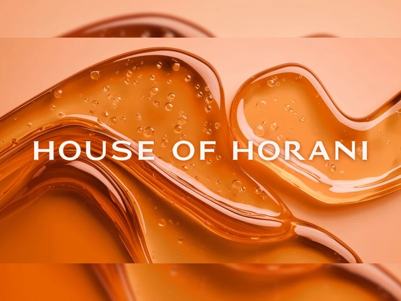
House of Horani Logo Design
byJetStyle
View Design
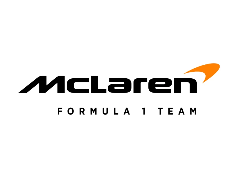
McLaren F1 Logo Design
View Design
Veda Logo Design
View Design
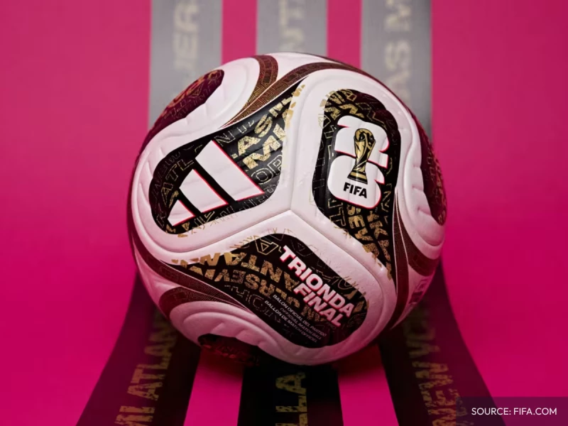
The History of World Cup Match Balls
View Design
Spanish National Football Team Logo History
Get Connected
With The Right Agency Partner
& Receive Proposals For FREE
View Design
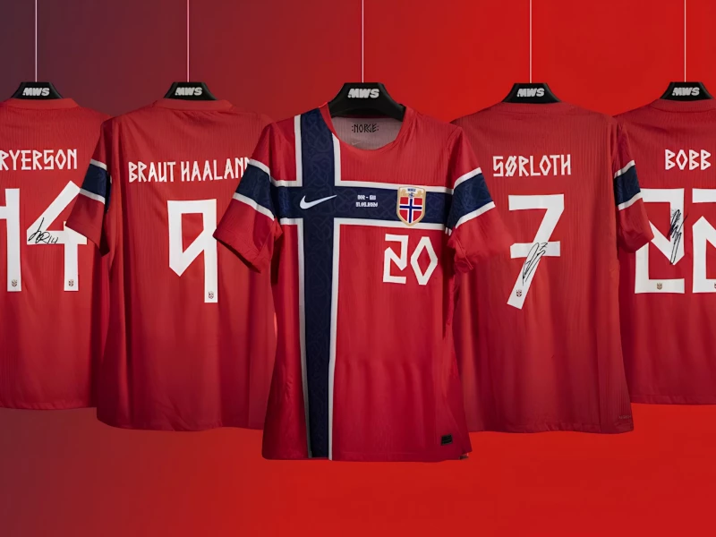
Design Editorial: Norway's Kit, Typography, and the Viking Font That FIFA Almost Banned
View Design
Belgium National Football Team Logo Evolution
View Design
Buz-Co Logo Design
View Design
Council of Architecture and Urbanism of Brazil Logo Design
View Design
Whatsapp Logo Design Analysis
View Design
Benifex Logo Design
View Design
Norway National Football Team Logo History
View Design
Claude Logo Design Analysis

View Design
Scuderia Ferrari Logo History
Ready to elevate your designs?