Standout Features:
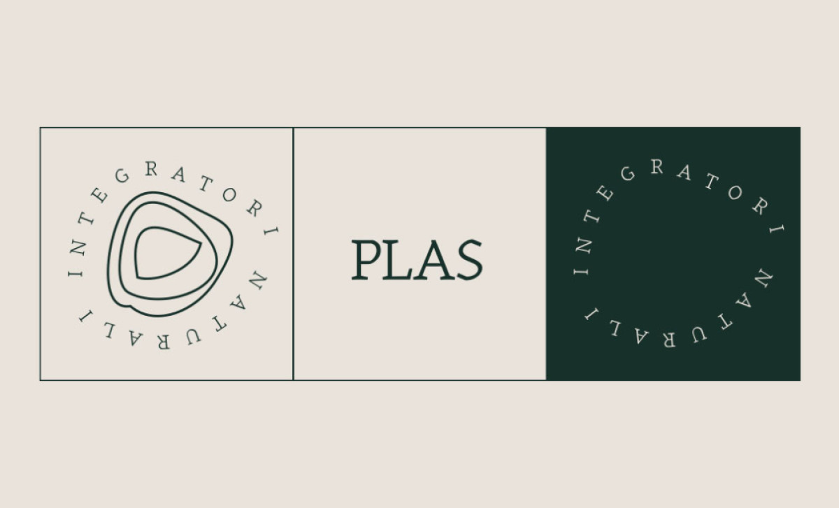
- Abstract organic symbol paired with classic serif logotype
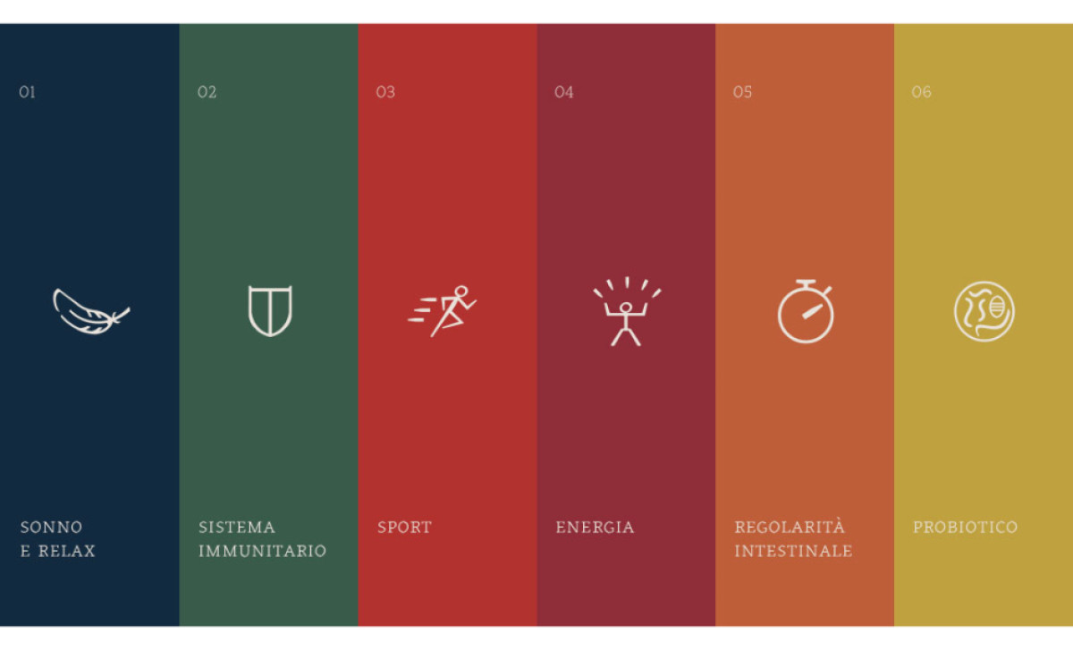
- Color and icon system differentiating product lines
- Clean, sophisticated aesthetic
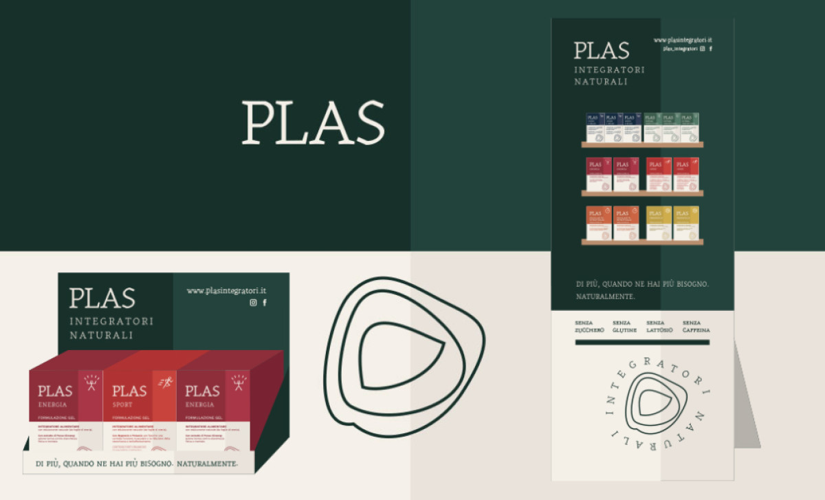
When you're selling health supplements like Italy's PLAS Integratori, especially ones backed by research but also positioned as natural, the packaging needs to look trustworthy and feel scientifically credible — all at the same time. Ottoduequattro designed their packaging system clearly aiming for exactly that.
It achieved this firstly through a brand identity that pairs a unique abstract line-art symbol (those organic, layered shapes, kind of like cells) with the name "PLAS" set in a classic, easy-to-read serif font. This mix means a few things: the symbol hints at nature or biology, while the serif font embodies expertise, which fits a science-based brand.
On the other hand, the system shines in how it separates different product types using color and icons. Every category — Sleep & Relax, Sport, etc. — has a unique muted color paired with a simple line icon (like a feather for sleep). This gives users quick visual clues to easily find what they need and understand the benefit category instantly.
Across the board, you see balanced layouts, classy typography, and the color system working together to make for packaging that keeps a consistently clean, minimalist style. This creates a feeling of quality. Instead of basic 'natural' clichés, it's vibrant and positioned professionally, which helps build trust for its consumers.
A clear organizational system using distinct colors and icons for different product lines, as effectively shown here, are must-haves for offering an extensive range of related products. It makes navigating the options much more intuitive for consumers, especially important for medical and pharmacy packaging where ease of consumer choice really matters.


