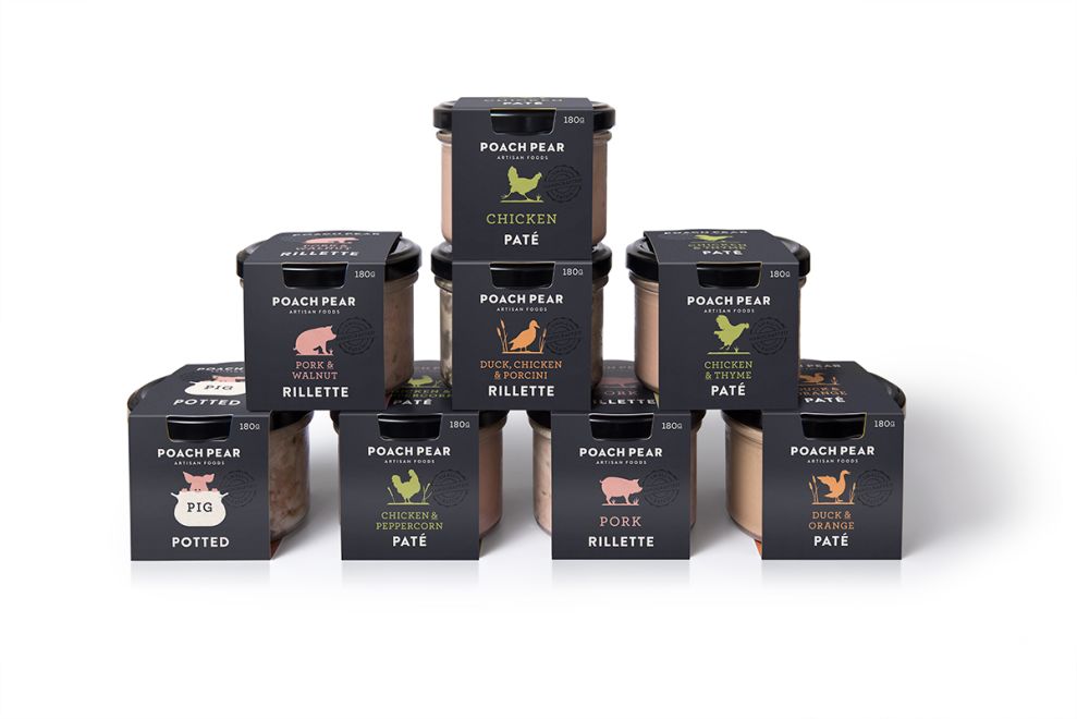
Charcuterie is experiencing a renaissance of sorts in the food industry. The tasty appetizer has been growing in popularity and Poach Pear Charcuterie knew they needed a modern design to help them stand out on store shelves while still keeping a premium, artisan appearance.
Dessein was the firm tasked with designing new packaging for Poach Pear Charcuterie that maintained an upscale appearance while also incorporating a modern, sleek look that would catch the eyes of shoppers as they browse the grocery aisles. The result is a clean, black packaging accented with white text and colorful images that relate to the type of meat inside.
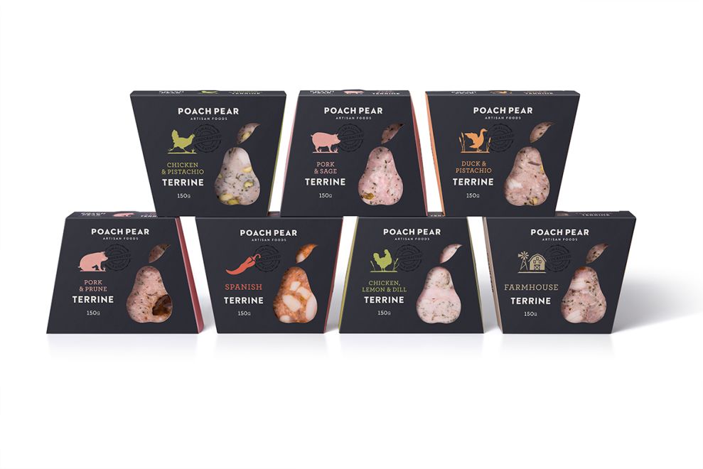
The packaging design is more than just appearance. The new design serves a functional purpose for grocery store displays as well. The containers stack nicely and create an appealing geometric shape with sharp lines that immediately attract the eye. Poach Pear Charcuterie can be confident that their brand will stand out when placed next to any of their competitors.
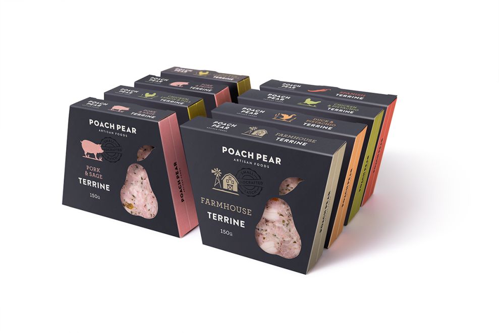
The clean design also features a cutout with an accenting pear shape that gives consumers a look through the clean glass jar right to the food inside. Not only is this appealing to the eye but it also tells shoppers that Poach Pear Charcuterie has nothing to hide behind their packaging.
Poach Pear Charcuterie has successfully given their product an exciting, modern look while still maintaining a classy appeal fit for a more upscale dish like charcuterie. The cut outs incorporate the actual product into the design and help Poach Pear Charcuterie stand out among the rest.
Poach Pear Charcuterie is an exciting packaging design in the Food & Beverage industry.


-preview.jpg)
