Qallo Packaging Design Showcases The Exciting Collaboration Of Two Companies
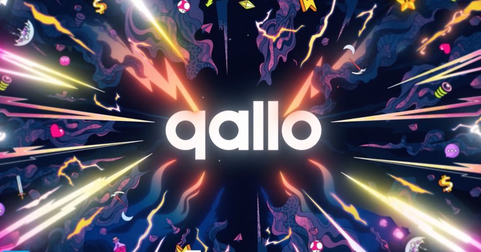
Qallo is an eSports and gaming performance brand focusing on new, healthy nutrition and supplements.
It successfully rejuvenated its branding with the help of a New York-based multi-award-winning international creative agency, Paper Crowns. Check out some of the best New York-based web designs here.
If there’s truly a case of a match made in heaven, look no further. The two companies elevated the brand by uniting their mottos “Reimagine Everything” and “Create Your Hero Story” into a revolutionary, albeit quirky Qallo packaging design.
Paper Crowns carefully researched, crafted and implemented the brand’s entire visual identity. Even though the most common target markets for supplements are those interested in bodybuilding and sports nutrition, the agency devised a visual solution that appeals to gamers, streamers, content creators, stock traders and all kinds of “digital warriors” to help them on their “hero’s journey.”
Recognizing that the eSports community is not only growing but is steadily becoming a dominant force, Qallo positioned itself as one of its primary supporters, empowering eSports athletes to reach their full potential.
As Paper Crowns cleverly puts it:
“Bonded by a lack of interest in reality, we created our own.”
Their creation, Qallo packaging design, backs up this disruptive market, highlighting the unification of the unleashed power of nature and meticulously selected ingredients contained in the packaging.
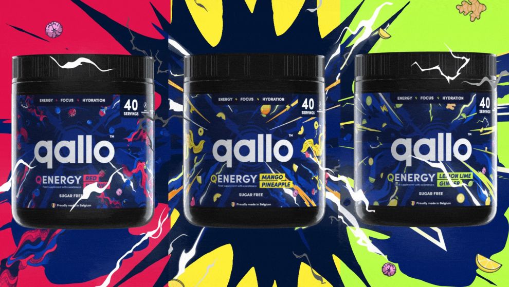
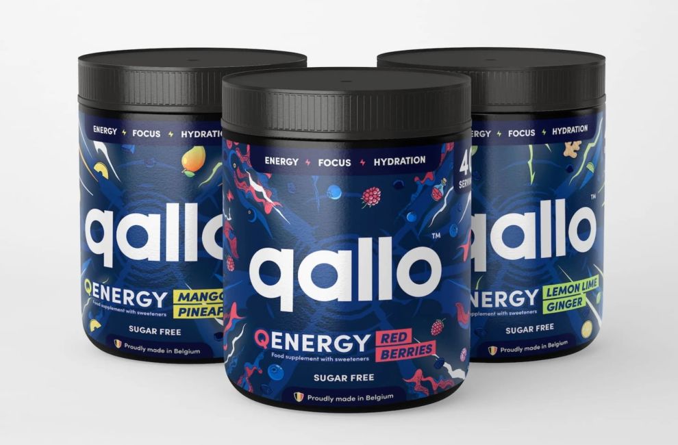
Qallo Packaging Design Makes A Strong Statement About “Geek Culture” Through Vibrant And Contrasting Colors
We live in a time when the so-called tech-savvy “geek culture” departed suburban basements and became the main staple of modern pop culture and sports. In just two decades, the worlds of gaming, anime and colorful superheroes exploded to the scene and became the most profitable elements of contemporary entertainment.
Qallo masterfully rides on this wave. The most impactful aspect of Qallo packaging design is its color palette that reinvents widely accepted standards of the supplement industry. It transforms the generic energetic, chrome visuals into eye-catching neon (red, yellow and lime) hues that clearly communicate the built-up energy restrained in every single container.
The colors transcend the usual “energy drink” mentality. They are in fact real-life versions of health, stamina and manna potions that aid genuine digital adventurers, whether they speedrun a new Zelda game, or deal with online accounting.
Minimalistic Typography Contrasts And Balances The Dynamic Character Of Qallo Packaging Design
Having in mind everything mentioned so far, one would expect Qallo’s messaging plastered all over the packaging, with the equally quirky and lively typography. However, it’s quite the contrary.
The untapped “Qenergy” it offers is somewhat visually subdued with the brand’s simplistic bold logo and typography.
While retaining its distinctive dynamic nature, the design approach is an inventive inversion of the most widely used design trends of today – negative space. Qallo packaging design uses its busy, deep blue background sprinkled with various elements (including fruit icons) to accentuate its minimalistic white logo, making it the memorable epicenter of visual discharge. Discover the best eSports logo designs.
When packaging designers use this approach, it creates a visually engaging and attention-grabbing composition while maintaining a clean and uncluttered layout
This simple technique makes the creative packaging jump off the shelves right into the subconsciousness of prospective customers.
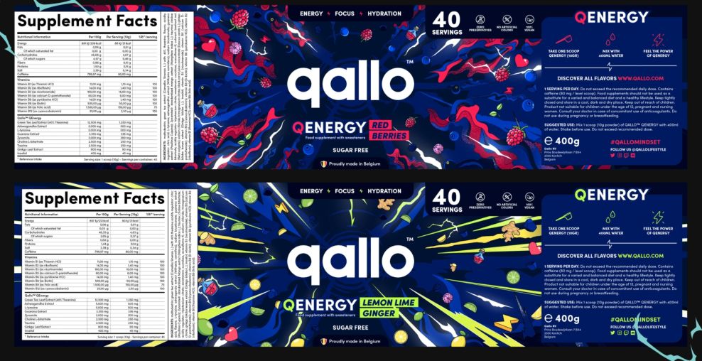
Qallo Shows How To Inform and Engage Consumers Through Packaging Design
There is only so much packaging designers can do when trying to make the actual shape of standardized items. We’re all familiar with the huge food supplement jars that Qallo uses. However, the team behind its design found a way to introduce a fresh take in this regard.
Despite having a vibrant color palette and familiar, almost graffiti vibes throughout, it manages to mitigate the classic “edginess” and “extreme” aesthetics of the ‘90s and early 2000s, as well as the nostalgia factor that many brands tend to overuse.
The added elements like gaming-related icons and cute fruit illustrations offer much more than a visual appeal. They are fun to look at and they remind prospects of their hobbies (or professional work in some cases.) They also inform and educate the consumers about the contents.
The whimsical nature of Qallo packaging design is seemingly abruptly stopped with “Supplement Facts” that inform users of the ingredients, nutritional information, serving sizes and more, which again showcase that “fun” and “professionalism” can go hand-in-hand seamlessly.
It’s precisely how branding experts create a sense of fun and appeal that catches the eye while providing factual and necessary information to consumers.

Qallo Packaging Design Is A Standout In An Oversaturated Market
Originality has never been easy. If everybody “thinks outside the box,” nobody actually does. However, Qallo packaging design found new ways of thinking within the confines of the box and it’s evident from the first glance.
In the oversaturated market of food supplements, where every brand promise wonders to a broad audience, Qallo limited its focus and target audience which paradoxically made said audience broader than ever before, especially those that were never targeted by such products in the first place.
Working with Paper Crowns for the product’s packaging may be one of the best decisions the company ever made, not only because of their bold design but also because of the shared values integrated into the branding.
Therefore, it’s no surprise that our jury laureled this design as a winner in the packaging design category!
-preview.jpg)