Team Behind the Design
Packaging Design Analysis
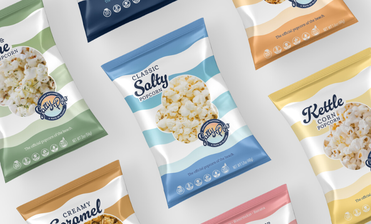
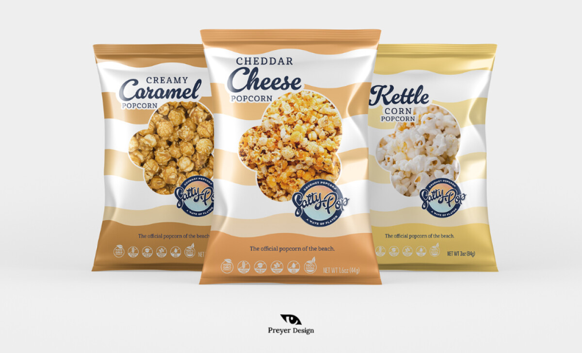
Great snack packaging often balances flavor appeal with a memorable visual rhythm.
Salty Pop Popcorn achieves this through wave-striped patterns, cheerful color coding, and a logo that reinforces its beach-day spirit.
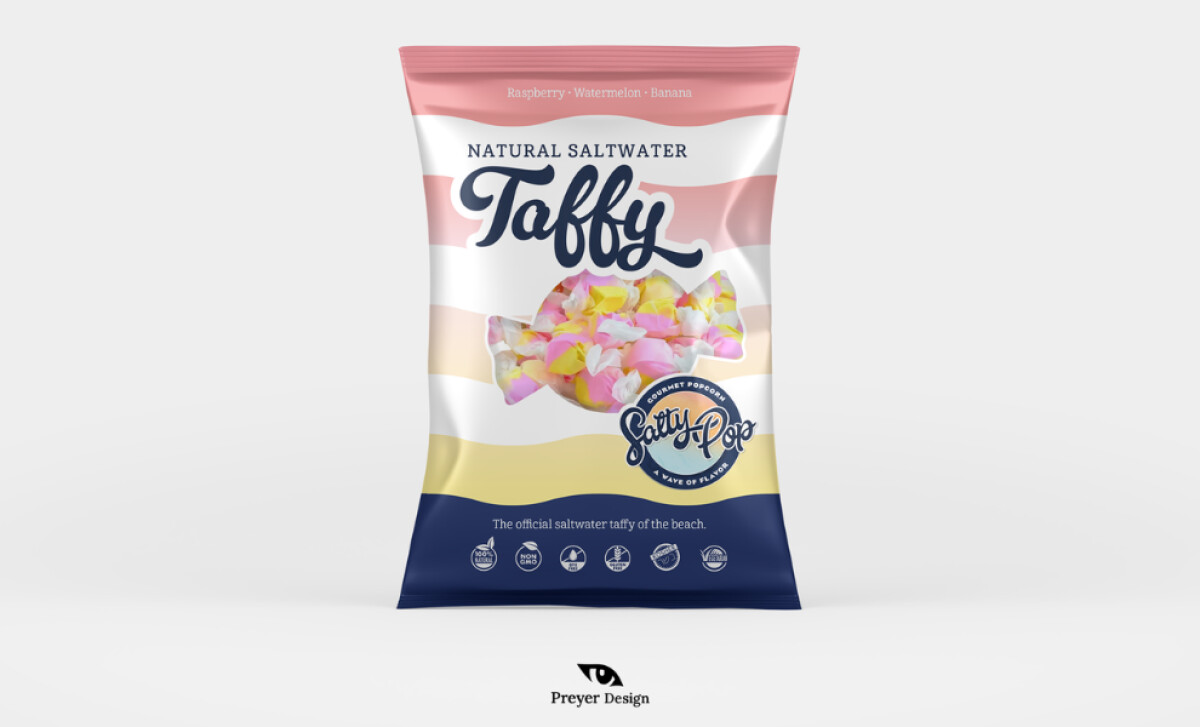
- Structure & Visual Identity: The wave-striped background gives the brand an unmistakable visual anchor. I like how this pattern communicates “beach” instantly while avoiding predictable seaside clichés.
- Typography & Flavor Hierarchy: The expressive flavor naming system creates a friendly voice and clear hierarchy. The blend of serif, all-caps, and occasional script helps each flavor feel unique without disrupting cohesion.
- Color & Differentiation: The flavor-coded palettes are soft, coastal, and easy to scan from a distance. I appreciate how the tones stay within the same atmospheric family, ensuring the full line feels harmonious on shelf.
- Product Visibility & Appetite Appeal: The rounded window cut-outs show the popcorn clearly, adding trust and appetite appeal. This window shape fits cleanly within the wave pattern, which keeps the layout balanced.
-desktop.jpg)
What Brands & Agencies Can Learn from Salty Pop Popcorn
This packaging system shows how a simple graphic theme can shape an entire product line while staying flexible across multiple flavors.
1. Build a Strong Visual Anchor
A single motif, such as waves or stripes, can unify a packaging family and create instant recognition. When used consistently, it helps brands stand out even in busy snack aisles.
2. Use Color to Clarify Choices
Flavor-coded palettes improve usability on shelves and strengthen purchasing confidence. Soft, thematic colors also help reinforce the emotional tone of a brand story or setting.
3. Balance Playfulness With Clarity
Expressive typography and friendly icons can add charm, but the information hierarchy still needs to remain clear. Salty Pop shows that personality and readability can coexist without compromise.
About DesignRush Featured Designs
At DesignRush, we review hundreds of agency projects each month. The featured designs stand out for creativity, relevance, and execution.
Many go on to be recognized as winners of our Monthly Design Awards.
Explore more creative work here:
- Best Packaging Designs
- Best Website Designs
- Best App Designs
- Best Logo Designs
- Best Print Designs
- Best Video Designs
For a full list of design agencies and related services, see our Agency Directory.