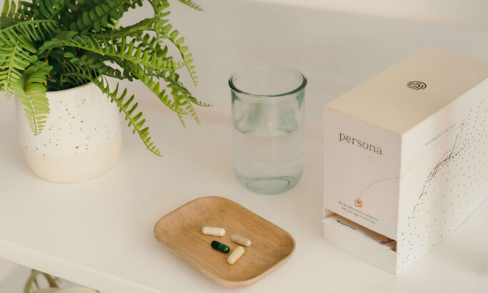
Standout Features:
- White background
- Bright splashes of color
- Logo in negative space
Studio Luvié's packaging design for SIT Pharmaceutical combines the precision expected of a pharmaceutical brand with the warmth and approachability to appeal to consumers.
Its clever use of negative space for the logo adds a distinctive and upscale touch to the brand identity. Negative space logos can be very memorable and add visual intrigue that draws the viewer in for a closer look.
A white background indicates a clean, clinical, and professional aesthetic commonly associated with the pharmaceutical industry. It makes additional colors pop and provides an uncluttered backdrop that emphasizes other design elements.
As for its palette, the warm, bright colors amidst the white background provide a friendly and inviting look. They also help consumers distinguish between each product.


