Team Behind the Design
Agency: Teran Brand
Client: Snob Foods
Category: Packaging Design (Food & Beverage)
Location: Quito, Ecuador
Project Brief: Design packaging that highlights freshness, nutritional integrity, and brand recognition across local and export markets.
Packaging Design Analysis
Related Articles
When I review food and beverage packaging designs, I often focus on structure, shelf presence, color choices, and the clarity of information.
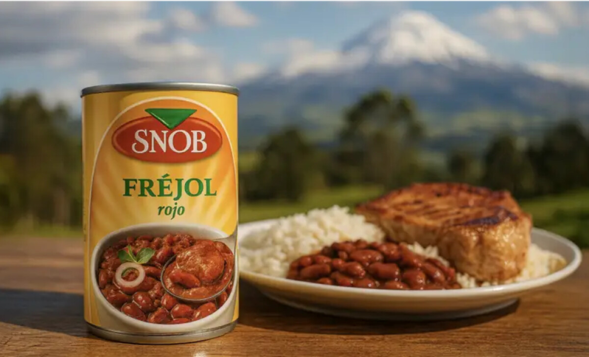
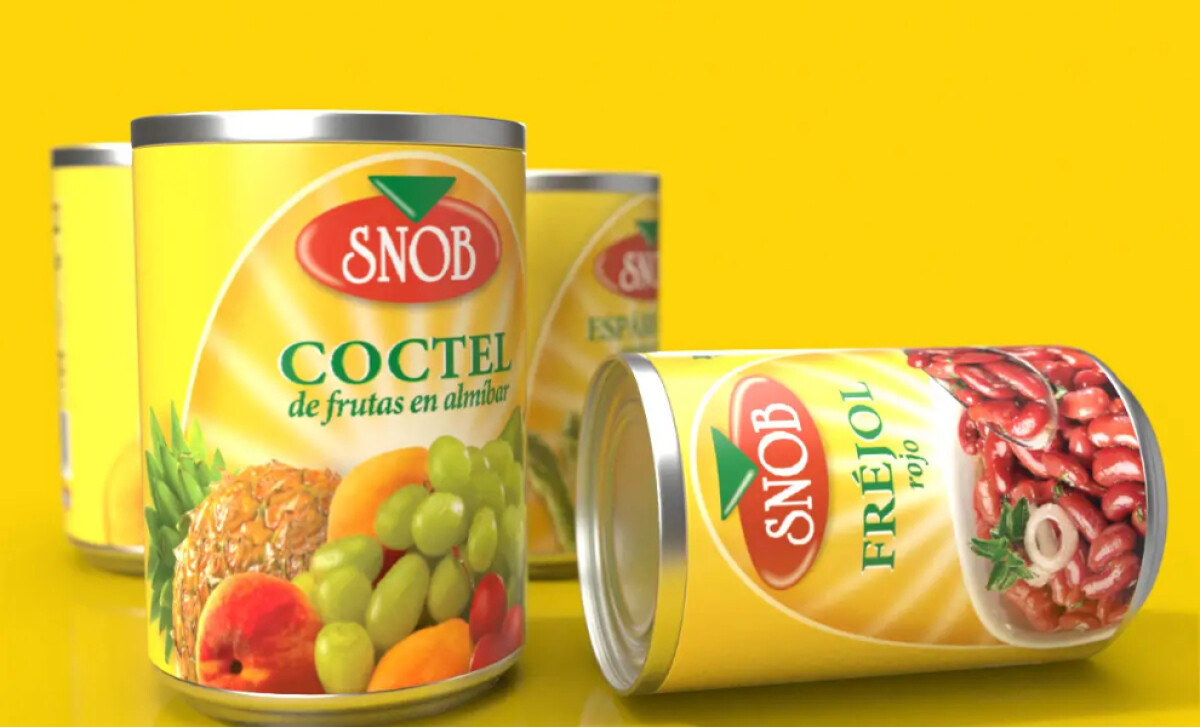
Teran Brand’s work for Snob Foods strikes a balance between authenticity and standout appeal.
- Structure & Consistency: I appreciate how the system works across cans, jars, and bottles. It creates coherence on the shelf while adapting to different product types.
- Shelf Impact: The bold yellow immediately draws attention. It radiates freshness and ensures quick recognition in crowded aisles.
- Information Hierarchy: The typography is legible and well-placed. Product names are easy to read, while supportive visuals (like fruit and beans) reinforce clarity.
- Brand Storytelling: I like how the green accents emphasize natural flavor and freshness. This subtle use of color helps convey authenticity and ties the packaging to the brand’s Ecuadorian roots.
Get connected with the right packaging design agency for your project.
GET STARTED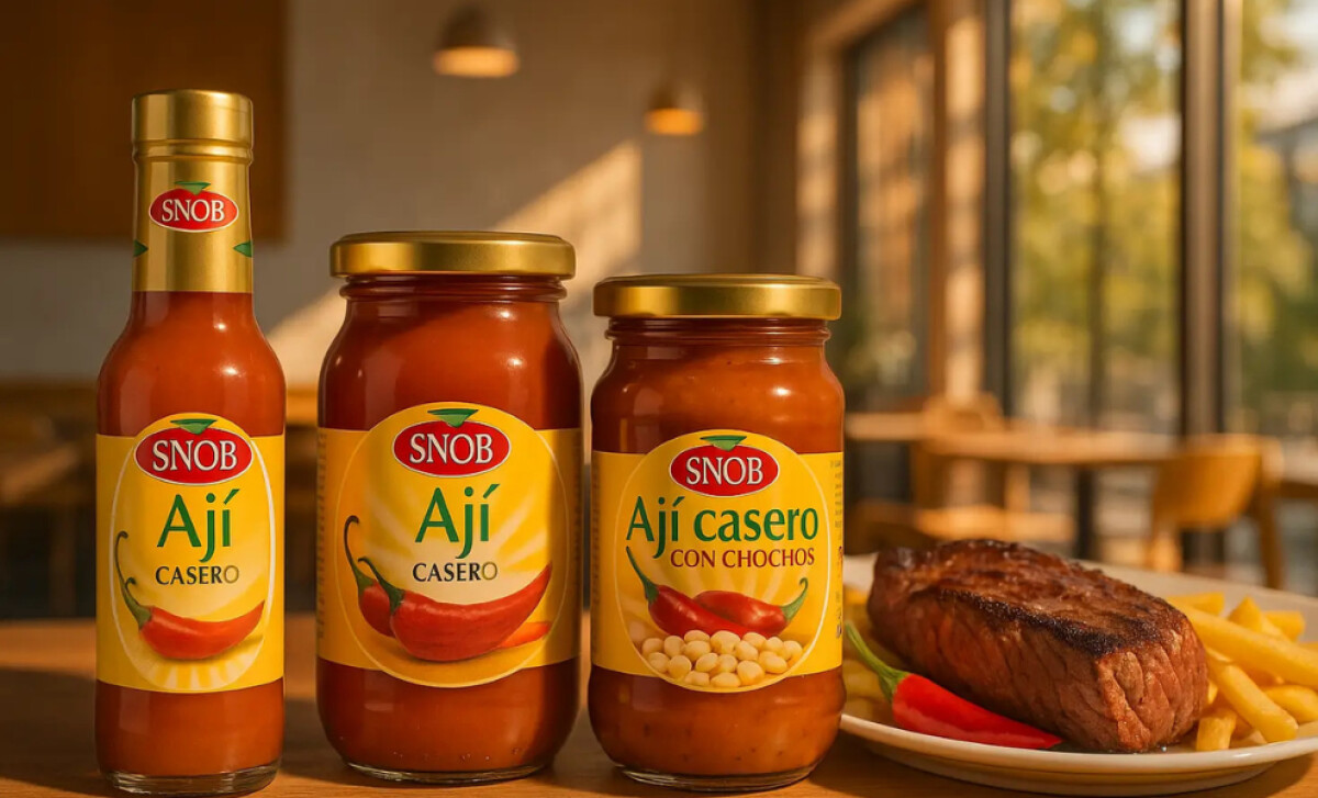
About DesignRush Featured Designs
At DesignRush, we review hundreds of agency projects each month. The featured designs stand out for creativity, brand alignment, and execution quality.
The most remarkable ones advance to our Monthly Design Awards, gaining recognition across the industry.
Packaging design in the food and beverage industry is critical for shelf impact and consumer trust. Explore more standout work here:
- Best Packaging Designs
- Best Website Designs
- Best App Designs
- Best Logo Designs
- Best Print Designs
- Best Video Designs
For a full list of design agencies and related services, see our Agency Directory.
Get a chance to become the next Design Awards winner.
SUBMIT YOUR DESIGN