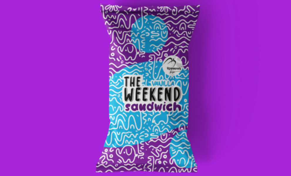
Standout Features:
- Attractive doodle art
- Different color schemes per flavor
- Flat texture packaging material
Design agency Brandon and The Weekend Sandwich collaboration is a match made in summer heaven! The designers gave life to doodle art through ocean waves, summer wind and cute animals.
The chocolate-flavored ice cream packaging uses a pink and purple combination, a subtle nod to the 80s art vibe. This color story complements the orange doodles quite well while also keeping the brand identity intact: playful and youthful. There are also hidden unicorn and elephant drawings in the doodle art, a sweet surprise for the kids who'll find them!
Meanwhile, their vanilla-flavored ice cream features a slightly different color scheme (purple and light blue), a great way to differentiate the flavors in one look.
Overall, this summer-themed ice cream packaging design is a visual treat to the kids and kids at heart!

-preview.jpg)
