Standout Features:
- Highlighting the main ingredients
- Leafy decorations
- Cute details on the lid
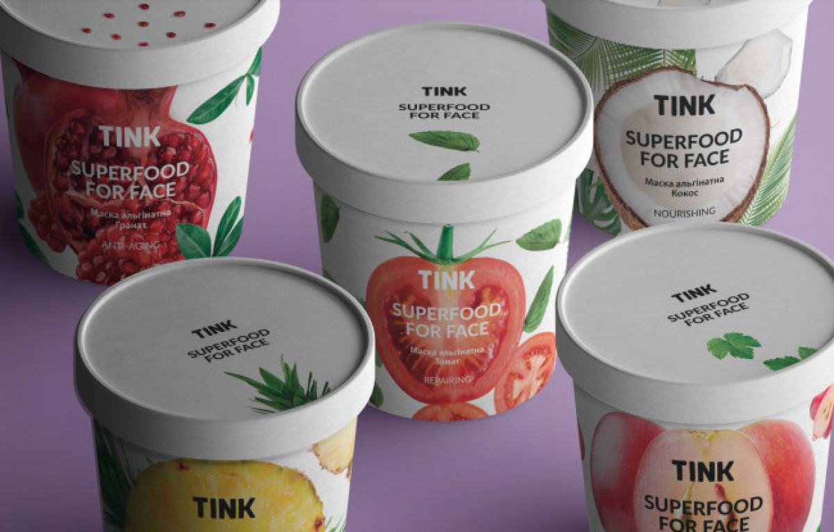
Our next pick representing the most fascinating cosmetics packaging designs is Anton Antishin’s intriguing and fresh solution for TINK.
The packaging design pays tribute to the main ingredients of the skincare products, highlighting them with an inviting vertical cross-section of the fruit dominating the frontal space of the round box. The imagery is used as background for the logotype and bolded product name or type, as well as its intended use.
The lush natural atmosphere of the fruit is empowered through leafy decorations surrounding the delicious cut section with the addition of smaller fruit cuts. With cute details on a clean lid, this packaging design showcases the products’ organic properties by portraying the main ingredient’s natural setting. Check out our article on best hygiene products branding examples.