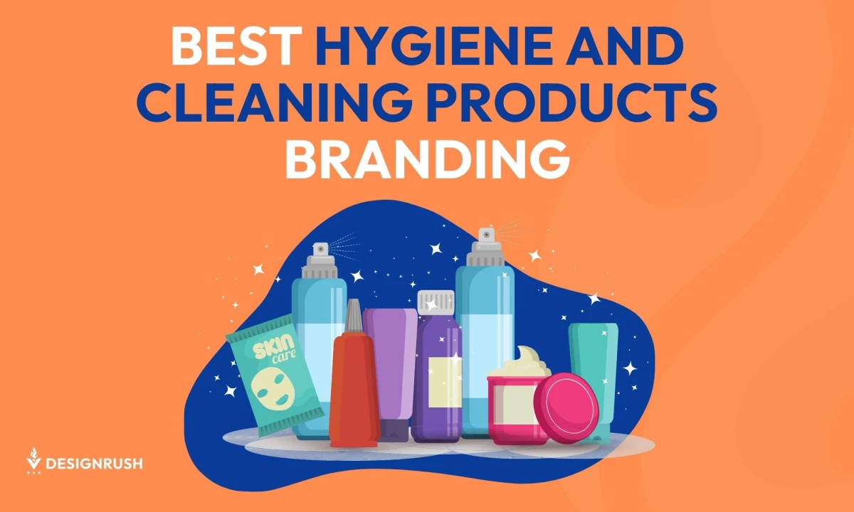
Maintaining cleanliness and hygiene is a must. As consumers become more conscious about health and safety, the demand for effective cleaning and hygiene products has skyrocketed. In response, many brands have stepped up with innovative solutions that clean effectively and promote a healthier lifestyle.
From luxurious packaging to eco-friendly ingredients, we'll deconstruct some of the best branding agencies' works that make products stand out on the shelves. Let's dive in and discover what it takes to create a winning brand in the hygiene and cleaning industry!
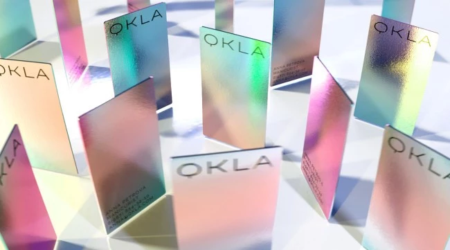
1. QKLA by tbtbo brand mastering
Standout Features:
- Unique design concept
- Sleek and classy vibes
- Feminine appeal
tbtbo brand mastering created this unique branding scheme for QKLA and its chain of beauty salons, designed to offer a luxurious and pampering experience for its customers with its services, fabulous interiors, and skilled professionals.
QKLA’s branding combines elegance, sophistication, and femininity, featuring sleek typography and neutral tones that make the brand more appealing to modern, professional women.
With an effective branding strategy focused on empowering and inspiring women from all walks of life, QKLA is the go-to destination for those looking to take their beauty routine to the next level.
Read this interesting post for more examples of women-centered branding strategies.
2. Galbaia by Vida Iglicar
-content-large-webp.webp)
Standout Features:
- Polished and sophisticated feel
- Use of metallic colors
- A blend of nature and modern elements
Environmental sustainability and organic beauty are two major trends today, and Vida Iglicar’s branding strategy for Galbaia embodies both.
This sustainable yet stylish beauty brand redefines luxury while staying eco-conscious. Galbaia’s branding blends metallic colors and modern elements with the details of nature, such as photos of leaves and stems.
Some believe eco-conscious brands compromise on luxury, but Galbaia proves otherwise, seamlessly blending beauty and sustainability. Its branding feels polished and sophisticated while maintaining a minimalist design that highlights its eco-friendly approach to its products.
3. Bubble & Frizz by Nikkin Creative
-content-large-webp.webp)
Standout Features:
- Calming color story
- Creative Lettering
- Hip and popular vibes
Nikkin Creative showcases an outstanding hygiene and cleaning product branding strategy. With self-care on the rise, bath products like bath bombs and bubble bars — key offerings from Bubble & Frizz’s — are gaining more attention.
The agency has expertly crafted a branding strategy that captures the essence of these products while maintaining a modern and stylish vibe that appeals to the masses. The soothing shades of blue and white complement the brand's ideals, reminiscent of a clear summer sky. Additionally, the agency designed a playful monogram featuring a single “B” in a fun typeface, adding personality to the branding.
Logos plays a crucial role in shaping Bubble & Frizz’s brand identity, and Nikkin Creative ensures it remains trendy and hip for consumers. Learn more about the importance of logos in this post.
4. Beauty Therapy by VaDot Studio
-content-large-webp.webp)
Standout Features:
- Great combination of fonts
- Minimalist design approach
- Nature-oriented strategy
Subscription boxes come in all shapes and forms, so your beauty brand must stand out if you want it to succeed. VaDot Studio has done a fantastic job ensuring that Beauty Therapy’s branding speaks volumes with its minimalist approach and natural elements in its logo and packaging.
The extraordinary combination of handwritten and sans-serif fonts gives the logo a modern yet calming feel. This thoughtful design reinforces the brand’s commitment to sustainability and eco-conscious beauty.
Beauty Therapy proves that making people beautiful doesn’t have to come at nature’s expense — an ideal its branding strategy communicates excellently.
5. Kinfill by Andrea Arques Rodríguez
-content-large-webp.webp)
Standout Features:
- Energetic color palette
- High-quality feel
- Trustworthiness manifested
Staying true to its tagline, "Modern homecare for those who care," this standout hygiene and cleaning products branding strategy shows the importance of trust in building a successful brand.
Andrea Arques Rodríguez has masterfully developed Kinfill’s branding strategy, conveying a sense of cleanliness and health in its visuals while still presenting itself as a reliable brand. Additionally, the combination of oranges and browns provides an organic feel, appealing to consumers looking for more natural ways of cleaning their homes.
The minimalistic approach to the visuals also blends well with this branding strategy's high-quality packaging and design elements. Lastly, their choice of using earthy colors and thin font styles show how dedicated they are to staying in touch with their nature — sustainable, organic, and helpful.
6. CLEAN LABS BIO by Doodles Creative Solutions
-content-large-webp.webp)
Standout Features:
- Interesting iconography
- Bold typography
- Assurance guaranteed
Another excellent example of an effective branding strategy for cleaning and hygiene products is CLEAN LABS BIO. Doodles Creative Solutions nailed this one, creating a visual identity that pushes the brand’s message forward.
Its eye-catching iconography assures consumers that CLEAN LABS BIO effectively cleans without harming the environment. The four-leaf clover in its logo symbolizes environmental awareness and good fortune, further enhancing its appeal.
The designers used thick and bold fonts to solidify the trustworthiness and reliability of this product, while the harmonious visual elements created a strong, lasting impression — key winning over customers.
7. My Wash Bit by Asense Branding
-content-large-webp.webp)
Standout Features:
- Consistency
- Contemporary font
- Bubly accents
As a detergent manufacturing company, My Wash Bit wanted to wash off their old branding with a bold and fresh new look. Enter Asense Branding!
The redesigned powder detergent packaging perfectly reflects the company. Featuring a lather foam design, a cool color palette, and five distinct icons at the bottom, each detail emphasizes both the product’s qualities and the brand's general fortes. Breaking away from typical shelf contenders, the cohesive use of cool tones reinforces the brand’s niche and communicates its reliability.
8. MOSHILO by VincDesign
-content-large-webp.webp)
Standout Features:
- Symbolic (literally)
- Blend of modern and traditional
- Unique color story
Moshilo, a Hong Kong handmade soap brand, mixes natural ingredients with traditional Chinese herbal efficacy. The brand follows the tranquil and evocative concepts of "Humanism", "Herb" and "Fundamental" and is dedicated to producing eco-conscious products with ingredients purchased or recycled from local farms.
Partnering with VincDesign to reposition their brand back in 2020, Moshilo emerged with a new, emblematic logo design composed of 3 duplicated Chinese characters “人” (i.e. human), representing “Humanism 人本”.
VincDesign introduced a nature-inspired olive green as the primary brand color, reflecting the herbs used and the conceptual “Herb 草本”. The three “人” characters forming a circle symbolize Moshilo’s commitment to protecting Mother Nature while strengthening the bond between humanity and its origins.
9. Labbel by Elisava
-content-large-webp.webp)
Standout Features:
- Streamlined minimalism
- Original shape
- Thermo-sensitive ink
With its latest branding and packaging solutions by Elisava, Labbel aims to make “luxury: and "personal care" virtually synonymous.
Its bath product range — shampoo, conditioner, bath gel, and moisturizing gel — caters to hotels, stores, and spas. They capture attention from the get-go by rejecting the loud, over-the-top visuals that have dominated for decades.
Inspired by the mystique of mermaids, the packaging features thermo-sensitive ink that reveals key ingredients when exposed to water vapor. When paired with the beautiful and revolutionary take on minimalism, this ingenious solution is bound to inspire shoppers who would normally pass by. It's simple, clean, and unmistakably original!
10. MANISANTE by Latente Studio
-content-large-webp.webp)
Standout Features:
- Classy minimalism
- Monochromatic color scheme
- All-caps typography
Latente Studio's approach is diving deep into the origin of things to tell a compelling brand story and that is exactly what the agency did. Created by three Italian friends who wanted to offer top-quality cosmetic products, Manisante focuses on one primary purpose: awakening the senses. Their cultural roots and the products' hypnotic scents inspired Latente to explore the origins of soap, redefining an everyday essential with deeper meaning.
The agency reimagined cleaning as a vital part of the body’s healing ritual. With a sleek yet elegant design, cleanliness is clearly the central theme. In the brand's philosophy, the body is a cherished temple — a blank canvas where a story unfolds. To complement this vision, Manisante chose a refined sans-serif typeface, adding a touch of sophistication to the product’s multisensory appeal.
11. Enza by Belbrd
-content-large-webp.webp)
Standout Features:
- Emphasis on sustainability
- Packaging reflecting purity and simplicity
- Consistent visual identity
Enza's rebranding, led by Belbrd, masterfully aligns its visual identity with its commitment to eco-friendly cleaning solutions. The design incorporates sustainable elements like green palettes and natural imagery, effectively communicating the brand's dedication to environmental responsibility.
The minimalist packaging design emphasizes purity and simplicity. By avoiding cluttered visuals and excessive text, the packaging allows the product's benefits to stand out, enhancing consumer trust and appeal.
Consistency across all visual elements, from typography to color schemes, strengthens Enza's brand recognition. This ensures that consumers can easily identify Enza products, fostering loyalty and reinforcing the brand's presence in a competitive market.
Through thoughtful design choices, Enza’s rebranding effectively communicates its core values, solidifying its position as a trusted leader in eco-friendly cleaning products.
12. HOMESTAR by Kyoungran Ji
-content-large-webp.webp)
Standout Features:
- Attention-grabbing vibrant color palette
- Legible, bold typography
- User-friendly packaging design
HOMESTAR's branding presents a compelling visual identity that revitalizes its market presence. The Kyoungran Ji’s use of a vibrant color palette captures attention and differentiates the brand in a competitive landscape. These lively hues convey energy and cleanliness, resonating with consumers seeking effective cleaning solutions.
The implementation of bold typography ensures immediate brand recognition. The clear and assertive font choices communicate confidence and reliability, essential traits for household cleaning products. This typographic strategy reinforces HOMESTAR's identity, making it easily identifiable on crowded retail shelves.
User-friendly packaging design is a cornerstone of this branding effort. Ergonomic considerations, such as comfortable handles and easy-to-open spouts, enhance the consumer experience, reflecting a thoughtful approach to functionality. This focus on practicality not only meets user needs but also builds brand loyalty through enhanced usability.
HOMESTAR's rebranding successfully combines aesthetic appeal with functional design, strengthening its position in the cleaning detergent market and contributing to a refreshed brand identity that appeals to modern consumers.
13. Hygia by Wesolvv
-content-large-webp.webp)
Standout Features:
- Energizing, warm off-yellow, and blue color palette
- Comprehensive product line for diverse cleaning needs
- Clean and modern visual identity
Hygia, a UAE-based brand under Yral Concepts, delivers a diverse range of cleaning and hygiene products designed for various environments. From essential tools like brooms and dustpans to advanced waste management solutions, the brand positions itself as a one-stop solution for maintaining cleanliness. This broad product offering strengthens Hygia’s market presence, appealing to both residential and commercial sectors.
The visual identity, crafted by Wesolvv, is anchored in an off-yellow and blue color palette, reinforcing its core messaging. Off-yellow evokes warmth, freshness, and optimism — ideal for a brand centered on hygiene. Meanwhile, blue signifies trust, reliability, and stability, essential for consumer confidence in cleaning products. This strategic combination creates an inviting yet authoritative brand presence, effectively communicating both cleanliness and dependability.
Hygia's branding reflects modernity and clarity, with its minimalistic yet professional approach enhancing its market appeal. By pairing a well-thought-out color scheme with a robust product offering, the brand successfully differentiates itself, creating a strong and recognizable identity in the hygiene industry.
14. BOO! By Evgeniya Abramova
-content-large-webp.webp)
Standout Features:
- Baby-safe sanitizing with natural, fragrance-free ingredients
- Quirky visual identity emphasizing child-friendly hygiene
- Playful messaging that reinforces safety
BOO! is a sanitizing brand designed with the safety of babies and children in mind. The brand’s core messaging —“Say BOO! to germs”— establishes a playful yet serious stance against harmful bacteria, appealing to parents who prioritize hygiene without exposure to harsh chemicals. With a strict focus on child-safe cleanliness, BOO! positions itself as an essential household solution, particularly for families with newborns and toddlers.
The product line incorporates natural ingredients like chamomile, aloe vera, and tea tree extract, ensuring effective cleaning while being free of fragrances and artificial coloring. This commitment to non-toxic formulations sets BOO! apart in the cleaning industry, catering specifically to parents seeking gentle yet powerful sanitation solutions.
Visually, BOO! adopts a soft and friendly identity based on quirky germ illustrations, aligning with its child-focused approach. The design elements reinforce the brand’s warmth and trustworthiness, making it stand out in a market often dominated by clinical or industrial aesthetics. By blending a reassuring visual identity with a clear mission of baby-safe cleaning, BOO! effectively carves out a niche that prioritizes both protection and peace of mind.
15. Good House by AAOO STUDIO
-content-large-webp.webp)
Standout Features:
- A relaxed, modern visual identity
- Distinctive, lifestyle-focused brand experience
- Contemporary packaging
AAOO STUDIO’s rebranding for Good House redefines the perception of household cleaning by moving away from the traditionally loud and urgent marketing tactics common in the industry. The rebranding embraces a more relaxed, lifestyle-oriented approach, positioning cleaning as an effortless part of modern living rather than a burdensome task.
The updated visual identity moves away from exaggerated promotional imagery, opting for clean, minimalistic packaging that resonates with small family households. The design conveys a sense of ease and balance, making the products feel like an organic part of a well-maintained home rather than intrusive chemical solutions.
By crafting a brand experience that feels light, unburdened, and approachable, Good House successfully modernizes its presence in the household cleaning industry. The refined visual strategy makes its products more appealing for retail display, encouraging consumers to embrace cleaning as an effortless, almost indulgent part of their home routine.
Major Branding Trends in the Hygiene and Cleaning Products Industry
The cleaning products industry is redefining branding through design, merging functionality with values to enhance product appeal, trust, and community engagement. Here are the key trends shaping this transformation:
- Eco-friendly packaging and natural ingredients
- Clear labeling and transparency
- Clean, functional designs
- Emphasis on well-being
- Community-driven branding
- Safety and certification focus
1. Eco-Friendly Packaging and Natural Ingredients
Today, sustainability is no longer a buzzword — it’s a core value driving brand innovation. Brands are embracing biodegradable packaging and plant-based materials to minimize environmental impact and meet consumers’ growing demand for greener options. This trend reinforces a commitment to both environmental stewardship and product purity, setting a new standard for the industry.
2. Clear Labeling and Transparency
Modern packaging now features clear, legible labels that detail ingredients, usage instructions, and manufacturing processes. By offering straightforward information, brands demystify product benefits and safety standards for consumers. This commitment to openness and credibility empowers customers to make informed purchasing decisions.
3. Clean, Functional Designs
Simple color palettes and uncluttered layouts emphasize clarity and purpose, making it easy for consumers to understand product benefits. Such designs are not only aesthetically pleasing but also enhance usability by focusing on practicality. This approach ensures that the visual identity reinforces the product’s core promise of delivering effective cleaning solutions.
4. Emphasis on Well-Being
Brands are positioning their products as essential tools for creating healthier, more comfortable living environments. Packaging and messaging highlight benefits like improved air quality and reduced allergens, connecting physical cleanliness with overall wellness. This trend resonates with health-conscious consumers, encouraging them to invest in products that support a holistic lifestyle.
5. Community-Driven Branding
Brands now actively engage with consumers through social media platforms and interactive events, creating a space for dialogue and shared experiences. By cultivating a sense of belonging, companies can drive repeat purchases and generate authentic word-of-mouth promotion.
6. Safety and Certification Focus
Displaying safety certifications and regulatory approvals prominently on packaging reassures consumers about the product’s quality and non-toxic formulation. Brands that emphasize these standards build a reputation for trustworthiness and reliability that resonates with cautious, informed buyers.
![]()
Our team ranks agencies worldwide to help you find a qualified partner to implement the latest AI solutions. Visit our Agency Directory for the Top Branding Agencies, as well as:
- Top Brand Positioning Firms
- Top Small Business Branding Agencies
- Top Product Design Companies
- Top Product Marketing Agencies
- Top Cincinnati Branding Agencies
And don’t miss our Awards section, where we showcase the top agencies recognized for exceptional creativity and impact.


-preview-webp.webp)