- Article by
- Branko Dimitrijević

This website uses a colour palette of 4 colours
#E7E9E8 #5DA6A5 #0F8257 #D6BD00
Technologies & Tools
Description
Team Behind the Design
- Agency/Designer: Mike Mullan
- Client: Upper Pass Beer Company
- Category: Packaging — Food & Beverage
- Location: Tunbridge, Vermont, United States
- Project Brief: Develop a cohesive brand identity, an illustrated beer-label system, and supporting merchandise for Upper Pass Beer Company, reinforcing its farmhouse-brewery roots and distinct craft presence.
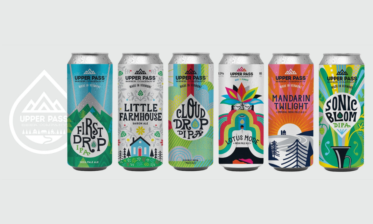
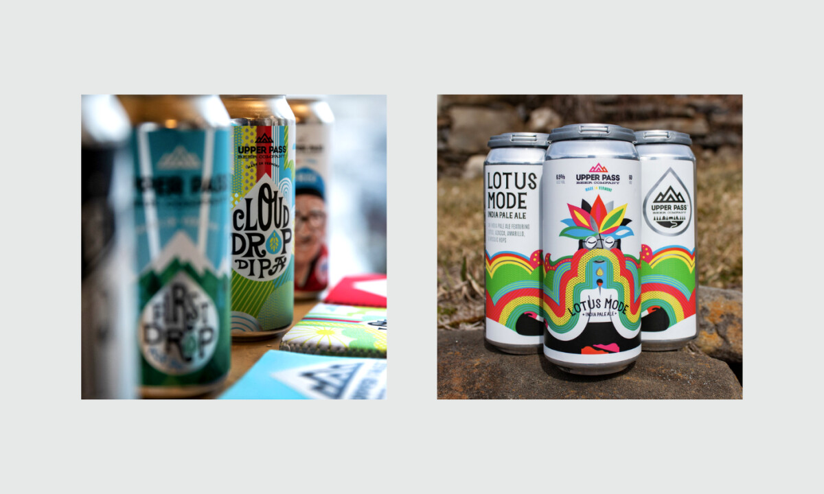
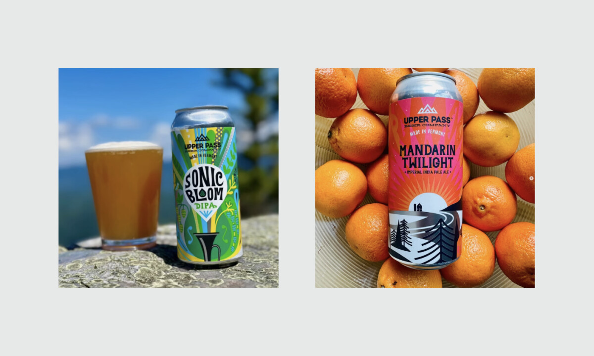
In beverage packaging design, flavor clarity must coexist with brand consistency. Upper Pass strikes that balance through a fixed layout and recognizable mountain symbol, complemented by vibrant, narrative-driven artwork unique to each brew.
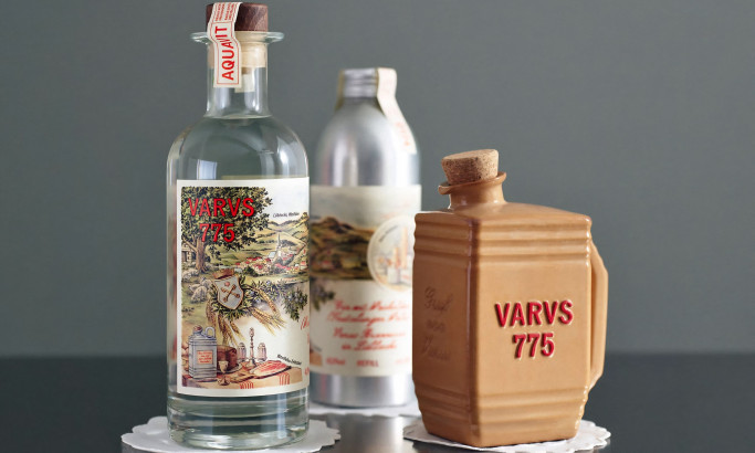
Varus 775
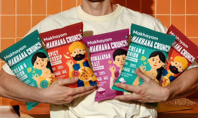
Makhyam Crunch
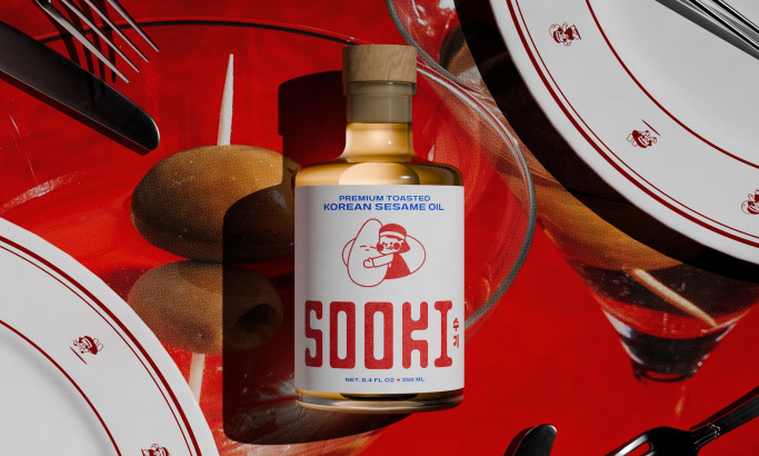
Sooki
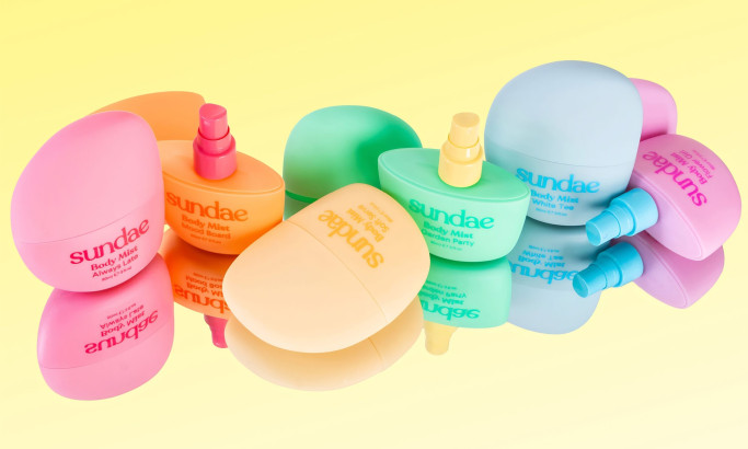
Sundae Body Mist
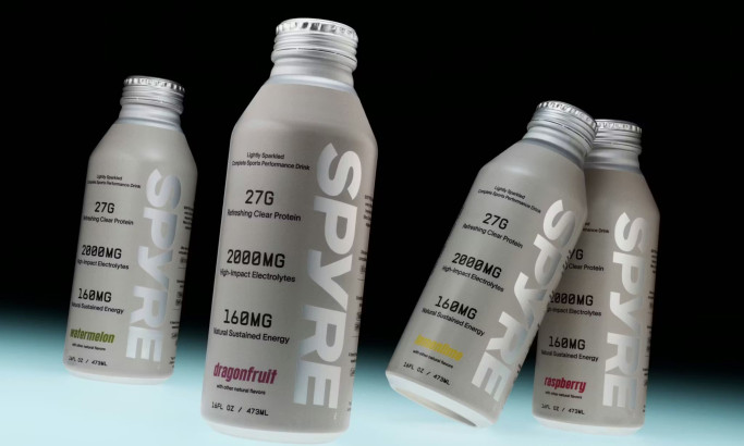
SPYRE
View All BestPackaging Designs