- Article by
- Branko Dimitrijević

This website uses a colour palette of 4 colours
#4D7D97 #1C252D #C1B581 #82BFCF
Technologies & Tools
Description
Team Behind the Design
- Agency: Sarah Rose Andrew
- Client: Versine Skincare
- Category: Packaging - Fashion & Beauty
- Location: Los Angeles, California, United States
- Project Brief: Design skincare packaging that reassures pregnant and nursing consumers through clear information, visual calm, and trust-led presentation.
Pregnancy-safe skincare packaging needs to build trust quickly, since the product choice is tied to health and personal care during a sensitive period.
Versine’s packaging achieves this through clear hierarchy, muted color choices, and a restrained visual system that feels calm and dependable.
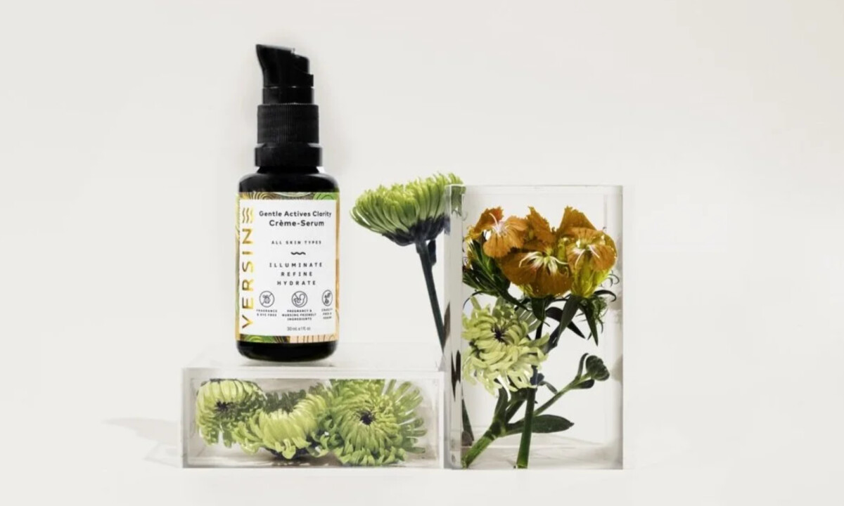
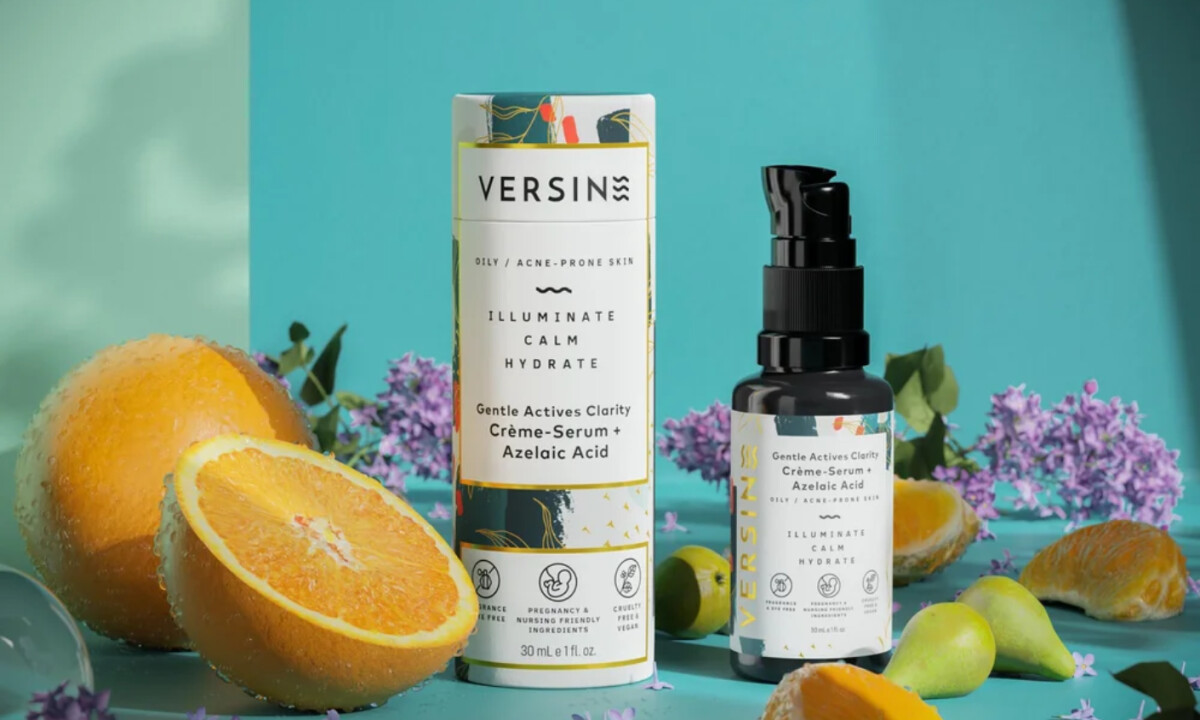
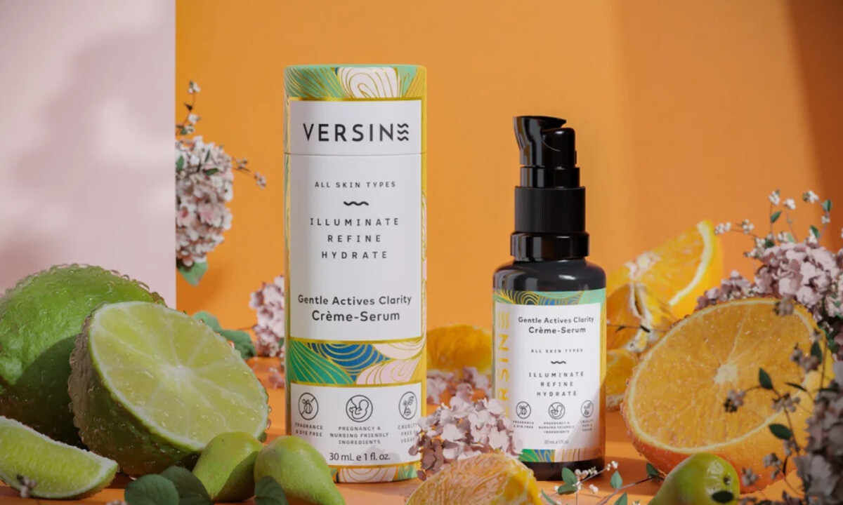
- Information Hierarchy:The label structure reads cleanly at a glance. I like how the brand name, product benefit, and key ingredient details follow a clear, intentional order. That order makes purpose and suitability easy to grasp within seconds.
- Pattern & Restraint: Organic linework and botanical-inspired patterns sit along the borders of the label and packaging panels. I find this effective because the patterns frame the content instead of competing with it. The central label space stays clean and readable, which keeps the focus on function.
- Color & Emotional Tone: The packaging uses warm cream labels paired with soft green and muted accent tones. I like how these colors feel calming without calling attention to themselves.
- Iconography & Trust Signals: Small certification-style icons sit along the lower portion of the label, grouped and evenly spaced. I like how they read as confirmation points rather than selling features. Their consistent placement makes them easy to notice without pulling attention away from the main text.
- System Consistency: The packaging stays consistent across SKUs in structure and layout. Variation comes through color and ingredient naming, which keeps the lineup cohesive on shelf. That consistency helps the system feel reliable over time.
What Brands & Agencies Can Learn from Versine Skincare
1. Clarity Builds Confidence in Wellness Packaging
Clear hierarchy and restrained messaging help consumers feel informed and reassured, especially when safety and health considerations are central to the product.
2. Soft Design Choices Can Still Feel Credible
Calm colors, gentle patterns, and white space often communicate trust and care more effectively than aggressive claims or clinical aesthetics.
3. Consistency Signals Maturity and Reliability
A unified packaging system across products helps wellness brands feel dependable and thoughtfully developed rather than trend-driven.
Makhyam Crunch
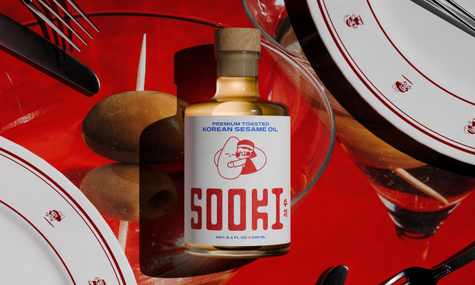
Sooki
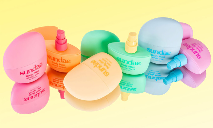
Sundae Body Mist
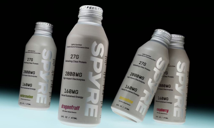
SPYRE
View All BestPackaging Designs