Team Behind the Design
Packaging Design Analysis
When I look at sports packaging, I focus on how well performance cues are balanced with approachability.
Walka Golf Club’s packaging gets this right by relying on restraint and material honesty, creating a premium feel without tipping into exclusivity.
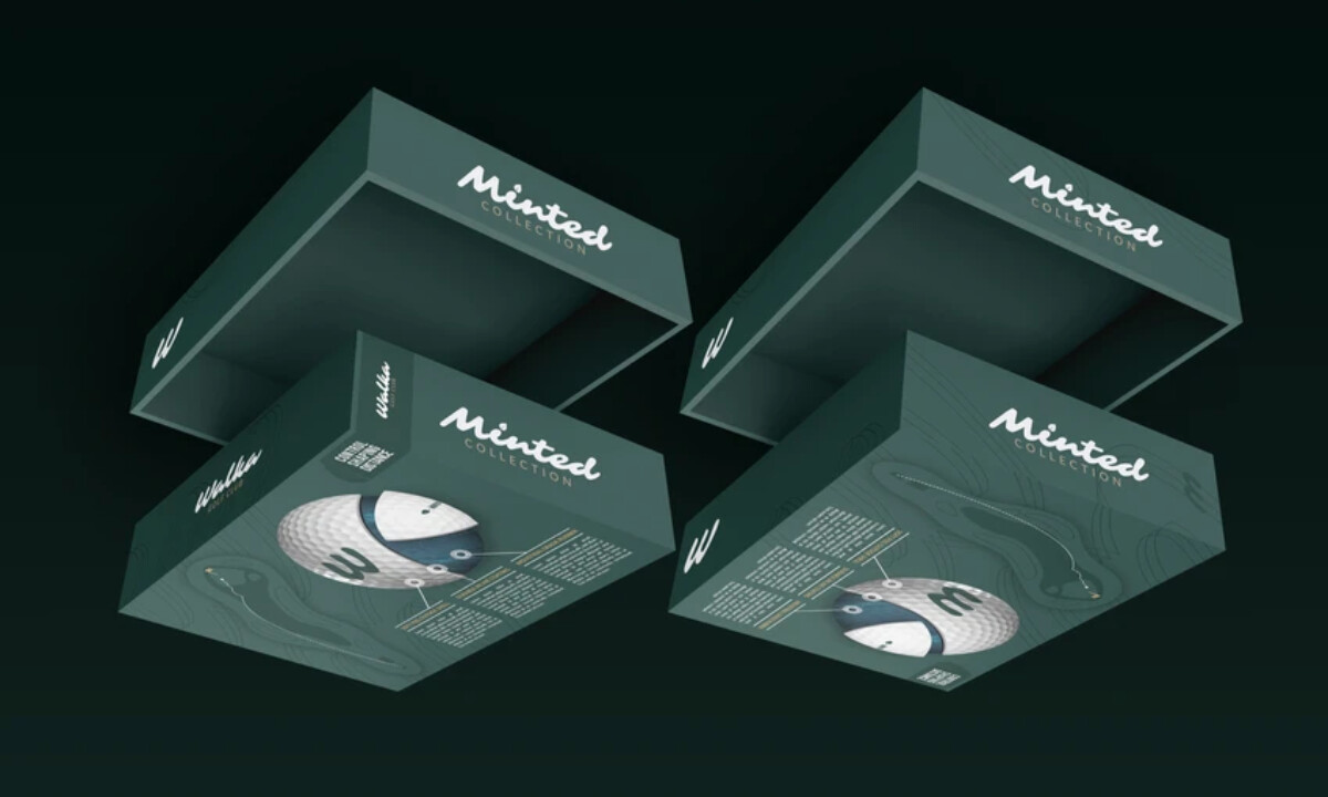
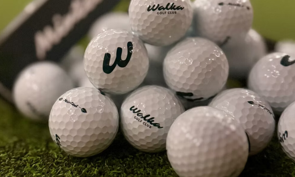
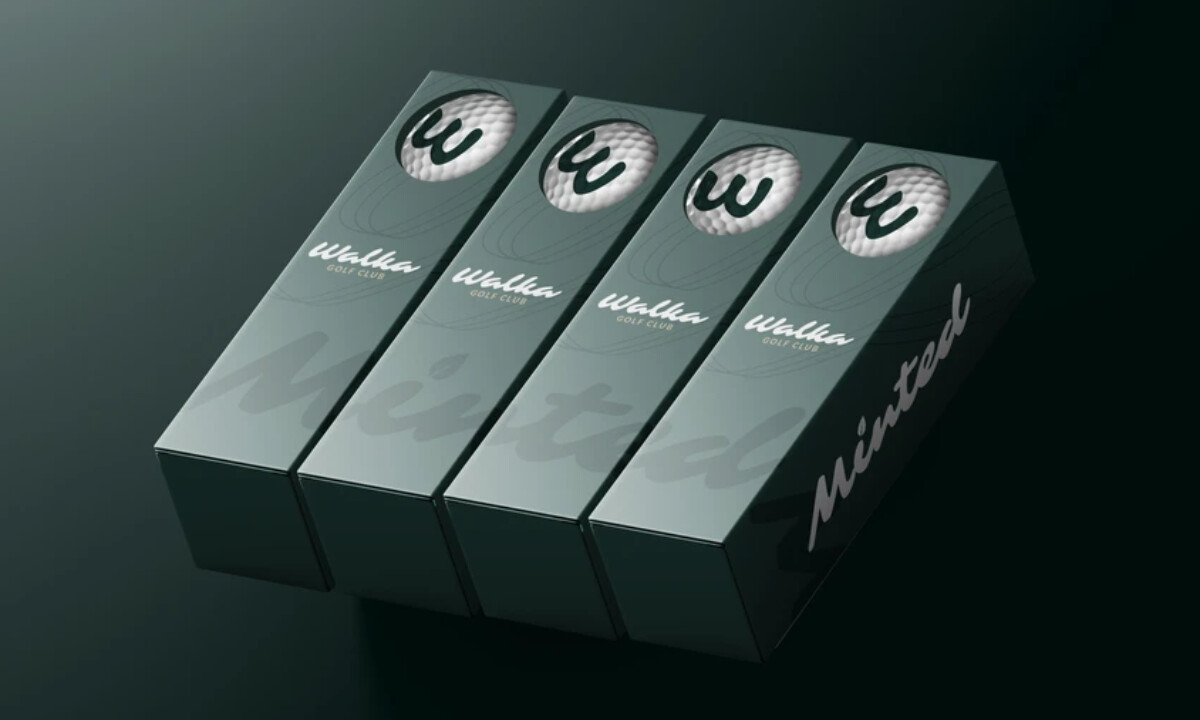
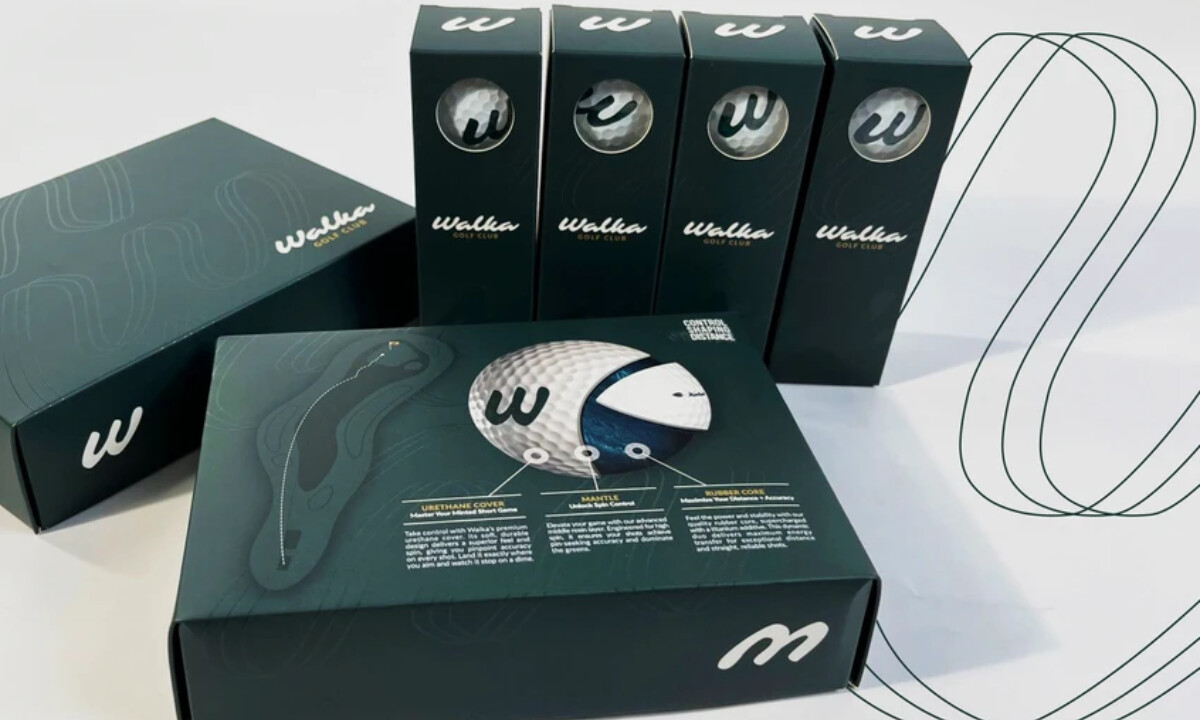
- Color: The deep green monochromatic palette sets a calm, confident tone. I like how it references the course environment without resorting to literal turf greens. The low contrast keeps the look composed and distinct from louder sports brands.
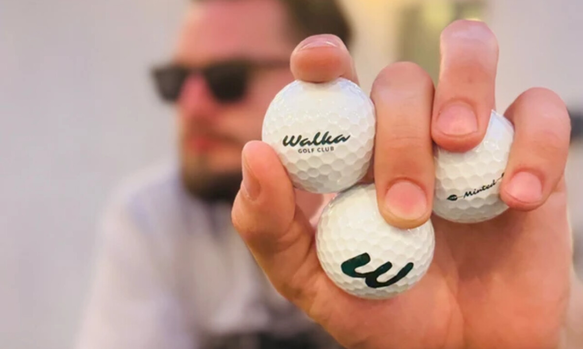
- Typography: The handwritten-style “Walka” script brings warmth into the system. Paired with clean, minimal sans-serif descriptors, the typography feels casual but intentional. This contrast makes the brand feel friendly while still grounded in quality.
- Product Visibility: The circular die-cut window is a smart move. I appreciate how it makes the golf ball part of the design instead of something hidden behind graphics. Aligning the window with the printed mark on the ball reinforces care and precision.
- Texture: The subtle topographic linework adds depth without noise. It’s understated, but it gives the large green surfaces something to explore on closer inspection. That kind of detail often separates good packaging from great packaging.
- Information Design: The cutaway ball illustration is clear and purposeful. I like how performance details are explained without overwhelming the layout, keeping the packaging informative while staying clean and readable.
What Brands & Agencies Can Learn from Walka Golf Club
1. Modern Sports Branding Can Stay Calm
Performance does not have to be loud. Controlled color palettes and softer typography can signal capability while keeping the brand approachable and premium.
2. Let the Product Lead the Design
Direct visibility builds trust. Die-cut windows and honest presentation allow the product to become part of the visual system rather than something to conceal.
3. Use Texture With Restraint
Subtle patterning adds depth to large color fields without clutter. When used sparingly, texture elevates the experience and rewards closer attention while preserving clarity.
About DesignRush Featured Designs
At DesignRush, we review hundreds of packaging and beauty projects every month. These featured works stand out for clarity, creativity, and strong alignment with brand purpose.
Only the most compelling submissions advance to our Monthly Design Awards, celebrating excellence and craftsmanship.
Explore more creative work here:
- Best Packaging Designs
- Best Website Designs
- Best App Designs
- Best Logo Designs
- Best Print Designs
- Best Video Designs
For a full list of design agencies and related services, see our Agency Directory.


