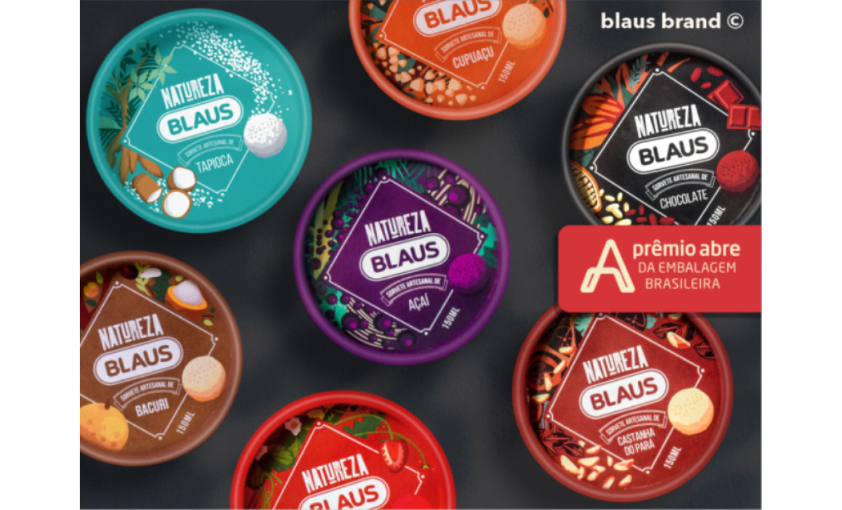
Standout Features:
- Framed label
- Color-coded containers
- Flavor-inspired illustrations
Berna Magalhaes developed Blaus Ice Cream's packaging design with a product-centric approach.
The ice cream containers come in colorful varieties: brown, red, maroon, teal, orange, black, purple, and so on. Each color represents a particular ice cream flavor, easing product recognition.
The brand name sits at the top center of the container's lid, commanding attention. Below it lies the ice cream flavor written in all capital letters. These textual content are enclosed in an elegant rhombus frame.
The beauty of this packaging design doesn't end there. Surrounding the brand label frame are flavor-inspired illustrations that look straight from a Ghibli movie. Considering all these attractive visuals, Blaus' packaging design is a great scene-stealer! Discover other deliciously made ice cream packaging designs here!
-preview.jpg)
-preview.jpg)