Standout Features:
- Distressed snowflake arrow motif
- Prominent Olympic rings placement
- Icy, directional visual metaphor
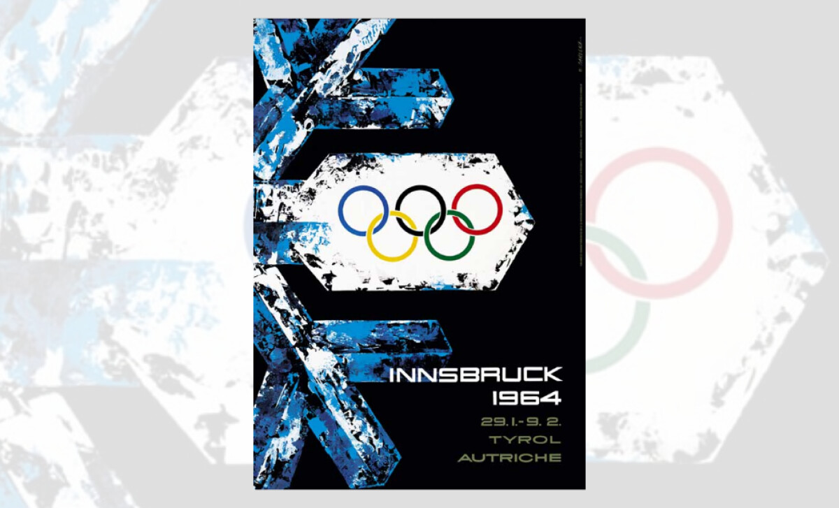
The 1964 Winter Olympics in Innsbruck were visually marked by this bold, directionally charged poster. A jagged snowflake doubled as signage, encapsulating both the crisp aesthetic of winter sports and the sense of momentum that defines the Games. Created for Austria, this design is memorable in its minimalist symbolism and maximal emotional resonance.
A fractured blue snowflake anchors the design; its arrow-shaped arms doubling as both winter symbol and wayfinding cue. This dual metaphor evokes urgency and decision, key traits in sport and communication. Strategically, the use of directional motifs helps boost viewer recall, as a Journal of Visual Communication study found.
The Olympic rings, centered on the largest arrow, are unmissable. Set against a stark white background, they contrast sharply with the cool blues and black. This contrast pulls attention directly to the symbol of global unity, reminding the viewer of the Games’ universal reach amid a regional setting.
Typography is sharp and futurist, hinting at a modern, forward-facing Olympics. The placement of the location and dates at the bottom right balances the dense top-left snowflake, giving the composition both structure and clarity. The high-contrast colors and angular font support the directional theme of the poster.
With its icy textures, layered metaphor, and focused layout, this Innsbruck poster exemplifies purposeful Olympic branding. It offers both a visual chill and a warm sense of identity, marking it as a standout in Olympics poster design history.