Brunello Cucinelli’s entry into the fragrance world, “Innocuo,” is defined by elegant restraint. Guided by Phillip Koch, the print campaign builds on the brand’s foundation of authentic Italian luxury and craftsmanship. The design’s language speaks to a slower, more considered way of life, reflecting the company’s core ethos.
Key Insights for Brands:
- To convey a premium feel, use a traditional serif font with wide tracking
- Use a simple, direct tagline, which can carry more weight than a complex one
- Anchor print campaigns with thoughtful real-life photography for authenticity
The Print Uses Typography as a Vessel for Quiet Luxury
A high-contrast serif font, similar to those used in classic editorial design, defines the campaign’s text. Set in all caps and spaced with generous tracking, the typography commands attention quietly.
The ample white space surrounding the text reinforces a feeling of a luxurious print design and gives the words room to breathe.
Philip Koch’s decision to use a classic serif instead of a modern font is significant, a choice often employed by top print design agencies, as it speaks the same visual language as respected heritage brands.
This achieves an effect that positions Innocuo as an extension of a cultural institution, not just another new product on the shelf.
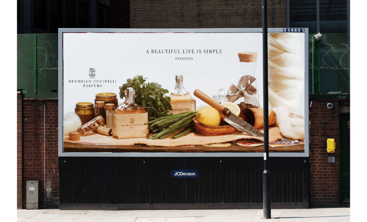
The Billboard’s Still Life Composition Reinforces Lifestyle Positioning
The main visual feels more like a classical painting than a modern advertisement. Elements such as fresh produce, wooden tools, and soft textiles surround the fragrance bottle.
By placing the bottle among these items, the design suggests it belongs in a warm, authentic home, integrating it seamlessly into a lifestyle narrative.
This artful composition is especially impactful for a billboard, as out-of-home advertising has been shown to produce significantly higher ad recall with consumers than many other media formats, including print and online.
Unlike many fragrance ads, this feels grounded and real. The still-life technique connects the product to familiar sensations of taste, touch, and scent. This makes the fragrance feel more authentic and connects it directly to a certain quality and lifestyle.
Simplicity Speaks in Brunello Cucinelli’s Outdoor Messaging
The message on the billboard is concise and profound: “A BEAUTIFUL LIFE IS SIMPLE.” This headline is set in a classic serif font and centered, surrounded by uncluttered space.
The lack of any extra graphic elements reinforces the message itself, letting the simple statement deliver its full philosophical weight. By pairing these words with a simple and clean composition, the design is a perfect summary of the brand’s guiding principles.
This billboard offers a quiet contrast to its loud surroundings, making people pause and consider the message. It’s a hallmark of the best print designs, feeling less like an ad and more like a piece of art.
This ability to make passersby pause and consider is key to bridging the physical and digital worlds, especially since a majority of younger consumers — 54% of Gen Z and 53% of millennials — are prompted by billboards to search for brands online.
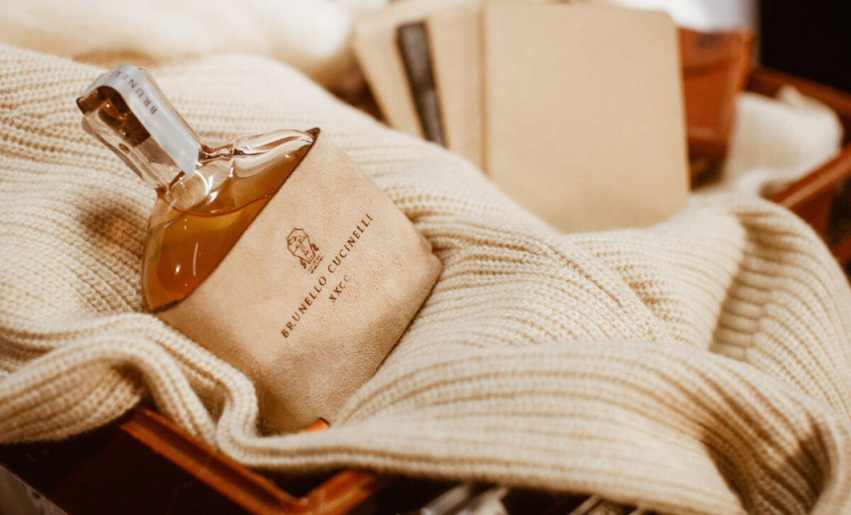
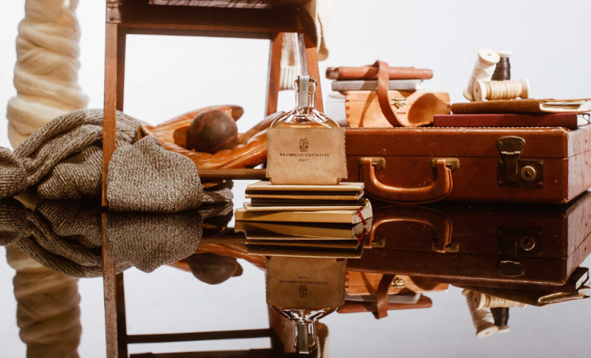
The Product’s Leather Wrap Signals Eco-Conscious Craft
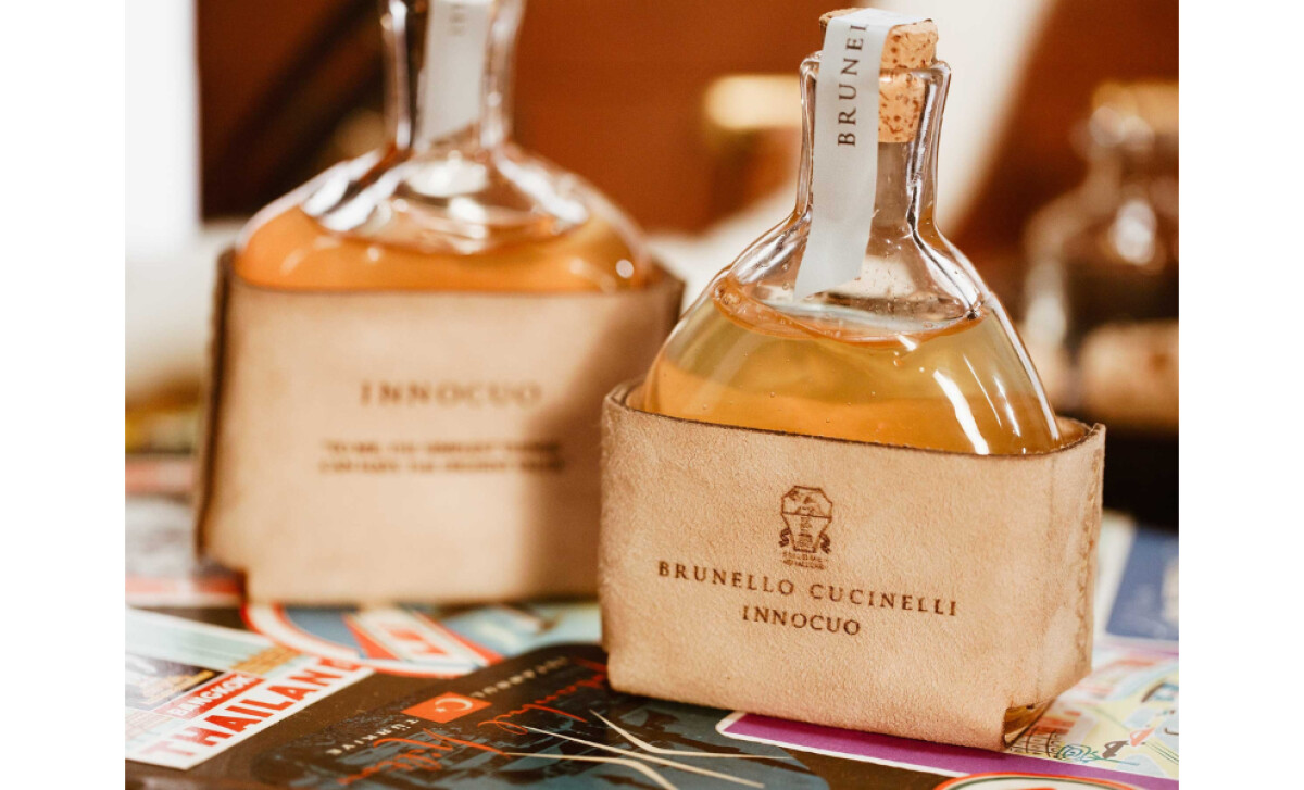
The design of the bottle itself contributes to the campaign's narrative. Its most notable feature is a soft leather wrap, stamped with a discrete logo in brown ink. This unique packaging detail ties the fragrance to the campaign’s overall aesthetic. It echoes the warm, earthy colors and textures of the still-life scene.
Explore our list of the best perfume bottle designs for more inspiration.
Here, the packaging does heavy lifting for the brand. The leather wrap immediately brings to mind Cucinelli's history with luxury materials. This choice communicates a commitment to quality and longevity. The bottle design enriches the campaign’s narrative by adding a layer of texture and tangible craft that words alone could not achieve.
The “Innocuo” campaign, guided by Phillip Koch, succeeds because it is so true to its brand. It chooses quiet confidence over loud marketing, perfectly reflecting Brunello Cucinelli’s identity.
This thoughtful and artful approach is a masterclass in luxury branding strategy, setting a high standard for the industry and earning this month's Design Award.


-preview.jpg)