Team Behind the Design
Print Design Analysis
For professional services print designs, what I focus on are the following key elements:
- color
- typography
- composition
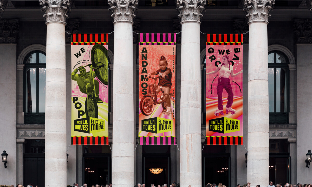
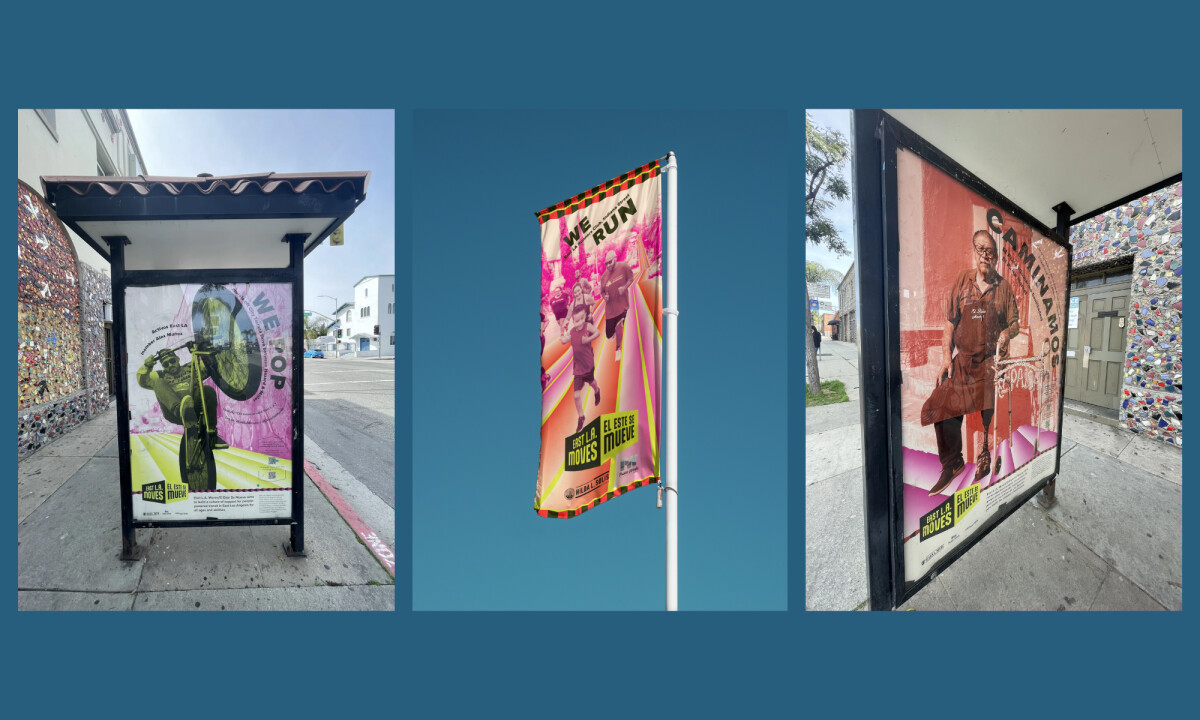
East L.A. Moves stands out by using design not just as promotion, but as representation and participation, translating cultural energy into public space.
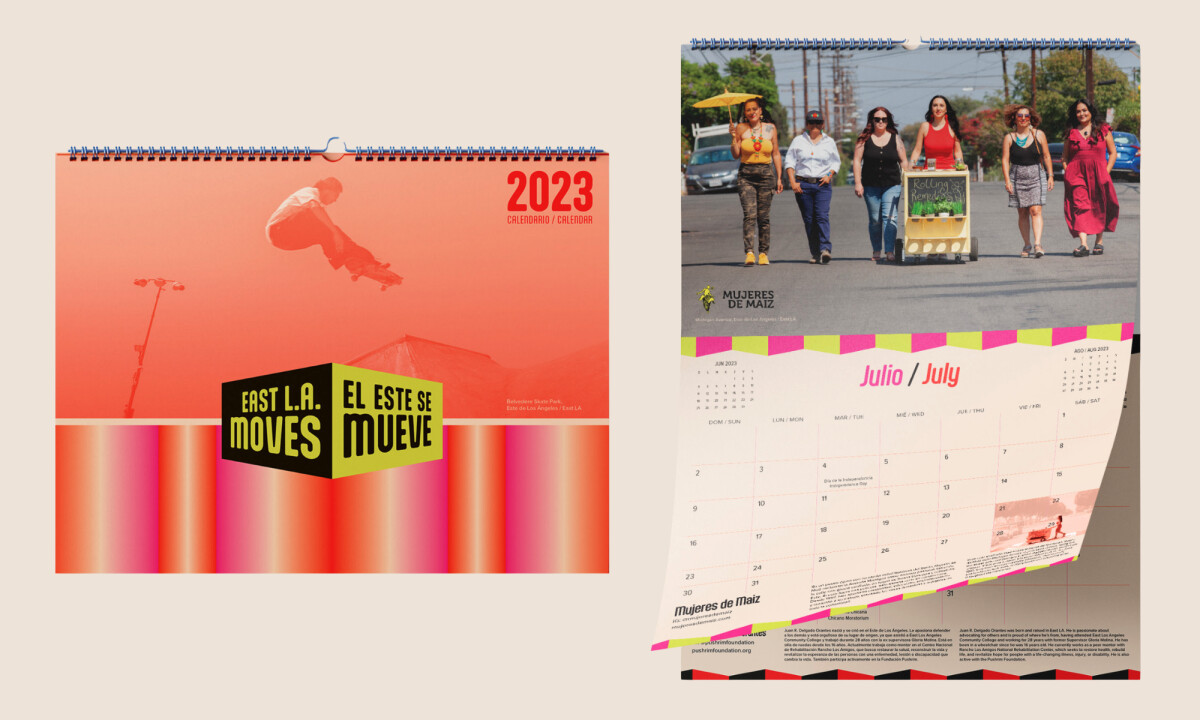
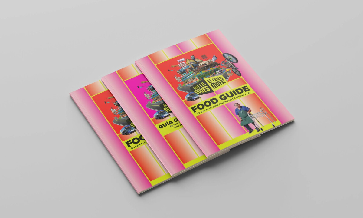
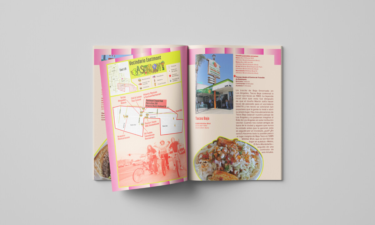
- Color & Visual Energy: The saturated pinks, reds, and neon yellows inject urgency and joy into the compositions, ensuring the posters command attention in busy urban environments. These colors reinforce movement and vitality while staying grounded in a cohesive campaign system.
- Typography & Bilingual Communication: Bold, high-contrast typography supports immediate readability at a distance while seamlessly accommodating both Spanish and English. The bilingual layouts demonstrate clear intent and balance, reinforcing accessibility without diminishing visual strength.
- Imagery & Community Representation: Photography and collage spotlight real people and everyday movement, from cycling to skating to walking. This approach keeps the campaign human-centered and reinforces the message that active transportation belongs to everyone in the neighborhood.
- Format Versatility & Public Presence: The designs scale effectively across bus shelters, banners, calendars, and printed guides. Each format maintains consistency while adapting to different viewing distances and physical contexts, reinforcing recognition throughout the city.
Word from the Designer
This perspective offers insight into how cultural knowledge and lived experience informed the design decisions behind the campaign.
"As the artist and graphic designer, I leveraged my deep connection to the culture and understanding of the community’s values and heritage to ensure that the campaign truly spoke to East LA residents of all ages. To reach and resonate with a wider audience, I provided posters, logo, and calendar design in both Spanish and English."
— Carolina Ibarra-Mendoza
What Brands & Designers Can Learn from East L.A. Moves
Here are some takeaways from the East L.A. Moves print design campaign:
1. Design as Cultural Representation
The campaign uses color, language, and imagery to reflect lived community experience, not generic messaging. When people see themselves represented, participation feels natural rather than imposed.
2. Treat Bilingual Design as a Strength
Spanish and English are integrated with equal visual weight, not as secondary translations. This approach increases accessibility while strengthening authenticity and trust.
3. Build Systems for Public Space Impact
Bold color, clear typography, and scalable layouts ensure visibility across streets, shelters, and printed materials. Effective public campaigns succeed when they adapt seamlessly to real-world environments.
About DesignRush Featured Designs
At DesignRush, we review hundreds of agency projects each month. The featured selections stand out for clarity, creativity, and execution across digital and brand experiences.
Exceptional works proceed to our Monthly Design Awards, where they’re recognized as leading examples of design craft.
Explore standout print design projects that push creativity forward:
- Best Print Designs
- Best Website Designs
- Best App Designs
- Best Logo Designs
- Best Packaging Designs
- Best Video Designs
For a full list of design agencies and related services, see our Agency Directory.
-preview.jpg)