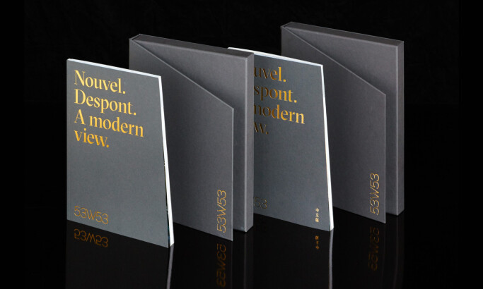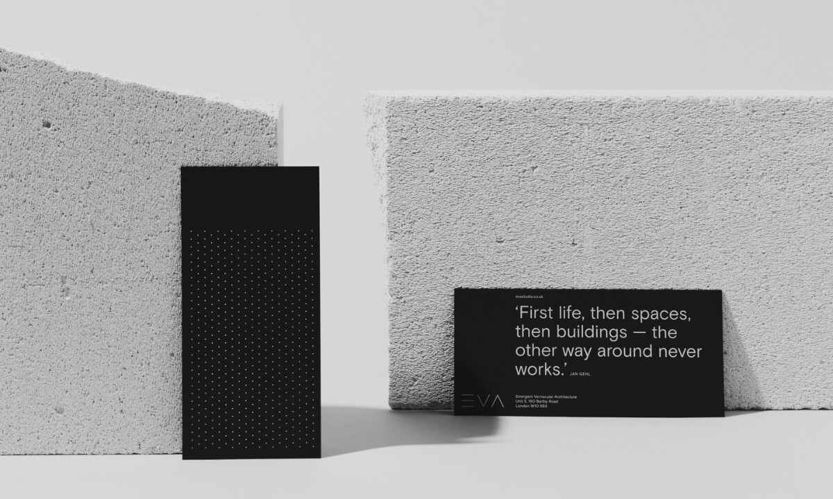
Jupiter Farms explores branding through reduction and material honesty. The identity uses stark compositions, tactile surfaces, and minimal typography to reflect a pursuit of clarity, structure, and discipline across print applications. Each element feels intentional, balancing visual calm with architectural rigor.
Get connected with the right print design agency for your project.
GET STARTEDGet a chance to become the next Design Awards winner.
SUBMIT YOUR DESIGN