Print may be called "dead," but UMA Studio’s identity proves otherwise. With brutalist typography and kinetic patterns by Estúdio Mira, print turns into a medium of impact, commanding attention where screens fall short.
Industry Insight: As design studios increasingly adopt kinetic and brutalist-inspired branding, I see a clear shift toward hyper-modern, motion-aware print design that refuses to fade into the background.
Print is evolving. A 2024 Tuts+ report on kinetic typography shows how motion-aware layouts have leapt from digital screens into static media, creating the illusion of movement to command attention.
Key Insights for Brands:
- Modular visual language ensures scalability across branded materials.
- Brutalist typography positions the brand as cutting-edge and unconventional.
- Dynamic line patterns echo architectural precision, sparking visual intrigue.
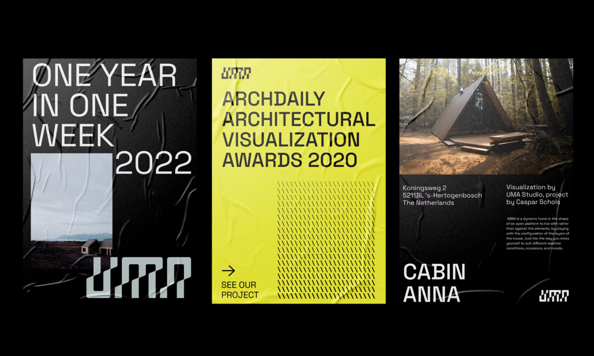
Modular Print Identity Establishes Scalable Brand Language
When I first came across UMA Studio's architecture print design by Estúdio Mira, I was struck by how effortlessly modular the entire system is.
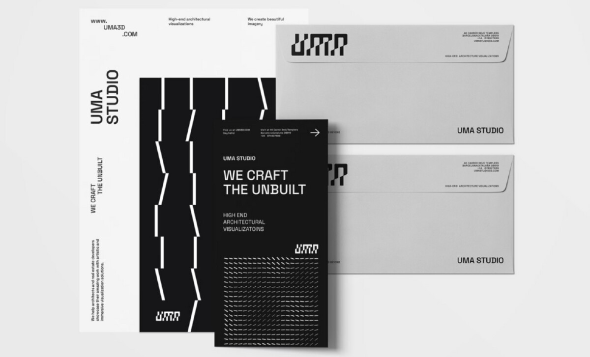
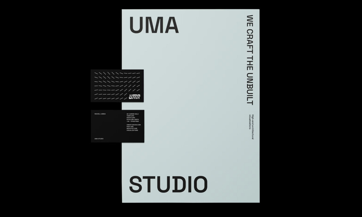
Built around a clean grid structure, the identity flexes across formats without losing its voice, from business cards to posters and promotional material.
This grid-based approach gives the visual language incredible adaptability. Whether you’re printing a brochure or embossing a tote bag, the system holds strong, ensuring brand consistency at every touchpoint.
Research backs this up: the Marq Brand Consistency Report found that consistent brand presentation across platforms can boost recall and preference by as much as 80%.
Brutalist Typography Reinforces Avant-Garde Aesthetic
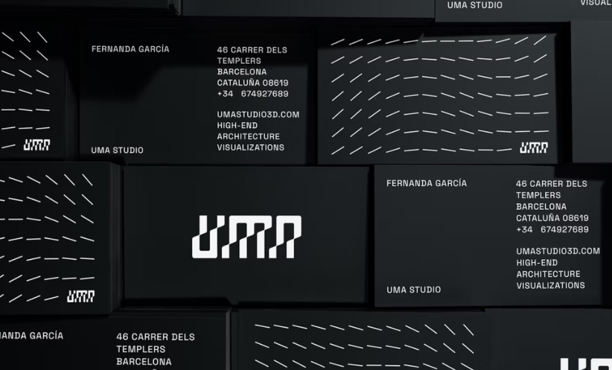
Typography is often the loudest voice in a print identity, and UMA Studio’s custom wordmark speaks and more importantly, it commands.
With its sharp, stencil-like construction, this brutalist font style brings out the industrial edge that architectural brands crave.
To me, this type choice positions UMA Studio at the front of pack of creative visualization, aligning with the growing use of brutalist aesthetics to convey authority and originality.
In fact, a 2024 study published in the International Journal of Social and Economic Sciences confirms that assertive, unconventional typefaces elevate brand recall and are more likely to be associated with innovation when tied to a company’s core purpose.Discover the fonts shaping print and brand identity and find your signature type now.
Kinetic Pattern Work Evokes Movement and Depth
One of the most captivating aspects of Estúdio Mira's approach to their client's print system is the kinetic line work.
These patterns are ornamental at first glance, sure. They do, however, serve more purpose: as a visual metaphor for architectural energy and motion.
These lines reflect UMA Studio's core philosophy: "We craft the unbuilt." And in doing so, the design becomes a tactile extension of their conceptual work.
It’s a smart move indicative of print design expertise: a recent study on visual metaphors in branding shows they significantly enhance recall and deepen emotional response, precisely because they connect abstract ideas with tangible design language.
Color Palette Anchors Visual Consistency
A brand’s print success often lives or dies by its colordiscipline.
Estúdio Mira opts for a minimalist palette: black, white, soft gray, and a striking neon yellow. The monochrome tones establish authority, while the yellow injects energy and contemporary flair.
The best print designs don't just use color for color's sake. Neon accents act as visual signposts, pulling attention to headlines, CTAs, or mission statements. Amongst muted design identities, UMA's palette makes sure they don’t get lost.
What Agencies Can Learn from Estúdio Mira’s UMA Studio Identity
When I reviewed Estúdio Mira’s identity system for UMA Studio, I saw a high-functioning design framework that other creative agencies should pay close attention to:
- Design beyond the logo: UMA’s identity isn’t reliant on a single symbol — it’s a complete visual language. From business cards to tote bags, every element feels intentionally crafted to reinforce the brand’s values.
- Marry style with meaning: Yes, the brutalist typography and motion-driven layouts are visually compelling, but they’re also intentional and strategic. They echo the studio’s architectural precision and position UMA as a forward-thinking creative partner.
- Print as a primary brand touchpoint: What impresses me most is how print wasn’t treated as secondary to digital. In fact, it sets the tone for defining the brand’s character. The tactile experience, the kinetic linework, they all reinforce UMA’s promise: to craft the unbuilt.
Too often, I see agencies minimize the role of print in brand systems. Here, it’s proof that when print is executed with intention, it becomes the brand’s voice and not just its reflection.
As someone who has worked on various brand identity systems, I believe this work offers a clear playbook: be modular, be meaningful, and don’t underestimate the power of physical design in a digital world.
See more standout print designs that prove the medium’s power to capture attention and build lasting brand recall.
You can also view other top design categories:
- Best Print Designs
- Best Website Designs
- Best App Designs
- Best Logo Designs
- Best Packaging Designs
- Best Video Designs
For a complete list of top agencies and services, visit our Agency Directory.