As one of the world’s most recognizable beer brands, Heineken has long positioned itself as a champion of sustainability. The “Brew a Better World” initiative, manifested here through workplace print installations by Coolgrey, translates these goals into an immersive physical experience.
Industry Insight: With 68% of companies reporting that consistent branding drives 10–20% revenue growth, Heineken’s consistent push of its sustainability mission showcases how cohesive brand storytelling can become a growth lever — not just a branding exercise.
Let’s explore how this design translates its brand ethos into a compelling visual system.
Key Insights for Brands:
- Use layered compositions and dimensional typography to give print designs a tactile, engaging quality.
- Distill complex narratives into clean iconography and simple illustrations for immediate clarity in print.
- Anchor your design system with a recurring symbol to reinforce your core message and create visual unity.
The Brand’s Sustainability-Centric Color Palette Stands Out
A color palette defined by Heineken’s iconic green is used throughout the space. This is matched with clean white for graphics and text, creating a high-contrast look.
Green is synonymous with growth, eco-consciousness, and renewal, directly reinforcing Heineken’s sustainability messaging. A 2023 study by Sun & Wu found that green is particularly effective at positively influencing consumer perceptions of a brand's social responsibility and connection to nature.
’'Excellent use of shades of green, keeping with the corporate brand messaging and established visual references.''
DesighRush Awards Jury Panel
The further use of color to separate the campaign's key messages is also a smart move. For example, other colors, like a coral tone for the word “SOCIAL,” are used to distinguish different themes. It creates a simple visual language that helps the viewer to navigate the information.
This palette balances brand identity and thematic messaging perfectly. You instantly know it's Heineken and you immediately understand the focus on sustainability.
The Print Design Features Dimensional Typography & Hierarchy
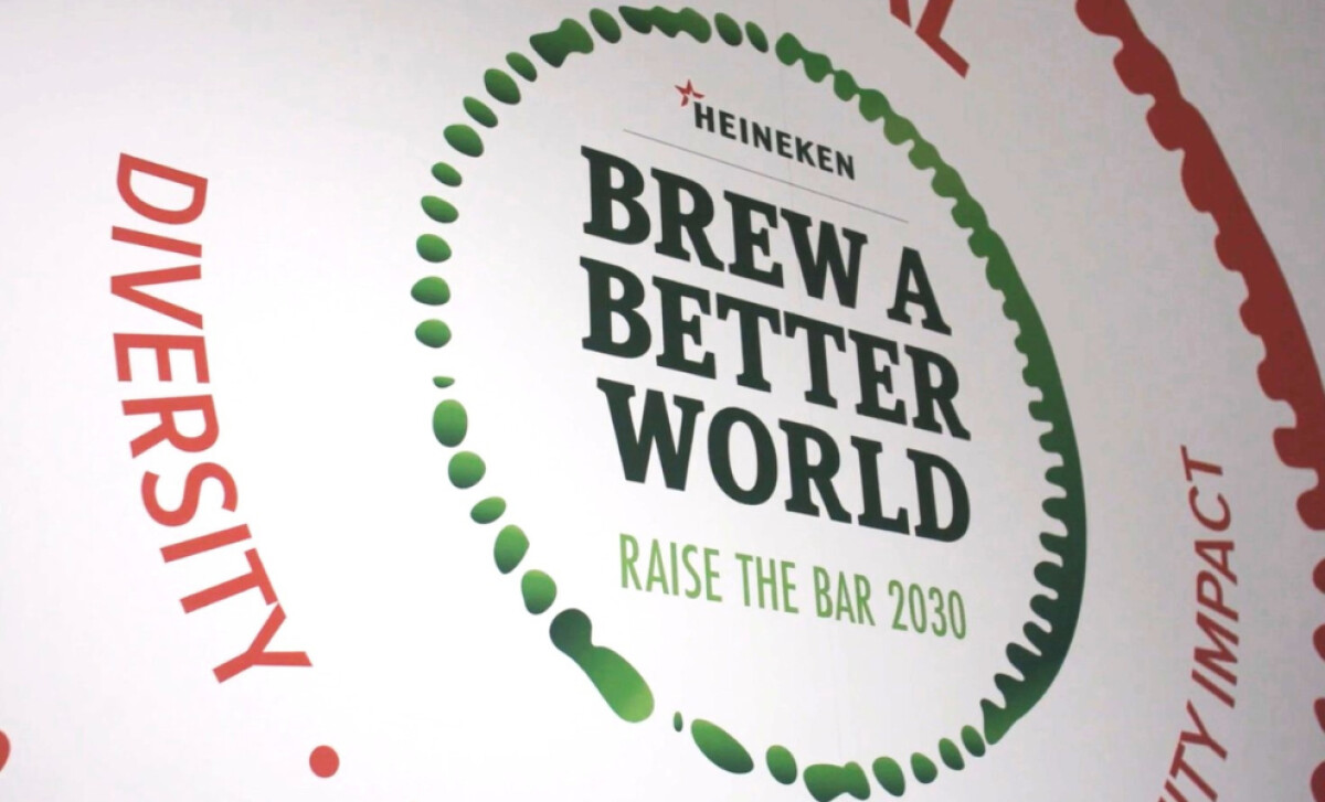
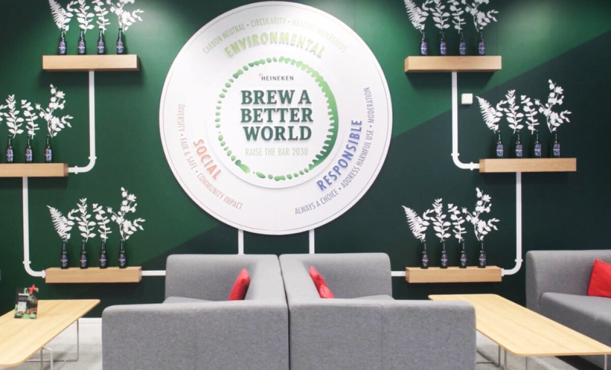
The centerpiece installation is a circular display of layered, three-dimensional typography. At its core, the phrase “Brew a Better World” stands out in bold serif lettering with beveled depth, ensuring it commands attention.
Supporting phrases such as “Raise the Bar 2030” are presented in lighter-weight fonts, often highlighted in green or other accent hues to signal different categories. This contrast creates a clear hierarchy while adding visual variety.
The three-dimensional lettering also heightens physical engagement, encouraging viewers to step closer and interact with the piece visually. This tactile quality transforms the message from a decorative element into an immersive brand experience.
Overall, the unique treatment of Heineken’s brand typography delivers both structure and tactility, which is essential in making the message literally stand out in public, often busy settings. This attention to detail is what solidified Heineken’ place among the best print design projects.
The Exhibit Employs Illustrative Environmental Motifs
-desktop.jpg)
Leaf silhouettes, floral outlines, and linear iconography flow across the walls of transitional areas such as hallways and waiting zones, merging natural and industrial elements into one cohesive print design.
Icons of trucks, wind turbines, and wheat stalks are repeated throughout the space, creating a continuous connection to Heineken’s narrative.
The illustrations, created by Coolgrey, appear in clean monochromatic line art, often white on deep green or black on white. This clarity of style gives the graphics a contemporary character that feels artistic but also approachable.
Additionally, each icon is simple yet instantly recognizable, ensuring the message is clear and accessible. Together, they trace Heineken’s sustainability journey “from barley to bar,” presenting the steps of responsible production in a direct and visually engaging way.
This approach reflects the type of thoughtful visual strategy often seen among top print design agencies, where every element serves both aesthetic and communicative purpose.
Consistent Circular Framing & Symbolism
_124413c32865-desktop.jpg)
You will notice the repeated use of circles in this design. From the main wall installation to the smaller award plaques, the circle is a dominant shape.
The choice of the circle is deliberate. As a universal symbol of unity, cycles, and renewal, it aligns perfectly with the sustainability theme.
It is also used in more subtle ways, like in the dotted gradient patterns. This consistent use of a single geometric form helps to create a cohesive look that ties the whole installation together.
Learn more about strengthening consumer trust by being consistent.
All in all, choosing a primary brand shape for a campaign like this reinforces its central theme (a complete, self-sustaining brand) while giving the installation a professionally consistent and aesthetic atmosphere.
What Brands and Agencies Can Learn From Heineken
Heineken’s print installation is a branded environment that shows how thoughtful design and brand storytelling can penetrate any environment.
Here’s what design teams should take away:
1. Give Your Words Physical Presence
For physical prints, typography in a physical space can be more than just text on a wall. Using raised or three-dimensional lettering gives your core message a tangible weight. This technique can make your brand's words feel more permanent.
2. Unify a Space with a Repeated Shape
A recurring geometric element, like a circle, can act as a visual anchor that connects disparate parts of an installation and creates a cohesive flow.
3. Consider the Sense of Touch
Print design is a tactile experience. The choice of materials, like durable surfaces and embossed details, can reinforce your brand's message and create a more memorable impression.
About DesignRush Featured Designs
At DesignRush, we review hundreds of agency projects each month. These featured designs represent some of the most engaging and purposeful executions across industries.
The best of them move forward to be recognized as Monthly Design Awards winners, celebrating creativity, relevance, and craftsmanship.
Looking for inspiration food and beverage print designs? Start here:
- Best Print Designs
- Best Website Designs
- Best App Designs
- Best Logo Designs
- Best Packaging Designs
- Best Video Designs
For a complete list of top agencies and services, visit our Agency Directory.