Manav Sthali Global School's Educational Brochure Informs and Entertains With Playful Content
Manav Sthali Global School, a leading institution committed to fostering a joyful and enriching learning environment, partnered with Wishbox Studio to create a brochure that reflects the school's fun yet educational mission.
Recognizing the crucial influence "play" has on primary learning, the school sought a brochure that will inform as well as entertain prospective parents and students.
Wishbox Studio understood that the design needed to present learning to young minds in an engaging way, making the integration of play into education the central focus of the brochure's conceptual framework.
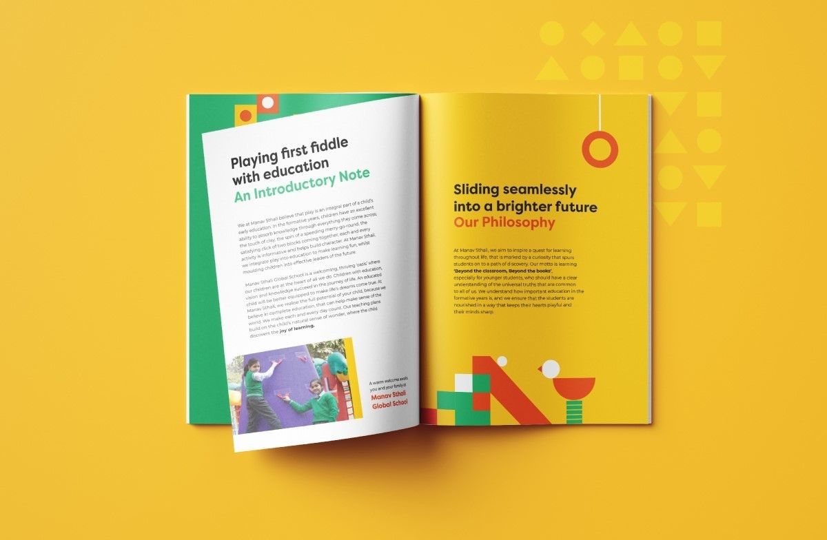
One of the ways they achieved this was through playful wordplay in headers and subheaders. For instance, the section on the school's values is titled "Our Ethos - Playing it Fair," highlighting the institution's commitment to fairness and integrity while maintaining a lighthearted tone.
Overall, approachable sans-serif typography with clear lines and rounded edges further shines light on said values.
Browse our collection of the best fonts for print designs that will make your creations stand out.
The Print Design Illustrates the Joy of Learning With Simple Geometric Shapes
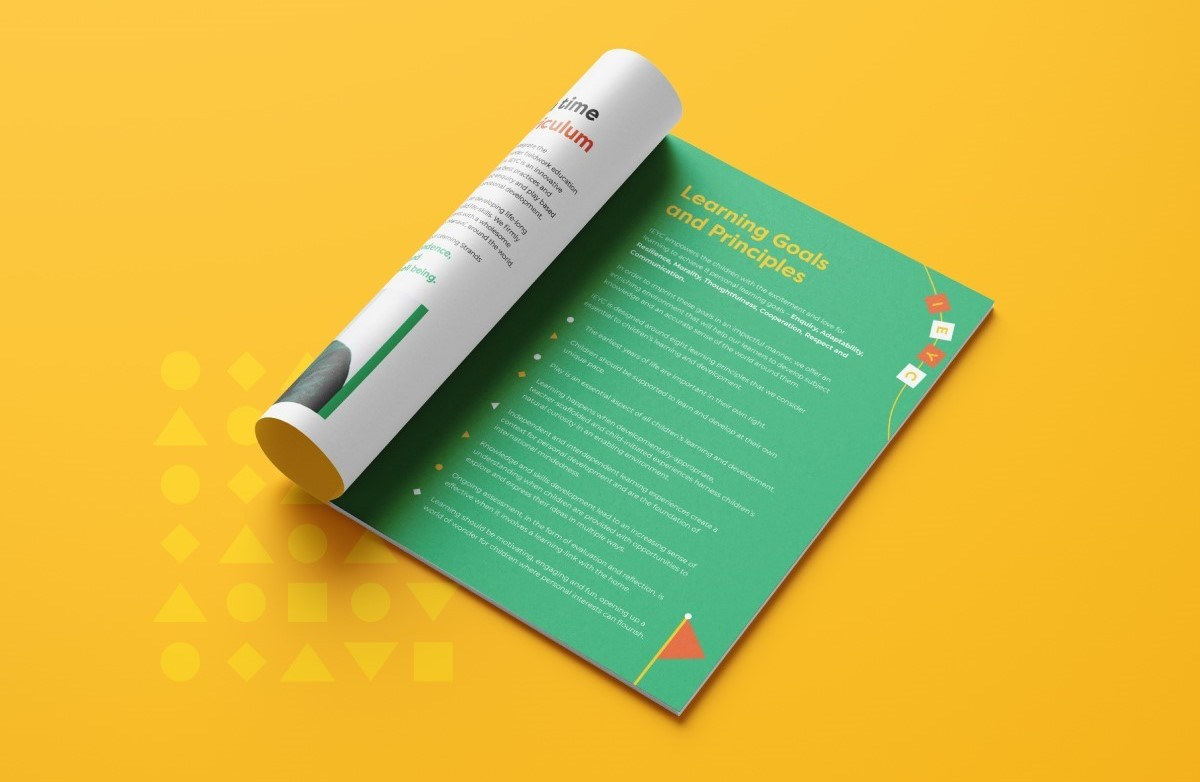
The brochure's central narrative of "learning through play" is brought to life through vibrant illustrations composed of simple geometric shapes. Circles, squares, triangles, and rectangles are the building blocks of a brochure’s visual language.
Professional print designers often use elements like these when creating educational material because of their ability to speak directly to young learners. The illustrations integrate these shapes to create more complex forms, symbolizing the evolution from basic concepts to broader educational themes and, ultimately, brighter futures.
Circles are nestled within squares, triangles combine to form diamonds, and multiple geometric objects are stacked to create sturdy blocks. This visual metaphor reinforces the idea of building upon a strong foundation while adding a playful dimension to the design.
Explore some of the most impactful print designs to get inspired.
Vibrant Colors Enhance Educational Themes in the Brochure Design
Manav Sthali Global School's brochure design employs a vibrant color scheme that complements its playful learning theme. The palette, consisting primarily of green, yellow, orange, and white, creates a visually stimulating experience that is both inviting and energetic.
Green, often associated with growth and harmony, represents the school's commitment to nurturing young minds; yellow, the color of sunshine and optimism, evokes enthusiasm for learning. Lastly, orange, a warm and vibrant hue, radiates energy, while white provides a clean backdrop that allows the other colors to shine.
This carefully curated combination of colors captures attention and creates a welcoming and inclusive atmosphere. Also, using solid colors throughout the brochure ensures thematic consistency and maintains a visually cohesive experience for the reader.
Understand the power of choosing the right brand colors.
The Print’s Realistic Imagery and Strategic Layout Promote Readability and Engagement
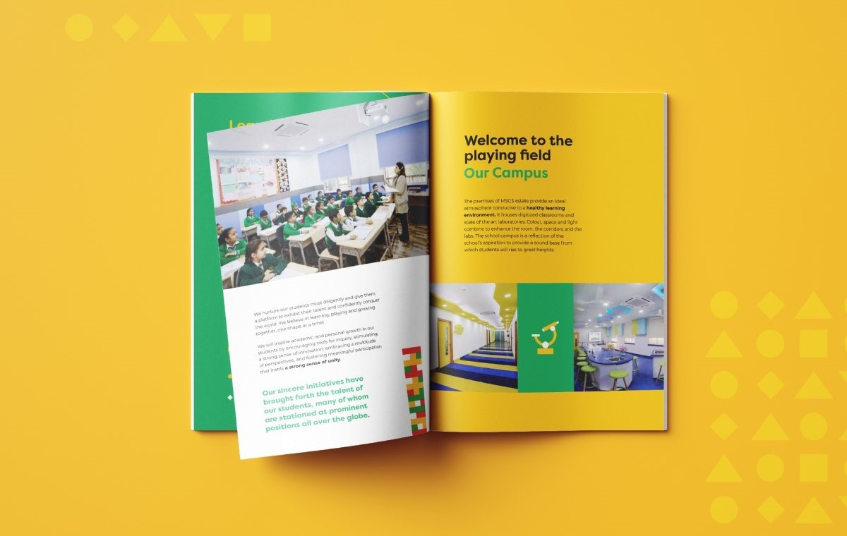
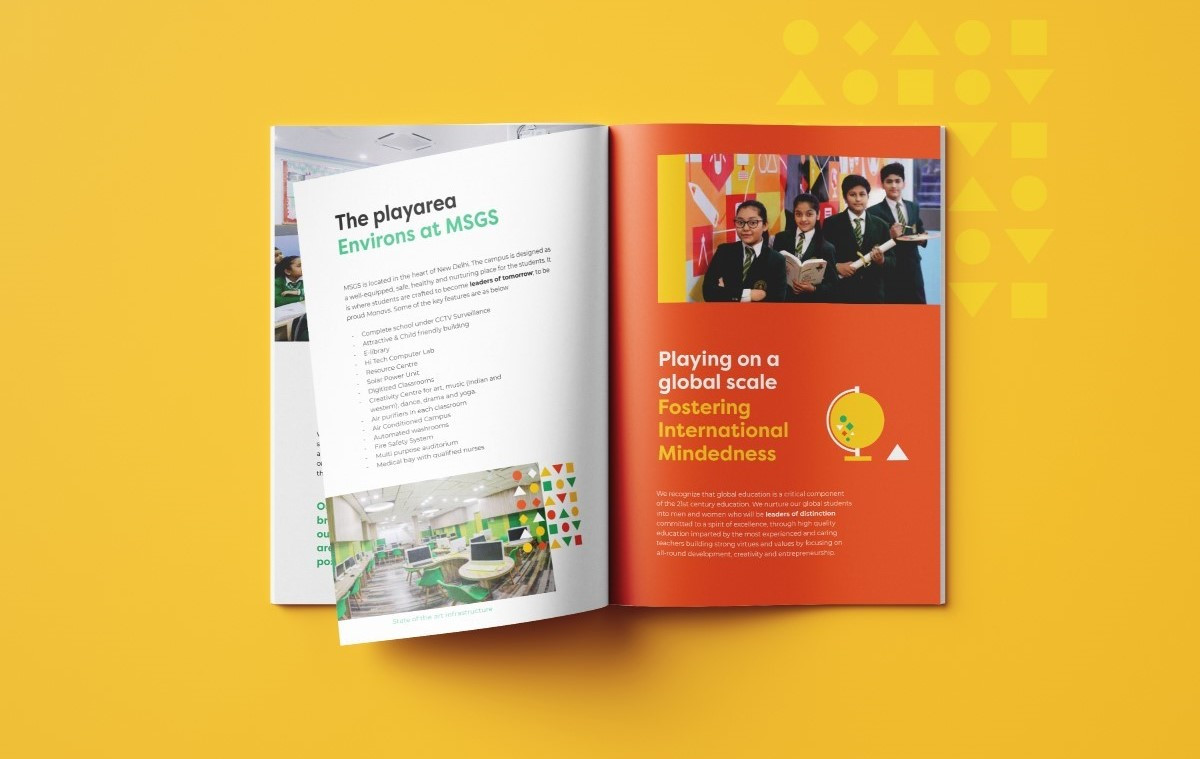
Photographs of students engaged in various activities — from collaborative projects to outdoor explorations — are woven into the design, offering a genuine glimpse into the school's dynamic and interactive learning environment.
The brochure's layout is a masterpiece of balance and clarity. Ample negative space is strategically employed, allowing vibrant colors and informative text to breathe. This thoughtful use of white space enhances approachability, inviting readers to explore the brochure's content at their own pace.
Dive into our list of the best print designs with effective visuals and layouts.
The design also skillfully breaks the monotony of text with dynamic images and color combinations. Each page is a visual treat, with carefully curated photographs and illustrations that complement the written information, making the brochure a joy to read.
By seamlessly integrating realistic imagery, vibrant colors, simple geometric shapes, and strategic layout, the brochure effectively communicates the school's commitment to a joyful and enriching learning environment. All these features make it a worthy recipient of the Best Designs Award.