Standout Features:
- Playful typography with varied weights, angles, and textures
- Vibrant green color palette
- Organic imagery and graphic elements
MeetJack, a brand offering a jackfruit-based meat alternative, emerged from a 2018 discovery in Asia. Now available across the Netherlands, its print campaign by A-Graphics aims for a bold and playful identity that can capture attention for this innovative food product.
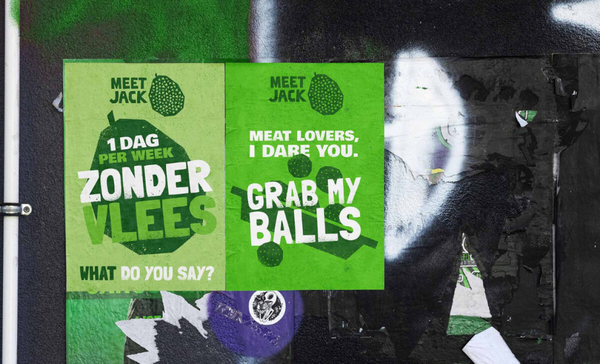
This food print campaign leverages chunky, oversized letterforms with varied weights and angles on textured, tone-on-tone whites and greens. Its rough-edged sans-serif font also enhances this handcrafted feel. Not to mention the provocative phrases that commands attention and break traditional layout conventions.
Green is the prevailing color throughout the campaign, appearing in shades from lime to forest green. Applied to backgrounds and graphic elements, it evokes freshness and nature. This strong association with health and sustainability, coupled with contrasting white text, perfectly aligns with the plant-based product offering.
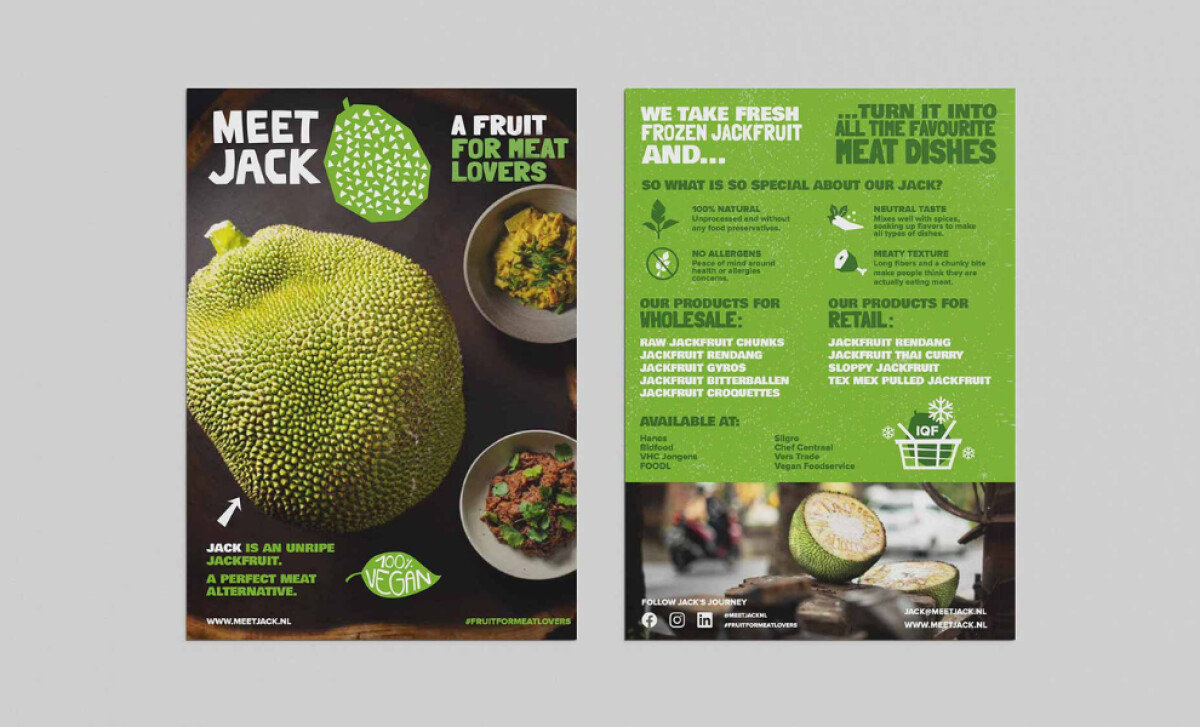
Photographic images of both raw jackfruit and cooked dishes are combined with hand-drawn or vector graphics. The overall composition feels textured, angular, and fun — reminiscent of urban poster culture.
This vibrant and cohesive assembly of colors, graphics, and text aligns with research showing such elements are vital for creating effective visual imagery in posters (Luo et al., 2022).
MeetJack showcases that a strong, personality-heavy print campaign, when consistently applied, can make a new brand stand out and capture the curiosity of its target audience.