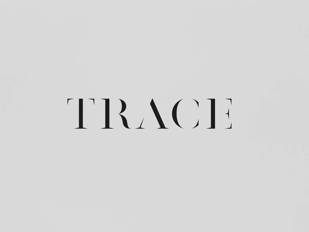
Having previously worked on branding for Curious Space, Socio Design also helped to redesign the company’s biannual magazine, “Trace.” Starting from the base logo of the magazine, Socio Design took a primitive approach to the project. They take the meaning of the word “trace” literally in their design, pulling out the look of a tracing template used for lettering. The logo is plain with solid black font placed against a light gray background. The idea is incredibly simple, but it still maintains a highly effective and eye-catching theme.
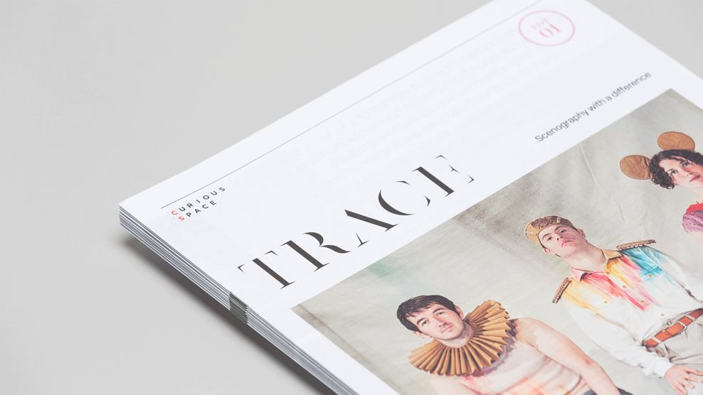
Trace Magazine is a self-promotional publication created by a group of Curious Space’s scenographers looking to show off case studies and global projects that are of importance to them. The booklet includes approximately fifteen to twenty pages of powerful content, and Socio Design found a way to pack a punch with its overall design scheme while having a minimal amount of space to work with.
All typography is kept very simple with a sans serif font that can be found on any computer. However, to call attention to specific titles and points of interest, the trace-styled font is once again used in coordination with the logo design. Titles are formatted in a variety of ways to keep things interesting as readers turn each new page. Some titles are straightforward and horizontally aligned on the page, while others are rotated in a number of directions, even sideways, to add variety to the reading experience.

While the trace-styled font draws major attention from the readers, the main focus is emphasized on the stylized and impressive photos that Trace Magazine exhibits. Each picture is strategically placed on the page, coordinating color schemes between photographs within every section.
To keep the focus on the photographs selected, a large amount of negative space is utilized. The white space keeps readers from being distracted away from the content. Socio Design uses a combination of the font and photographs to guide readers through the story Curious Space is telling through the pages.
Trace Magazine’s wordplay logo—the use of an actual traced lettering design to present their brand—their stylized imagery, and their utilization of negative white space all come togetherperfectly to exhibit a highly original publication produced by Curious Space.
Trace Magazine is an elegant print design in the Arts & Recreation and Food & Beverage industries.