The best print and packaging designs have a unified theme that, when combined, sends shockwaves across the world like an incoming asteroid destined to eviscerate life on Earth.
That big.
Too many print and packaging designs are sub-par. Commit to it. If you are going to design something, connect all the dots. Reach into your design arsenal and make everything flow together.
How? To start, take Muni Coffee Company's brand identity for example.

Crate47 created an all-encompassing package for Muni Coffee Company. Look at that font, which is (at times) speckled like a tin camping mug. Take note of the contrasting golden browns and dark blues. They shine like the stars above a cozy, rustic campsite. This print design is mesmerizing.
This branding grasps your brain and says “HEY. THIS IS A UNIFYING, ALL-ENCOMPASSING DESIGN THAT WILL KNOCK YOUR SOCKS OFF. CHECK ME OUT. I AM GORGEOUS.”
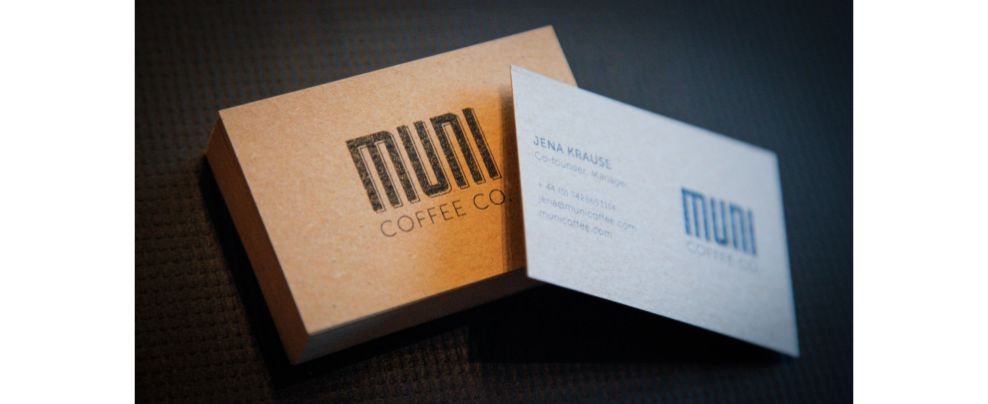
The business cards look more like a keepsake than a professional item. The combination of muted gold and stark white is like peanut butter and jelly -- meant to be.
Plus, the black text that accents the gold case makes the entire business card appear like a collector's item.
It is magical. It is fantastic. It is flagical.

The cards look dusted with glittering gold. The perfect proportions of the black borders are a Type A person's dream come true.

This complimentary gift set is pure luxury. Take this gift bag inside of your Bentley, kind sir. Here is a tip of 200 bitcoins.
The best print and packaging designs use the same color palette throughout the design, and Muni Coffee Company is no different.
Here we have all black backgrounds on bags of various sizes. A small bottle in the same hues compliments the set.
Finally, we see a white coffee mug that is accented with a black line at the top. This item stands out against its dark counterparts, but still ties in the theme with its unifying pop.
Muni Coffee Company gave their design structure. By doing so, their brand identity came to life through complementary fonts, colors and lines.
Muni Coffee Company is a cool print design in the Food & Beverage industry.