Team Behind the Design
Agency: Bera Design
Client: MyMarket Network
Category: Print Design (eCommerce & Retail)
Location: São Paulo, Brazil
Project Brief: Produce print materials that communicate MyMarket Network’s modern identity through bold colors, clean typography, and practical layouts.
Print Design Analysis
Related Articles
I often look at typography, layout, imagery, and production quality in reviewing eCommerce and retail print designs.
Strong print materials help brands establish a lasting physical presence with customers.
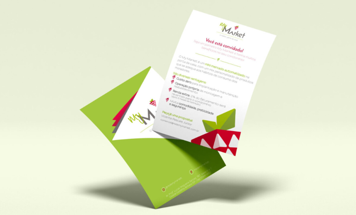
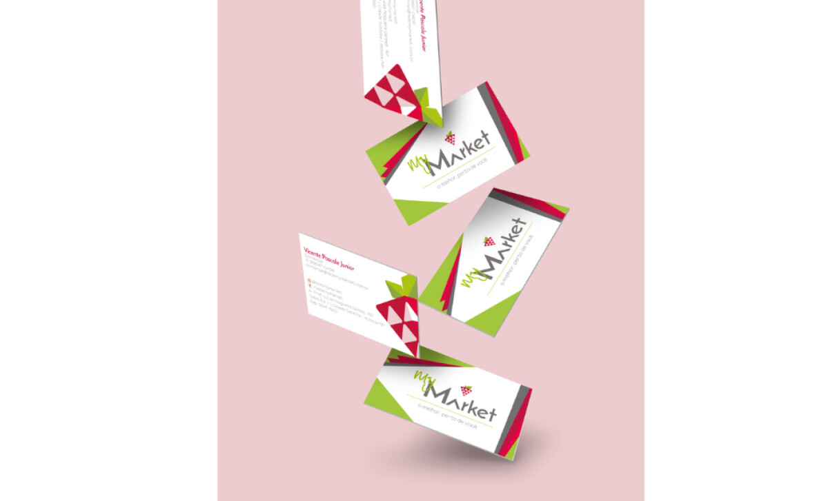
- Typography: I appreciate the use of clean, modern typefaces that balance clarity with personality. The green “My” script pairs well with the structured “Market,” adding both warmth and professionalism.
- Layout: The folder, flyers, and business cards use geometric balance and space effectively. The consistent diagonal cuts give each piece a dynamic, modern look.
- Imagery: The strawberry symbol reimagined with triangular shapes is both playful and memorable. It ties directly to Atibaia’s identity while working as a versatile retail logo.
- Production Quality: The contrast of matte backgrounds with vibrant red and green accents suggests durability and polish, which can elevate credibility in print applications.
Get connected with the right print design agency for your project.
GET STARTED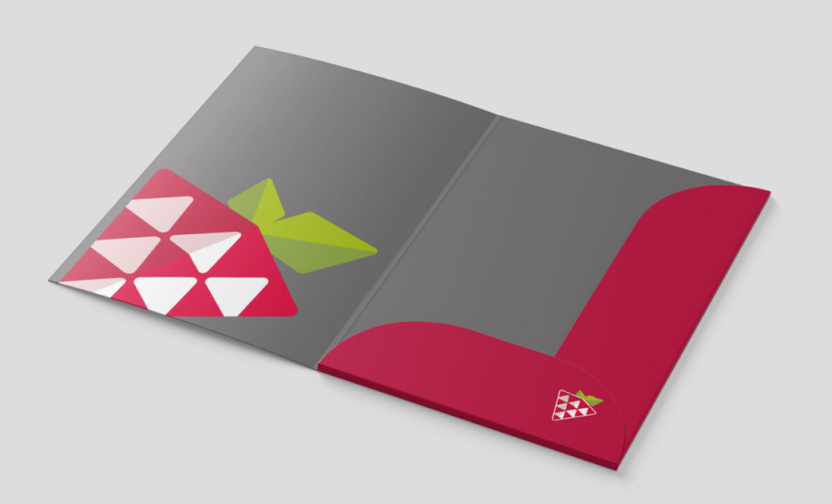
About DesignRush Featured Designs
At DesignRush, we review hundreds of agency projects every month. The featured works stand out for their creativity, execution, and ability to capture brand values in design.
The most impactful projects are later selected as Monthly Design Awards winners, a recognition of industry excellence.
Explore the best print designs in retail and beyond. You can also view:
- Best Print Designs
- Best Website Designs
- Best App Designs
- Best Logo Designs
- Best Packaging Designs
- Best Video Designs
For a full list of design agencies and related services, see our Agency Directory.
Get a chance to become the next Design Awards winner.
SUBMIT YOUR DESIGN

