Pelican Shakespeare’s Book Cover Prints Bring Classics Into The 21st Century
Every few years, old classic novels get a facelift. These facelifts often include a complete redesign of the cover. You’ve definitely seen the same in bookstores. The literature you read in high school definitely looks different now thanks to a new book cover design.
Penguin books launched a similar endeavor when they decided to redesign their Pelican Shakespeare series.
The previous book covers were outdated and unoriginal, so the team at Penguin Books enlisted the help of artist and designer Manuja Waldia to help give the series a fresh and modern new look that would help them stand out on the shelves.
The brand wanted a cool, stylish new cover design for these classics, and they got exactly what they came for:
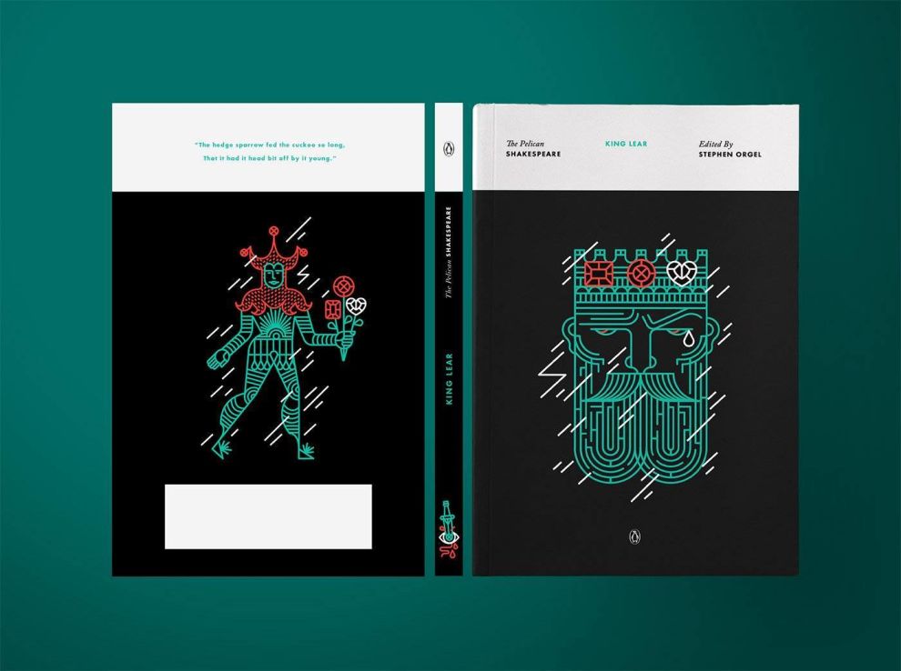
A total of 40 books, the series is ongoing and art directed by Paul Buckley. We used a modern linear and geometric style to approach these classics in a contemporary manner, categorized as Tragedies (black), Comedies (light blue) and Histories (maroon). The series won a Gold Medal at the SOI Annual Exhibition (Book category).Waldia took a series of plays with content that has stood the test of time and created a book cover print design that holds a similar prestige and excellence. These designs are modern, exciting and minimal. They’re clean, bright and bold.
They definitely add another layer to Shakespeare’s works of art that immediately pull readers in — new and old alike.

Pelican Shakespeare’s Modern Print Designs Add Character With Geometric Illustrations
You might think that Shakespeare and his works are boring old classics that deserve to be kept on a tall shelf far away from view, but after looking at these enchanting and elaborate book covers, you’ll certainly change your mind.
A simple, plain background makes up the backdrop that lets these elaborate and imaginative illustrations take center stage.
Designer Manuja Waldia went with a colorful and geometric illustration for these book covers, taking the contents of the novel and using it to create a design that was inspiring, illustrative and subtle.
These designs add depth to the novel. They symbolize the contents within. They’re bright and bold and eye-catching. These designs and illustrations demand to be seen much like the novels themselves demand to be read.
There is, however, a simplicity to these designs. It’s not all intricate swoops and swirls. There’s an artistic and creative quality to these geometric patterns, but there is also an edge of minimalism. These are all outlines, after all. They aren’t filled in images. This creates a depthful effect that pulls readers in for more.
You can almost feel these designs, which in turn causes you to quite literally reach out and grab them.
The Pelican Shakespeare Book Covers Tie The Series Together With A Common Theme
Shakespeare was known to include a lot of connected elements throughout his works, and similarly, these designs are tied together with subtle design elements.
These book covers all include geometric illustrations that give a subtle nod to the content of the plays within. Another element that ties these covers together is the background coloring. Depending on the genre, the book will get a different background color.
Tragedies get a black background, comedies get a light blue background and histories get a maroon background. Each also includes a white bar at the top of the book which is where the title, author and publication is typed out.
This color theme works as a little bow that wraps up these designs in a simple, minimal way. They add elegance and cleanliness to the design that softens it. And there’s modernity in the subtle and sophisticated choice made by the designers.
Color adds depth and personality when it comes to these designs that work as the perfect backdrop to let these illustrations, and the content of the book itself, shine.

The Pelican Shakespeare Print Designs Get A Modern-Day Facelift
Say goodbye to the dusty, outdated book cover designs of the past and say hello to these modern, exciting and refreshing print designs that add depth and personality to these centuries-old classics.
These Shakespearean classic get a modern refresh with their simple, clean backgrounds, colorful, geometric illustrations and simple typography.
These prints take minimalist design trends to heart, creating a cover that is simultaneously in your face and subdued.
Each play is tied together by a background color theme. Comedies are wrapped in a light blue background. Tragedies are wrapped in a black background. Histories are wrapped in a maroon background.
This subtle effect is engaging. It adds a cohesiveness overall that ties these designs and these pieces of literature together.
In addition to this theme, the geometric illustrations that sit at the center of these designs are eye-catching and creative. They give a subtle nod to the content contained within without being overly complicated or abstract.
This simplicity is further emphasized by the tiny, simple text that sits at the top of the design.
These modern, funky and minimal book cover print designs send a strong and seductive message — Shakespeare never gets old.