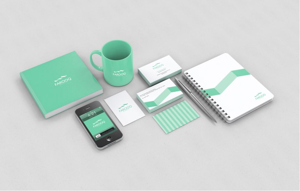
When The Memon Welfare & Education Society founded the Farooq Academy for the girls of their community, they hired Mumbai based creative agency ZWA! to design a brand identity for it. It resulted in a simplistic yet powerful print design that was representative of what farooq Academy stood for.
The logo is an aqua-green and white three dimensional letter “F”, for Farooq Academy. It takes inspiration from the element of excellence and the freedom of thought, both representative of education.
The logo also resembles a flying bird figure, symbolising both freedom as well the ability to achieve one’s goals through education. As a shape, it also resembles a book — again representative of knowledge. The text is also very pleasant to look at, not cluttering up the frame but still standing out clearly.

The visual focus immediately goes to the “F” logo, that is used in a vast range of visual materials at Farooq Academy, like stationery, cups, bags, brochures, as well as on the website.
The text of the logo is solid and bold, but not too heavy for the eye. It uses two basic colors, both evoking a sense of pride and belonging. Aesthetically designed on the aqua background, a predominantly white logo is used, while on the white background, aqua manages to catch the eye. Both the colors complement each other while also providing a nice contrast.

The shape in the design uses space effectively, without being too chaotic or overwhelming to the eye. The effect is a pleasing and clean visual, symmetrically aligned with each of the products it is featured on. It is evocative of learning and absorbing information without getting distracted.
Overall, the design is calm, doesn’t clutter up surfaces, and is visually very appealing to look at. The color scheme, shapes, and textures used together combine to form a symbiotic appearance.
Farooq Academy is a stand-out print design in the Education industry.


