Standout Features:
- Dynamic typographic layering
- Vivid gradient color scheme
- Innovative use of minimalist design
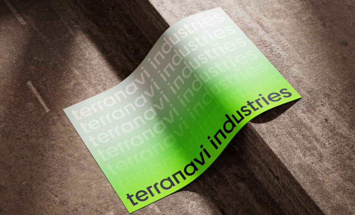
Terranavi Industries required a print design that spoke to its modern, professional identity. Kattch delivered an aesthetic that is both sophisticated and industrially inspired. The design choices — from layered type to vibrant gradients — work in concert to project an image that sets the brand apart in its service sector. The design features dynamic typographic layering, with "terranavi industries" repeated in varying opacities from a sharp black to a soft white. This technique creates a visual rhythm and depth. The evolving opacity also helps in capturing attention, lending an almost futuristic quality that complements Terranavi's modern image.
There's also a vivid gradient color scheme, transitioning from bold, bright green at the bottom to a soft white near the top. This striking choice gives the piece a contemporary, almost digital feel. The green aligns with forward-thinking industries, while the gradient enhances text legibility and subtly guides the eye.
Minimalism in design is often associated with modernity. The simplicity of the layout — just the brand name, repeated — allows the audience to remember the brand. It also adds a sense of professionalism, making the design feel clean and polished.
Kattch's design for Terranavi Industries successfully delivers that modern impact. It’s a prime example for other professional services print design that shows how bold typography and contemporary color can forge a memorable and forward-thinking brand statement.