Team Behind the Design
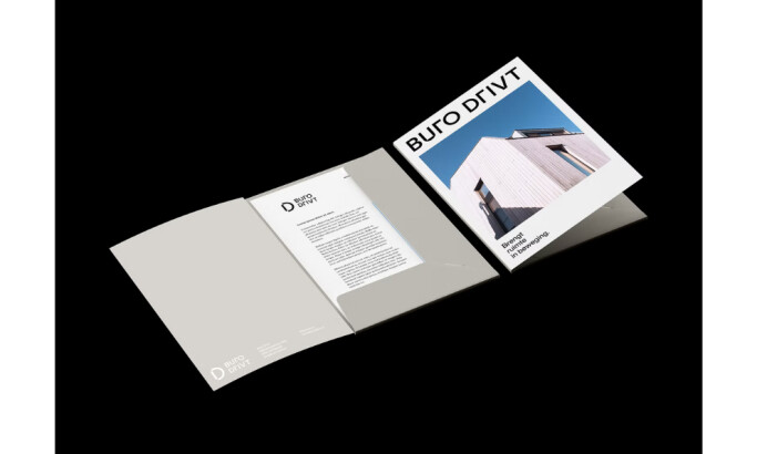
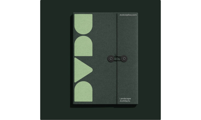
Print Design Analysis
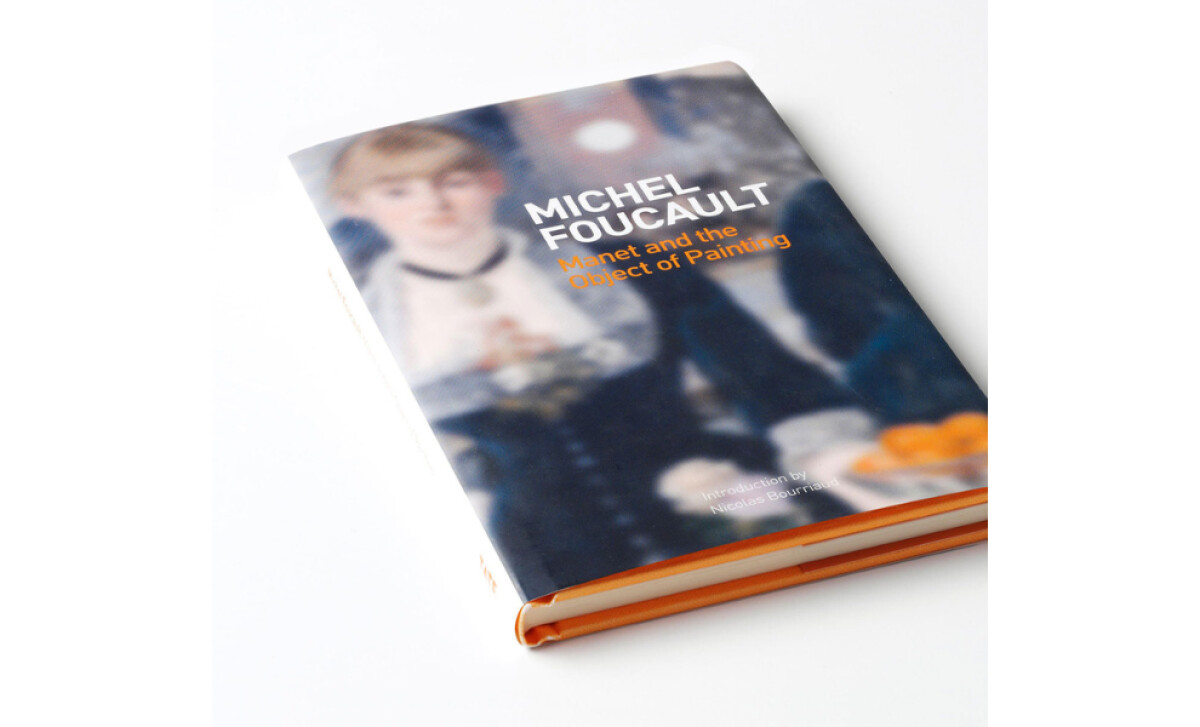
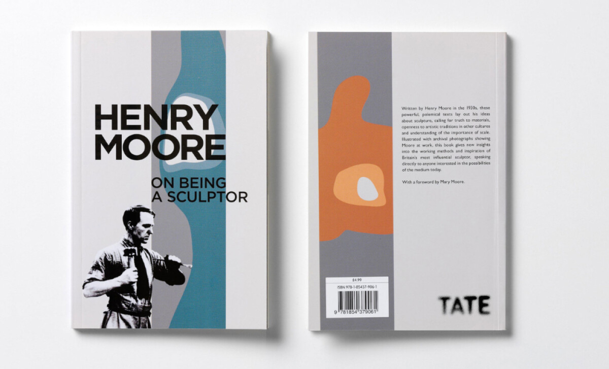
I see book cover design as more than surface appeal. It sets expectations for the content inside while shaping how a reader connects with the work.
Chalk’s covers for Tate achieve this with restraint and confidence.
- Typography: The fonts are modern and unforced. They frame each subject with clarity while keeping the titles approachable.
- Layout: The compositions feel intentional. Text and imagery sit together in a way that directs attention without clutter.
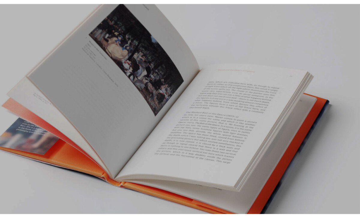
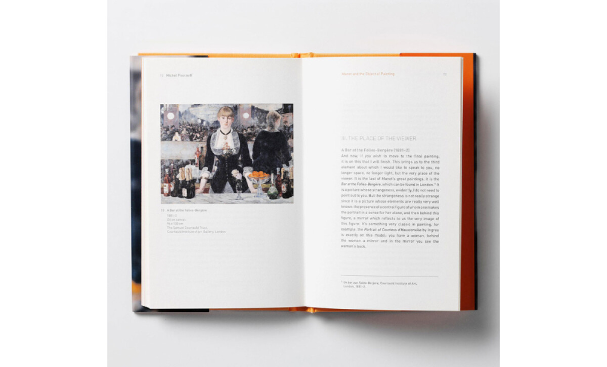
- Imagery: Archival photos and artworks are presented with care. They anchor each book visually and create an immediate point of interest.
- Production Quality: Materials and binding choices give the books a weight that feels fitting for Tate. The result is a physical object that reflects the institution’s standards.
What Brands & Agencies Can Learn from Tate
Tate’s book covers show how design can honor art history while presenting publications with authority and care.
1. Let Typography Carry Authority
Choose fonts that feel confident and modern, framing the subject with clarity while keeping the tone approachable for a wide readership.
2. Keep Layouts Balanced and Deliberate
Arrange text and imagery so they work together without distraction, giving artworks space to stand out and ensuring the hierarchy is easy to follow.
3. Treat Production as Part of the Message
Select materials and finishes that reflect quality, from binding to paper choice, so the books feel as enduring as the institution they represent.
About DesignRush Featured Designs
At DesignRush, we review hundreds of agency projects every month. The featured designs are among the most striking, standing out for creativity, execution, and relevance.
The strongest entries are later selected as our Monthly Design Awards winners, marking them as industry benchmarks.
Discover standout projects across industries:
- Best Print Designs
- Best Website Designs
- Best App Designs
- Best Logo Designs
- Best Packaging Designs
- Best Video Designs
For a full list of design agencies and related services, visit our Agency Directory.