TYPOGRAPHY IS DESIGN Challenges Norms by Introducing Disruptive Glitch Aesthetics
The TYPOGRAPHY IS DESIGN exhibition celebrates revolutionary designers and their postmodern approach to typography. Its visually disruptive print designs by Sophia Presley challenge norms.
One of the designs featured in the exhibition embraces the chaotic beauty of digital glitches, with jumbled and spliced letters creating an unexpected yet legible aesthetic.
This deliberate embrace of imperfection challenges the viewer's expectations, forcing them to engage with the text in a new and exciting way.
The design's unpolished style aligns with the exhibition's theme of questioning traditional graphic design principles, inviting viewers to appreciate the unfiltered nature of creativity.

The Print Design Transforms Typography Into Visual Narratives Through Linear Patterns
The second print design featured in the TYPOGRAPHY IS DESIGN exhibition merges typography with linear patterns, creating a visual narrative that speaks to the power of integrated design.
Top-notch print designers have expertly woven the exhibition's title into parallel lines, stretching and distorting letters to become part of the pattern.
Lines, often representing structure and continuity, become a dynamic canvas for text, evoking movement and rhythm. The result is a harmonious blend of typography and visual art, where text and design merge into a seamless expression of the exhibition's theme.
Explore some of the most impactful print designs to get inspired.

Striking Typography and Monochromatic Themes Amplify the Design's Impact Across Exhibition Materials
The print designs for the TYPOGRAPHY IS DESIGN exhibition maximize visual impact through bold typography and a striking monochromatic color palette.
Stellar print designs in black and white adorn posters, tickets, advertisements, and merchandise, creating a unified and instantly recognizable visual identity.
This design choice emphasizes the graphic nature of the typography. This move amplifies the exhibition's message with drama and urgency while ensuring seamless integration across various materials.
Understand the power of choosing the right brand colors.

TYPOGRAPHY IS DESIGN Features a Bold Interpretation of Unconventional Aesthetics
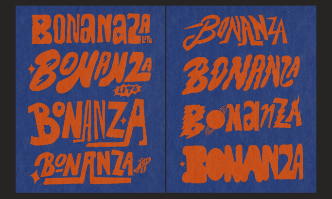
TYPOGRAPHY IS DESIGN showcases a bold interpretation of unconventional aesthetics, demonstrating how spontaneous, chaotic, and unpolished styles can create a cohesive narrative.
The showcased print designs celebrate the distinct approaches of modern artistic designers. This challenges viewers to expand their understanding of typography as an expressive art form.
The exhibition invites viewers to appreciate the depth and complexity of typography by embracing imperfection and celebrating the raw energy of unconventional forms.
All in all, TYPOGRAPHY IS DESIGN is a very worthy Best Print Design Award winner.


