-details-webp.webp)
Choosing a font can feel like a minor detail, but it's one of the most critical decisions in design. The right typeface communicates a brand's personality before a single word is read, while the wrong one can undermine the entire message.
This year’s most popular fonts combine modern aesthetics with high functionality, making them essential tools for designers. From clean sans-serifs to expressive scripts, these 15 trending typefaces are dominating branding, web, and editorial design in 2026.
The Most Popular Fonts: Key Points
- 51% of all designers make legibility their number one priority when selecting a font. If people can't read it, the design fails.
- For on-screen reading, clean and modern sans-serif fonts are the go-to choice, making up 61% of fonts used on websites today.
- A huge 85% of designers agree that choosing a distinctive font is critical for building a memorable brand identity.
Most-Used Fonts in 2026: Visualizing Design Preferences
Font trends reveal more than style. They reflect what resonates with audiences and where designers are placing their trust in today’s digital landscape. Here's a visual representation of what web designers are going for this year.
Here’s a closer look at the fonts leading today’s design choices and how each serves specific branding and communication goals.
1. Arial: Best for Universal Readability
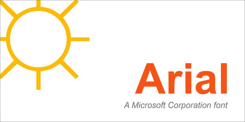
The most popular font in 2025 is Arial, found on 23% of all websites. Its dominance comes from being a default system font on countless computers for decades.
Arial is a neo-grotesque sans-serif, but it’s softer and more rounded than its famous predecessor, Helvetica. You can see this in the angled cuts on the terminals of letters like ‘t’ and ‘e’, which give it a less rigid, more approachable feel.
Because it is everywhere, Arial guarantees a consistent reading experience for nearly any user on any device. This makes it a practical and safe choice for body copy in presentations, internal documents, and web content where clarity is the absolute priority.
However, its ubiquity is also its biggest weakness; using Arial for branding can make a company appear generic and less intentional with its design choices.
2. Helvetica: Best for Timeless Corporate Identity
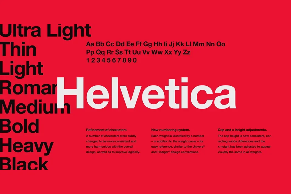
Another very popular font, and perhaps the most famous of the 20th century, is Helvetica. It’s the second most-used font on the web, at 21%, and its clean, neutral look has made it a favorite for corporate branding for over 60 years.
Just look at the logos for Jeep, Panasonic, or The North Face. The design is a masterclass in functional modernism. It features a tall x-height for readability and uniquely tight spacing between letters, creating solid, impactful blocks of text.
Helvetica’s power is in its neutrality. It doesn't inject much personality, which allows the message itself to take center stage. This makes it perfect for projects that require a tone of authority, efficiency, and universal clarity, like public signage, user interfaces, and corporate style guides.
See how the Ambiq website leverages this font for a clean, modern design.
3. Roboto: Best for Digital-First Design
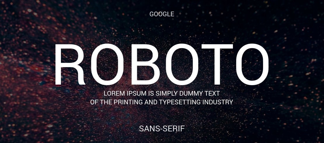
The third most popular font on the web, used on 8% of sites, is Roboto. Created by Google specifically for its Android operating system, Roboto was born for the screen. It is a neo-grotesque sans-serif, but with a twist.
It has a dual nature, blending the rigid, geometric forms of fonts like Futura with the friendly, open curves of more humanist designs. You can see this in the way a perfect circle forms the 'o' while the 'R' has a more traditional, gentle curve.
This balance makes Roboto incredibly versatile. It’s serious enough for a corporate UI but friendly enough for a consumer-facing app. Its primary strength is its exceptional clarity on high-resolution digital displays of all sizes, from smartwatches to giant monitors.
Use Roboto when you need a font that feels modern, approachable, and, above all, effortlessly readable on a screen.
Check out the BrandFoundry Ventures logo to see how Roboto creates a modern and approachable feel.
4. Montserrat: Best for Modern Corporate Branding
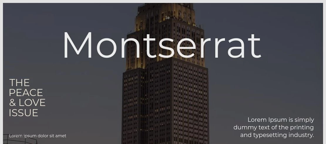
For businesses aiming for a clean and contemporary voice, one of the most popular font choices is Montserrat. Drawn from the urban typography of old Buenos Aires posters, its geometric forms are balanced with subtle optical adjustments that make it highly legible on screens.
The letters are wide and have a generous x-height, giving them a friendly but stable appearance. Decision-makers choose Montserrat because it projects confidence without feeling stuffy, making it a workhorse for tech companies, design agencies, and any brand that wants to appear both professional and approachable.
Explore the OXO app design to see how Montserrat provides a professional and approachable user interface.
5. ITC Garamond: Best for Elegant, High-End Displays
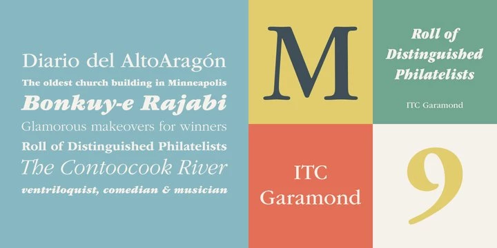
When a brand needs to communicate timeless authority, ITC Garamond is a popular font that designers turn to. This is a modern interpretation of a classic, redesigned with a taller x-height and wider proportions that give it a more assertive and luxurious presence.
Its sharp serifs and noticeable contrast between thick and thin strokes demand attention. You see this in high-end branding and editorial layouts where the goal is to create a sense of prestige and refinement. For a business in law, finance, or luxury goods, using ITC Garamond signals a foundation of history and quality.
6. Lobster: Best for Playful, Bold Branding
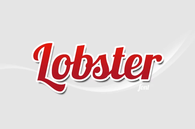
Another popular font, especially for brands with a bold and friendly personality, is Lobster. This script is anything but delicate; its thick, uniform strokes and expressive ligatures make it incredibly readable for a handwritten style.
The letters connect in a fluid, natural way that feels energetic and approachable. A business owner might choose this free trending font for a food truck, a children's product, or a creative agency to instantly inject a sense of fun and personality. It’s a go-to for making a brand feel human and less corporate.
7. Neue Haas Grotesk: Best for Professional, Minimalist Designs

For designers who find Helvetica too sterile, Neue Haas Grotesk is a font popular for its warmer, more nuanced take on modernism. As the original design that Helvetica was based on, it has a cleaner and more elegant feel, with curves that are slightly more organic.
Its exceptional clarity and professional tone make it ideal for user interfaces and corporate branding where readability is paramount. Decision-makers appreciate it because it provides that classic, trustworthy feel while offering a subtle touch of design sophistication that sets it apart.
View the Verizon logo design to see an example of the font's professional tone and design sophistication.
8. Playfair Display: Best for Luxury Editorial and Branding
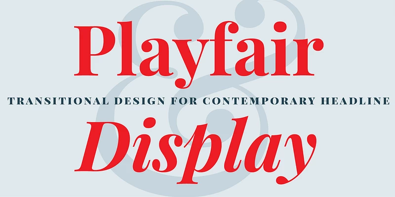
One of the most popular font for projects that require a touch of high-end drama is Playfair Display. Inspired by 18th-century typography, it features an extreme contrast between its delicate, hairline strokes and its thicker main strokes.
This design makes it incredibly striking in large sizes, which is why it’s a favorite for headlines in fashion magazines and on luxury brand websites.
Its ornate details and elegant structure communicate sophistication, making it the perfect choice for a business that wants to project an image of quality, tradition, and artistry.
9. Retail: Best for Nostalgic Product Design and Advertising
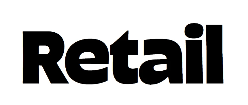
Retail is a popular font style that brilliantly captures the feeling of mid-century American branding. Its design is a balance of reliability and personality; the "Text" styles are restrained and highly readable for everyday use, while the "Display" styles are expressive and bold.
This duality makes it perfect for product packaging and advertising that want to evoke a sense of nostalgia while still feeling modern. A business might use Retail to launch a new line of organic snacks or a craft soda, leveraging its friendly, trustworthy vibe to connect with consumers.
10. Rustic: Best for Vintage-Inspired Projects
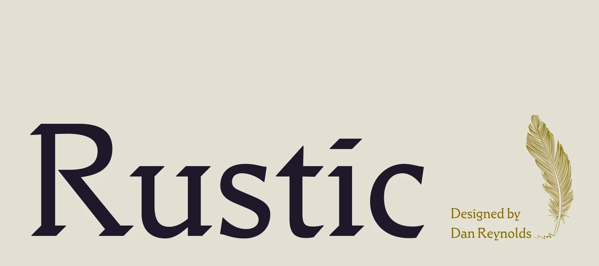
For projects that need a handcrafted, vintage quality, Rustic is a popular font that delivers authentic charm. Inspired by early 20th-century calligraphy, its letters have noticeable artifacts and a hand-drawn feel. With five weights and large capitals, it provides a classic look without sacrificing legibility.
This font is an excellent choice for a heritage brand, a craft distillery, or a farm-to-table restaurant. It helps a business tell a story of tradition and artisanal quality simply through its typography.
11. Lakeside: Best for Adding a Personal Touch
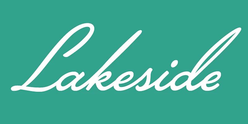
Lakeside is a handwritten script font popular for its ability to add a personal, human touch to a design. It’s not overly formal or delicate; instead, it mimics the flowing style of 1940s brush lettering, giving it a classic and confident feel.
The OpenType technology ensures that letters connect seamlessly, creating a truly authentic handwriting effect. Decision-makers might choose Lakeside for a signature logo, a high-end invitation, or a campaign that needs to feel intimate and direct, as if it were written just for the reader.
12. The Future: Best for Creating A Geometric, Modern Look
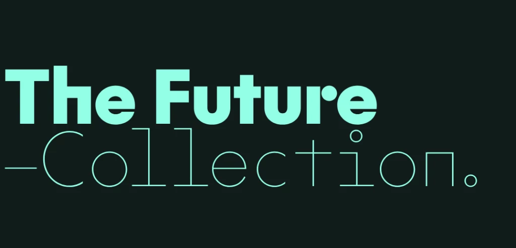
The Future is a popular font style that captures the clean, geometric precision of the Bauhaus movement. As a careful homage to the iconic Futura, its design is built on circles and straight lines, giving it a modernist and highly structured aesthetic.
It is exceptionally legible, communicating efficiency and forward-thinking. This makes it a favorite for architecture firms, tech companies, and any business that wants to project an image of intelligence and cutting-edge design.
13. NaN Serf: Best for Versatile, Multi-Channel Typography
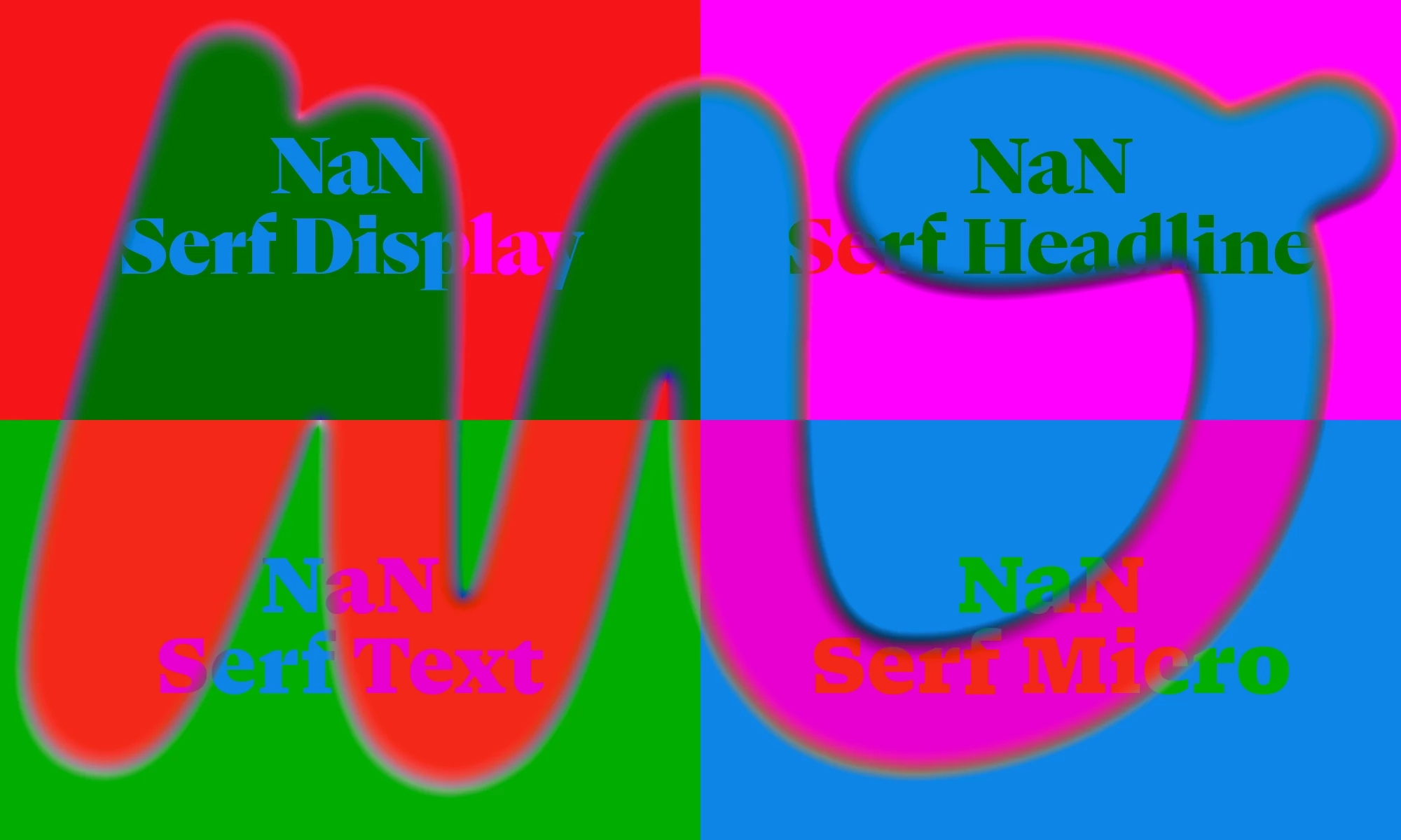
The most popular font for brands that need to work seamlessly across both print and digital is NaN Serf. It was designed for optimal performance at all sizes, from tiny micro-text on a screen to large headlines in a magazine.
Its design balances the warmth of a traditional serif with the clarity of modern geometric fonts. The open counters and sharp details ensure it stays readable on digital devices, a key consideration for any business today. Its versatility makes it a smart, long-term choice for a corporate identity system.
14. Alkaline: Best for Retro-Inspired Logos
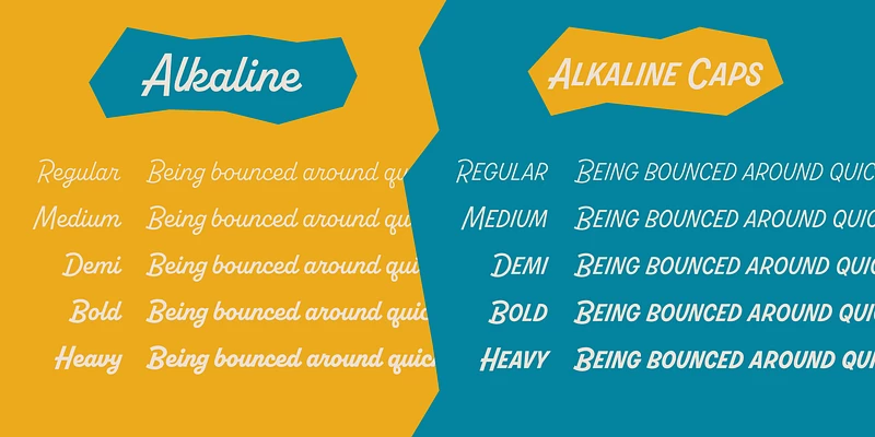
Alkaline has become a very popular font for logos, especially after its use in Dribbble's redesign. It's a retro-inspired script that feels both playful and sophisticated, drawing inspiration from the lettering on mid-century appliances. The all-caps version adds significant versatility.
What makes it so effective for branding is that it’s packed with personality without sacrificing function. With its dynamic 18° camber, it is one of the best fonts for logos because it effectively blends fun and practicality in equal measure.
For a creative agency or a consumer product that wants to feel fun, stylish, and a little nostalgic, Alkaline is a standout choice.
15. TT Autonomous Mono: Best for Tech-Inspired Design
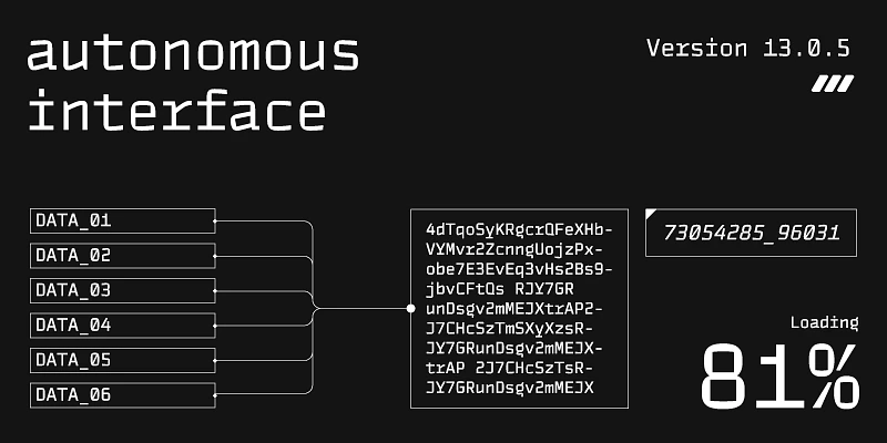
For designs that need a futuristic or tech-forward feel, TT Autonomous Mono is an increasingly popular font style. Unlike many fonts that just mimic a monospaced look, this is a genuine monospaced font, giving it exceptional clarity and a brutalist, industrial edge.
Influenced by the aesthetics of electric vehicles, it features square characters and angular internal spaces. As one of the best fonts for websites, a tech startup, a robotics company, or a design firm focused on digital products would use this font to communicate innovation and a bold, structured approach.
The Most Popular Fonts: Wrap-Up
When 82% of designers agree that typography is a top-three component of their work, it’s because it has this direct effect on brand perception. This list shows that choosing a font goes far beyond aesthetics. It’s a critical business decision.
Seeing Arial and Helvetica at the top of the usage charts proves that clarity and function are paramount, but their ubiquity also presents a strategic challenge: how do you stand out? The answer lies not in simply picking a font, but in understanding the job it needs to do.
The goal, then, isn’t just to use one of the most popular fonts; it’s to select the one that does the most work for your brand. By choosing with purpose, you ensure that every headline, every button, and every block of text is aligned with your business goals.


