Narcos: Mexico’s 30-Second Teaser Features a Stylized Presentation of the Show’s Title and Running Themes
Power. Crime. Corruption.
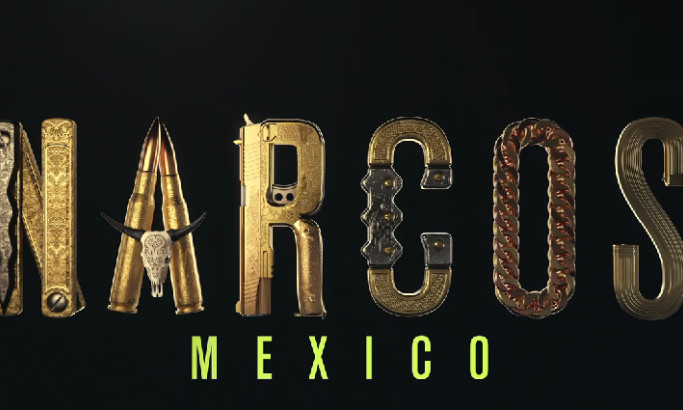
Narcos: Mexico, one of Netflix’s most well-received original shows, retells the country’s massive illegal drug trade that led to a bloody drug war.
To ignite the coming of its third and final season, Mondlicht Studios collaborated with Rhubarb Agency for this short yet eerily intriguing promotional video – a foretelling of the gruesome action waiting to unfold.
Clocking in at 30 seconds, the designers included many sufficient details without giving away too much of the story. Instead of flaunting the cast or scenes, they created stunning imagery focused on the show's title.
The agency took each letter of the word Narcos and embellished them with visual elements related to the story. Similar to how branding agencies use imagery and symbols to tell a story, this video is loaded with visuals that give foresight of what’s to come next season. Guns, knives, gold chains, skulls and bullets all decorated the letters, giving a solid tease of what to expect from the series finale.
Narcos: Mexico’s Teaser Video Highlights All the Little Details with Sharp, Close-Up Shots
As mentioned, the teaser video for Narcos relied on abstract 3D imagery to hint at what’s in store this season.
Such a design route can go both ways; the visuals can either confuse or leave viewers wanting more. With the video’s outcome, the latter prevailed.
The editors did a remarkable job showcasing all the letters’ stylized images. Each one had its moment in the spotlight, shot up close to reveal all the minute details. The close-up view did justice to the meticulous design, from luxurious embossed piping to gorgeous patterns.
Such keen attention to detail deserves all the praise!
And because of the video design, the letters became larger than life. This design technique is a testament that great animation can compensate for the lack of human elements.
Mondlicht Studios Sets the Mood for the Narcos: Mexico Series Through Strategic Lighting
Since crime dramas are dark and serious-themed, visuals for these shows usually follow. However, Narcos: Mexico video design turned a different path as it banks on “magical realism” to tell its tale. It’s not all about the darkness, after all.
To showcase such an aesthetic value, the video designers placed its imagery in a dark environment and added flare through their brave lighting work.
All the objects seen in the video are in gold and illuminated by a single fixed highlight. The lone spotlight and the tracking shot on the elements reveal the depths of each letter design.
It created that “shadowy” effect that professional video producers use to add drama and mystery to the entire sequence.
By the end of the video, we see all the letters lined up to form Narcos with light running across it for extra emphasis.
Narcos: Mexico Promo Video Uses Soft and Somber Music to Build Tension and Anticipation
Music alone is an effective means to tell a story, and it stays true to the Narcos: Mexico video teaser. The music used by the agency was enough to encapsulate the premise of the show.
A soft and mellow Latin American instrumental ensemble plays as the word Narcos comes into shape. The background music is dark and catastrophic yet romantic and playful. These music choices are the proper juxtaposition to the show’s violent and action-fueled environment.
Lastly, the soundtrack perfectly highlighted the show’s surrealist depiction of what many people consider one of the most ruthless drug wars in history.


