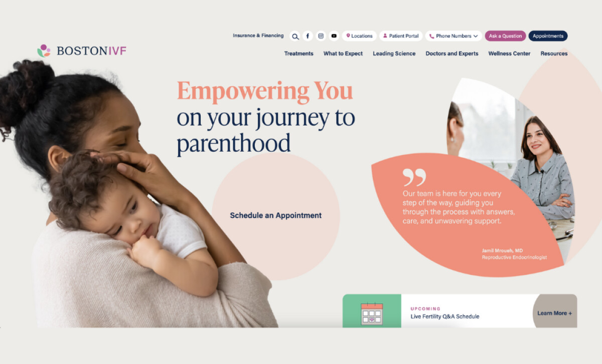
The Boston IVF website redesign is a compelling example of how thoughtful digital design can support sensitive healthcare journeys. Led by eDesign Interactive, the project transformed a complex, outdated site into a modern platform that reflects Boston IVF’s leadership in fertility care and its inclusive, compassionate approach to serving patients.
Key Insights for Brands
- Structured layouts simplify navigation and guide diverse user journeys
- Authentic healthcare visuals create an emotional connection and build trust
- A soft, inclusive color palette supports clarity and reduces anxiety
Structured Content Layouts Guide the Browsing Experience
Fertility care involves a wide range of emotional and logistical needs. Some visitors may arrive ready to schedule an appointment, while others are still beginning their research and looking for answers. The redesigned Boston IVF website supports these journeys clearly and compassionately without creating confusion or friction.
eDesign Interactive began by rethinking the site architecture from the ground up. Several fragmented pages were audited, consolidated, and reorganized into a purposeful, intuitive structure.
The new navigation system is no longer based on internal silos but instead reflects how real users think, search, and act. It guides them through step-by-step experiences tailored to their current needs, whether they're exploring fertility options, learning about insurance, or researching specific procedures.
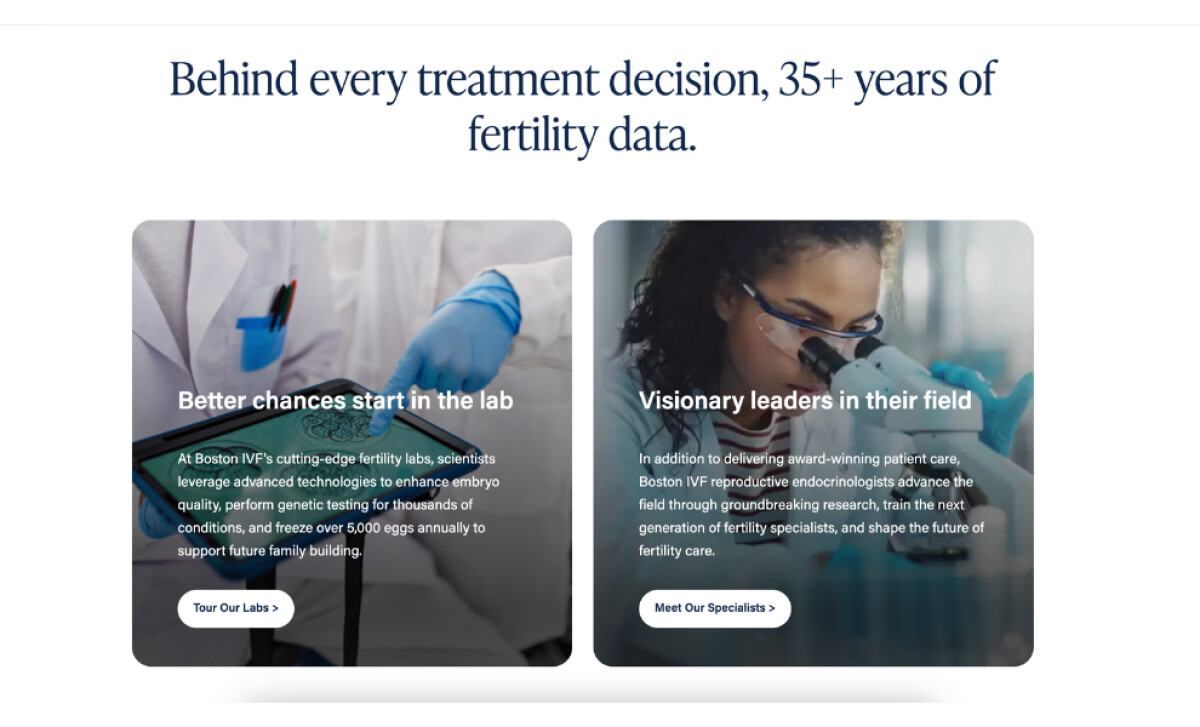
Strategic call-to-action buttons, such as “Tour Our Labs” and “Meet Our Specialists,” are placed perfectly. These elements are never overused or aggressive. Instead, they appear precisely when users are likely to have enough context to make a decision. This thoughtful flow builds trust and reduces drop-offs, supporting a smoother path from curiosity to conversion.
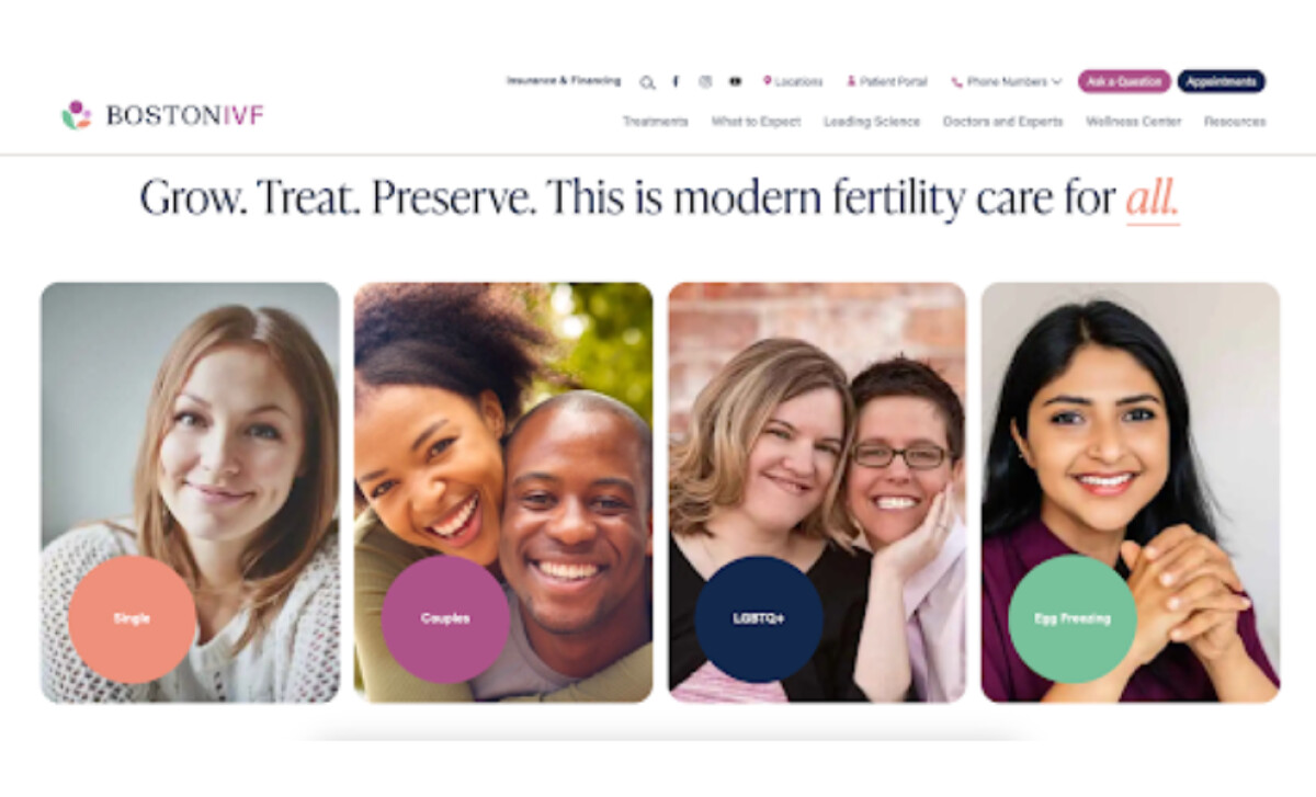
Warm Visual Storytelling Builds Trust and Credibility
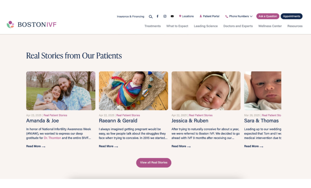
The website design puts people, not processes, at the center of the experience. This was a deliberate shift from the previous design, which leaned heavily on clinical content and institutional framing.
eDesign repositioned the entire site around stories, imagery, and visuals that reflect empathy, inclusivity, and support.
From the opening hero section to the dedicated patient stories hub, photography plays a big role. Visitors are introduced to real families, smiling couples, hopeful individuals, and the physicians who guide them through treatment. These visuals replace generic or overly clinical images with authentic emotion.
The result? A website that feels human, connected, and trustworthy from the very first scroll!
Every design element around these visuals is intentional. Generous white space allows the imagery to breathe, while a well-structured typographic hierarchy improves readability and rhythm.
Headings are bold but not aggressive. Body text is clean and consistent across mobile and desktop. Together, these choices create a site that feels both comforting and credible – two qualities that matter deeply in fertility care.
Check out the best fonts for websites.
Soft Colorful Accents Communicate Calmness and Care
Color was one of the most important elements in establishing the site’s emotional tone. The designers used a palette of soft apricot, muted hibiscus, calming navy, refreshing mint, and clean neutrals. This color system gives the site personality while maintaining accessibility.
Light backgrounds keep content readable and open, while darker accents anchor important sections like navigation and footer areas. Interactive elements also use consistent contrast to remain visible without feeling harsh.
These combinations translate into a gentle, supportive environment that helps patients feel more at ease. They also help build brand recognition, adding a visual signature that reflects Boston IVF’s values.
A Patient-Centered UI Boosts Engagement
This redesign proves that a good healthcare website can be both compassionate and conversion-focused. In the first eight days post-launch, Boston IVF saw:
- 59.5% increase in average engagement time
- 22.2% rise in page views per user
- 62.3% surge in Google organic impressions
These early results show that users are staying longer, exploring more content, and that strategic functionality improvements are driving measurable growth.
By combining structure, storytelling, and usability, eDesign Interactive created a platform that meets patients where they are and helps them move forward with confidence. It’s a powerful reminder of what’s possible when healthcare website designers prioritize clarity, empathy, and real-world impact.
More than just a visual upgrade, this is a patient-first platform that reflects the human side of care, making it a standout project that truly deserves spotlight.