Welcome the Bronx Charter School for the Arts, where a rich foundation in the arts is believed to be the key to social and academic success. Elementary aged children are given an education that revolves around daily theatrics, art, dance, and music.
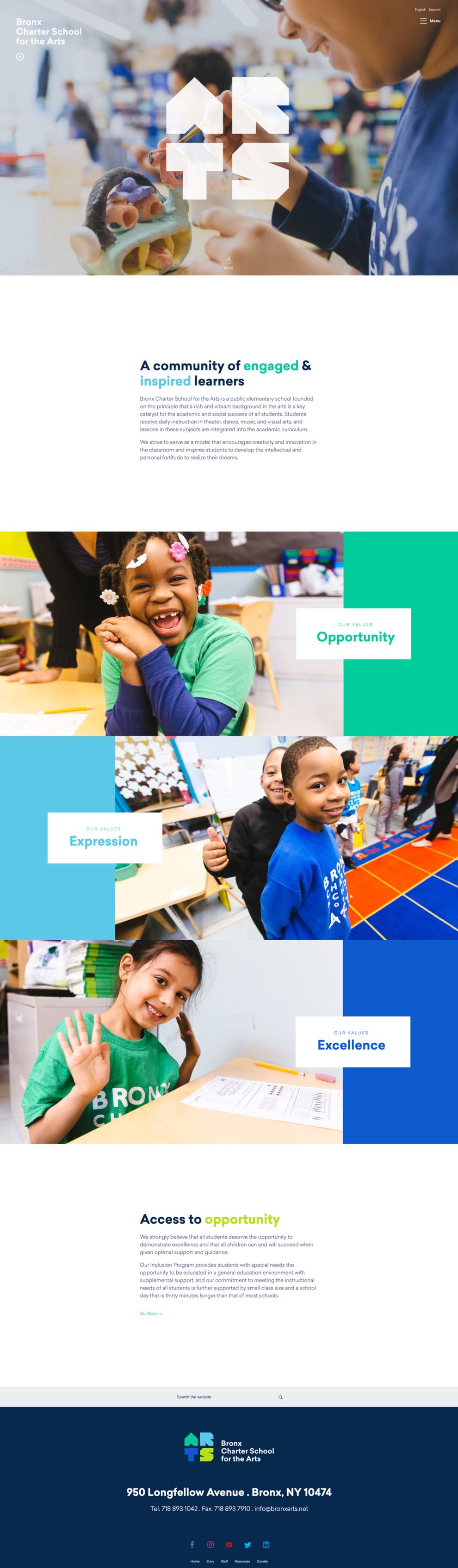
Creativity is the key to arts -- and Bronx Arts brings this concept alive as soon as you enter their website. The close-cropped image of a child engaging in a crafting project is accompanied by the word “arts” in a boxy and blocky white font. It’s enlarged and centered appearance makes the word impossible to miss and is a brilliant design choice to testify how the school aims to do things differently.
As you scroll away from this initial image, the white backdrop is complimented with shades of blues and greens in text boxes to bring some vibrancy to the page. These colors combine fantastically with the alternating photographs of children in class as Bronx Arts lists out the values they hold strong. The choice of colors pulls from the school’s logo design, but also creates a childish and playful feel to the entire page that works well for the school.
Why pick the Bronx Charter School for the Arts? Well, head on over to their story page and learn about what it is that the school is accomplishing.
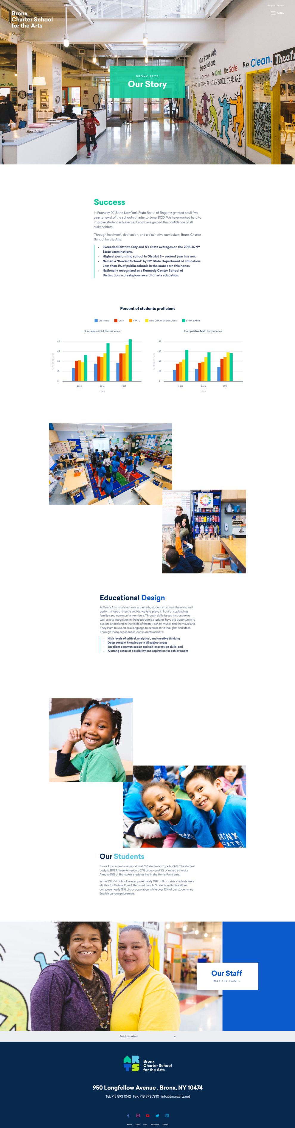
Bright primary colors stand out against the white background as you scroll through the extensive, but impressive stats on the school. These colors draw your attention to the charts that showcase the school’s performance compared to other schools, making it easy for you to see where the school stands.
These same colors complement the number of action photographs added, letting first hand see what the school looks like and staff doing what they do best. The combination choice between vivid colors and strong visuals makes it easy for you to go through the information presented and make sense of it.
Additionally, the page employs strong organizational tactics so that your transition between information is a smooth one. Each area relies on the same primary colors to announce the topic presented. It’s a smart way to make sure the information is having the best impact possible on you.
The Bronx Charter School for the Arts aims to be different and their website is a visual testament to just that. Playful colors add to the child-like atmosphere while making the user’s visit to the website a friendly one.
The Bronx Charter School for the Arts is a top website design in the Education and Arts & Recreation industries.


-preview.jpg)

