“Keeping it simple.” A simple statement on a simple background. Anyone looking to hire digital designer, Chris Biron, will immediately have a sense of the style he incorporates into his work. Right away the website creates an impression on the viewer with 3 words written clearly in black and white.
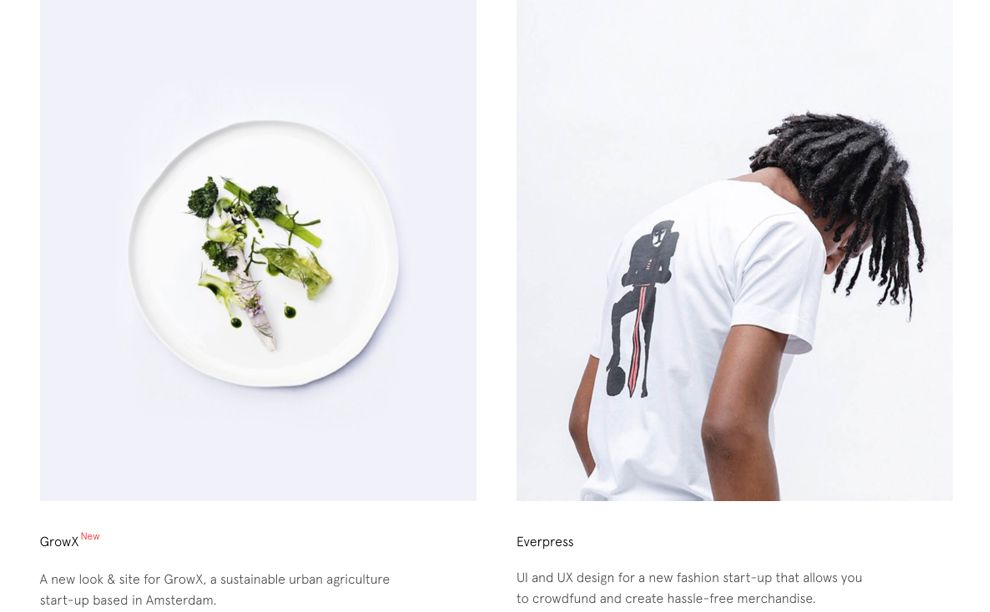
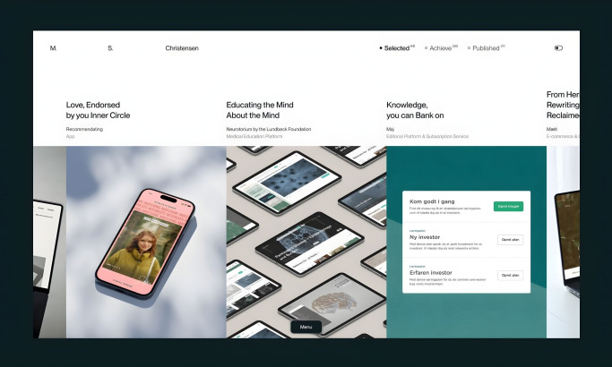
The simple layout continues through the portfolio pages which display only a single image and a small amount of text to introduce the project. The design work is front and center while the text takes a back seat. If you want to read a novel, this is not the website for you.
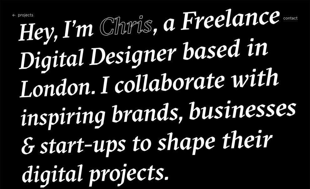
The “About” page flips the color scheme on its head. We go from black and white to white and black. The colors and typography are the same but the change feels like a massive shift in design. Again, Chris Biron has shown what can be accomplished by “keeping it simple.”
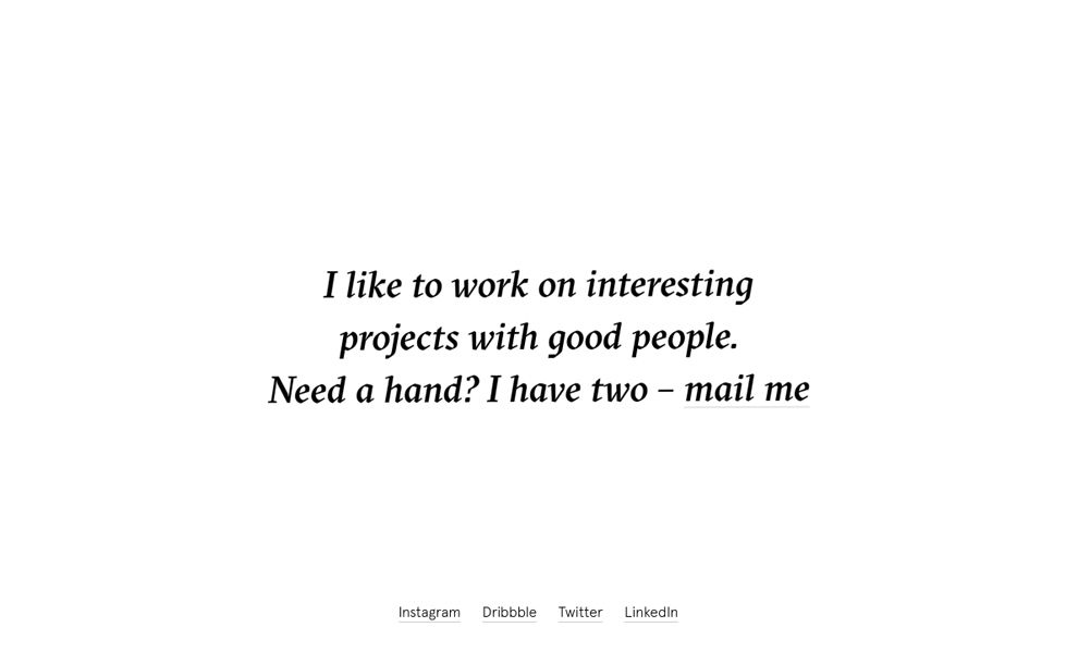
The website concludes as it began: quite simply. Black text on a white background with a quick statement and a contact link.
This portfolio site feels very bold and confident. The designer is essentially saying, “You either love my work or you don’t. If you love it, let’s work together.” There is no song and dance, no complex animations meant to make us gasp, and no desperate attempt to seem “different.” Sometimes the best thing a designer can do is let the work speak for itself rather than try to upstage everyone else. As they say, “Keep it simple.”
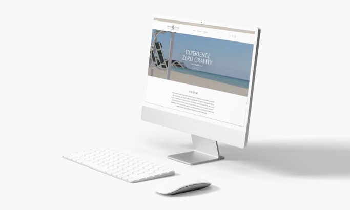
Chris Biron is a clean website design in the Professional Services and Technology industries.