Team Behind the Design
CloseWise is a SaaS platform built to connect notaries, signing services, and title & escrow companies through streamlined scheduling, workflow automation, and business management.
To elevate the product’s clarity and credibility, Storm Brain redesigned the website with a refined visual system and conversion-focused layouts that make its features, benefits, and value proposition immediately understandable.
Website Design Analysis

A successful SaaS website must translate complex workflows into interfaces that feel simple and reliable.
CloseWise’s redesign leans on clarity, structure, and visual consistency to help busy professionals understand product value within seconds.
- Branding & Storytelling: The blue gradient system gives the brand a clear anchor, and I like how the cyan-to-indigo shift feels energetic without losing a sense of reliability. It fits well for software that handles sensitive documentation. The messaging stays tight and benefit-led, which makes the platform’s value easy to understand at a glance.
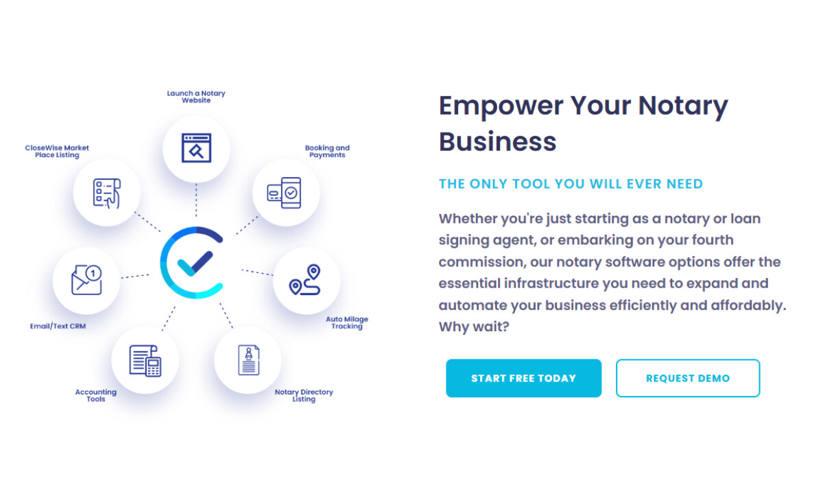
- Visual Design & UI: The geometric typography stays crisp and readable, which I always appreciate in SaaS design. Icons and circular elements soften the interface in a way that makes the tools feel less intimidating. With rounded cards, soft shadows, and steady spacing, the UI lands in a place that feels modern and approachable.
- UX & Layout Structure: The modular grid guides you through features, benefits, and pricing at a steady pace. I like how the hierarchy stays clear and the white space gives everything room to breathe — both technical and non-technical users can move through the content comfortably.
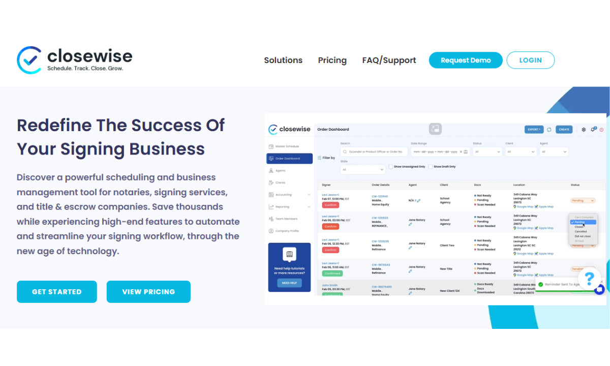
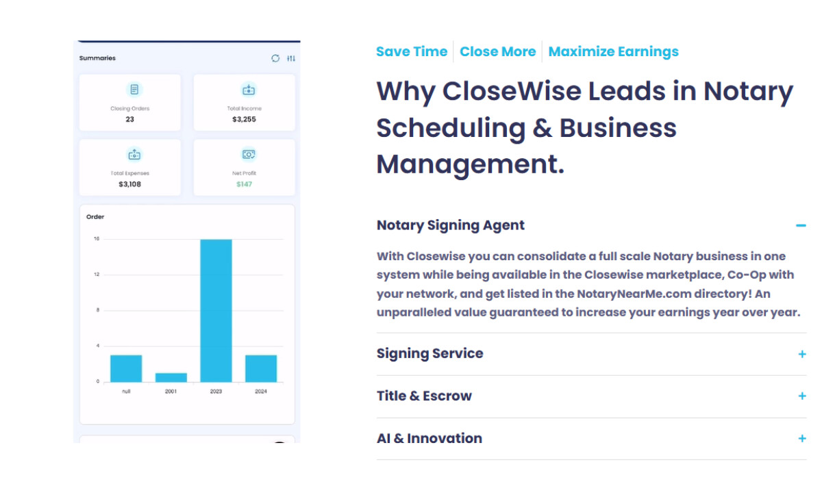
- Product Presentation: Authentic product screenshots, coherent color mapping, and light-shaded dashboard cards create an interface that feels trustworthy and credible. These elements often reduce hesitation for first-time SaaS evaluators and support conversion-oriented browsing.
What Brands & Agencies Can Learn from CloseWise
-desktop.jpg)
CloseWise’s redesign shows how SaaS platforms can present complex workflows in a way that feels direct and confident. It’s a strong example of turning dense software into a smooth, conversion-ready experience.
1. Use color deliberately to guide trust and action
The cyan-to-navy gradient does more than set a mood; it draws attention toward CTAs and key benefits. Intentional color placement helps users move through the interface without friction.
2. Let structure lighten cognitive load
A steady grid, clear headings, and open spacing make dense information easier to process. This approach works especially well for long feature sets and pricing tiers, giving users a clear path through complex content.
3. Pair straightforward marketing with real product visuals
Authentic dashboards build confidence faster than polished mockups. Showing the actual interface helps users understand workflow clarity and overall efficiency before booking a demo.
About DesignRush Featured Designs
At DesignRush, we review hundreds of agency projects each month.The featured selections represent standout digital execution, clarity, and creativity across web, product, and brand experiences.
The strongest of these advance to our Monthly Design Awards, highlighting excellence across global industries.
See more creative projects across categories:
- Best Website Designs
- Best App Designs
- Best Logo Designs
- Best Print Designs
- Best Packaging Designs
- Best Video Designs
For a full list of design agencies and related services, see our Agency Directory.


