Team Behind the Design
Website Design Analysis
Evaluating a professional services website means looking at how well it communicates value to busy, goal-oriented users.
Coworking Connection’s digital presence delivers a streamlined experience that highlights flexibility, amenities, and locations while keeping the path to conversion clear.
- Navigation & Information Structure: I appreciate how the navigation immediately surfaces coworking, offices, meeting rooms, and virtual mailboxes without unnecessary depth. Location-based paths for Murrieta and Temecula support faster decisions and reduce friction for first-time visitors.
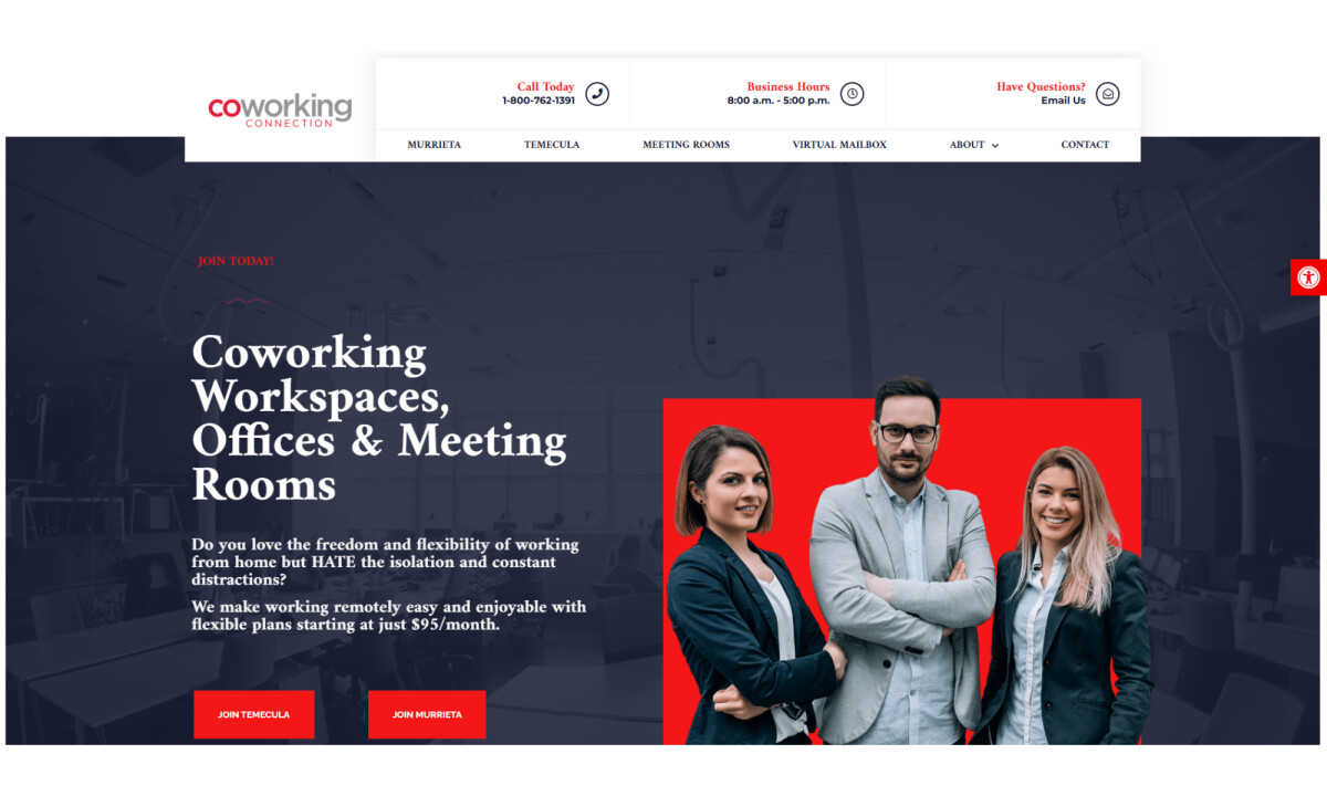
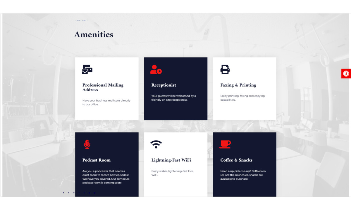
- Visual System & Brand Presence: The dark blue foundation paired with bold red accents establishes hierarchy and draws attention to primary calls to action. I find that the use of real people and active workspace imagery reinforces credibility and approachability.
- Motion & Scroll Interaction: Subtle motion is layered throughout the site to create a refined, modern experience. I notice smooth entrance animations and gentle scroll-based shifts that add depth while keeping the interface easy to read.
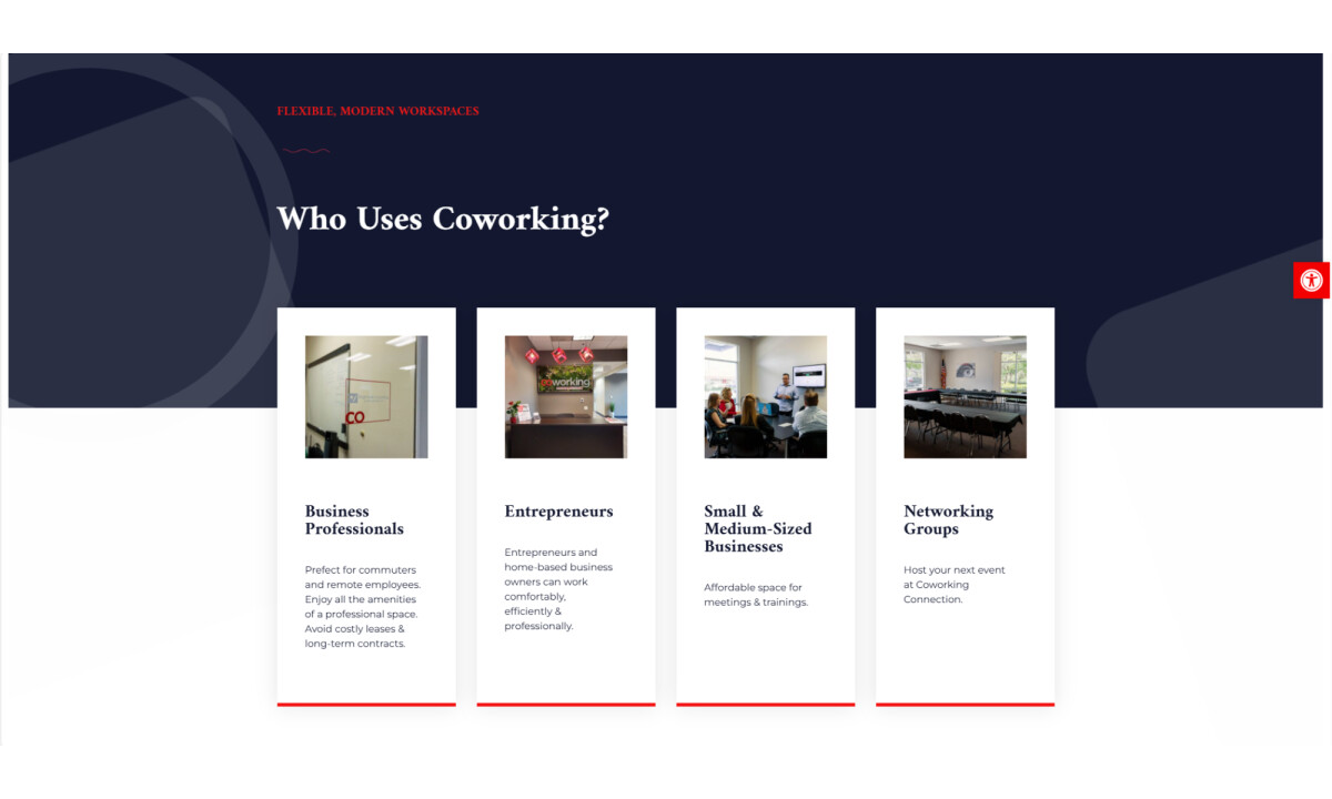
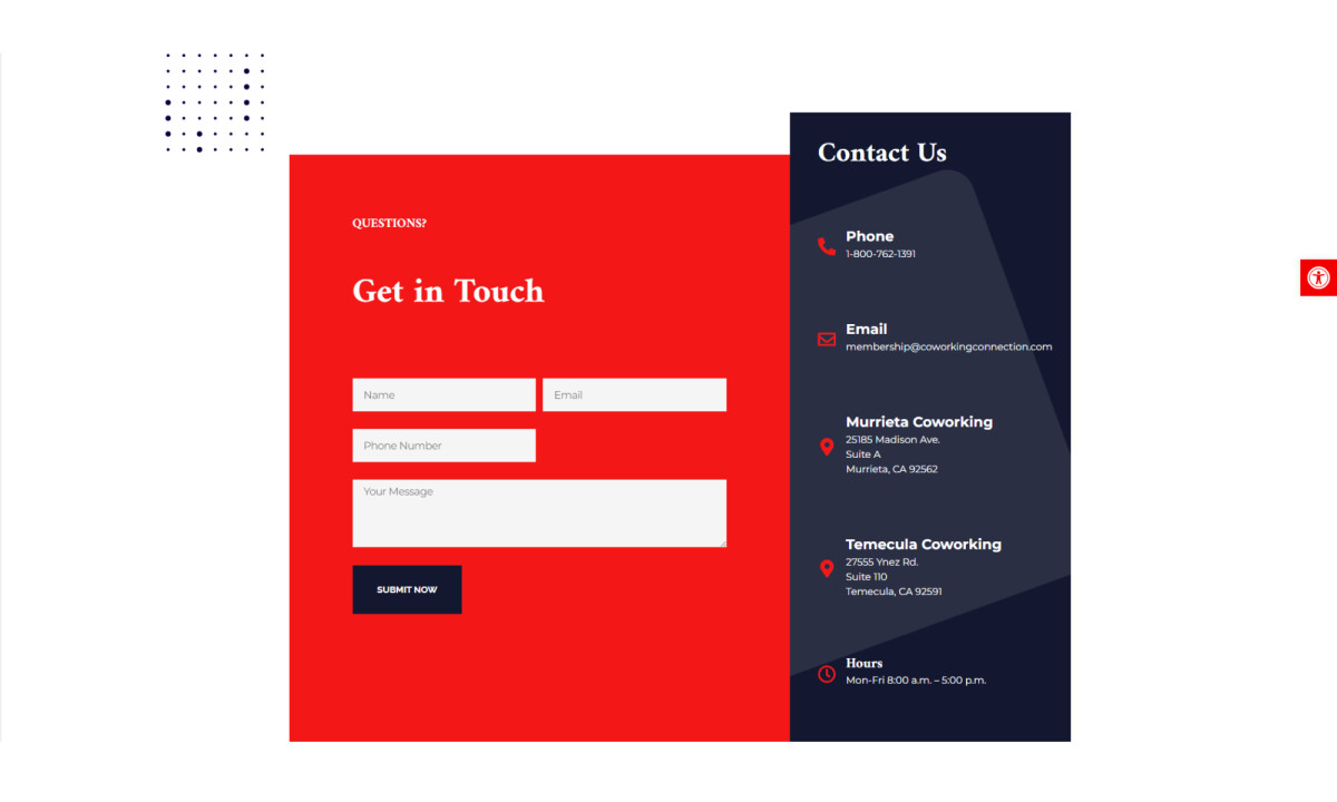
- Content Presentation & Conversion Focus: Content is organized into scannable sections that clearly communicate who the space is for and how it can be used. I like how forms, free trials, and RSVP prompts are placed naturally within the flow rather than feeling forced.
What Brands & Designers Can Learn from Coworking Connection
Here are three key lessons from the Coworking Connection website design:
1. Make Location-Based Decisions Effortless
Clear navigation paths for Murrieta and Temecula help users quickly find relevant workspace options. Reducing choice friction is essential for service businesses tied to physical locations.
2. Balance Professionalism with Approachability
A strong color system paired with real, active workspace imagery builds trust without feeling corporate or cold. Showing people using the space makes the offering feel tangible and welcoming.
3. Design Conversion into the Content Flow
Forms, trials, and RSVP prompts are integrated naturally within scannable sections. When calls to action feel like part of the journey, users are more likely to engage.
About DesignRush Featured Designs
At DesignRush, we review hundreds of agency projects each month. The featured designs stand out for creativity, relevance, and execution.
Only the most compelling work progresses to our Monthly Design Awards, recognizing excellence across the industry.
See more creative projects across categories:
- Best Website Designs
- Best App Designs
- Best Logo Designs
- Best Print Designs
- Best Packaging Designs
- Best Video Designs
For a full list of design agencies and related services, see our Agency Directory.


