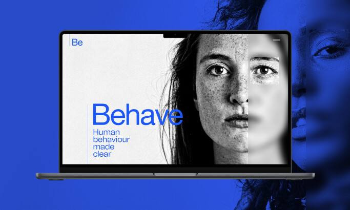
As designers that loved working in the Web 2.0 era, it was kind of hard to adjust to the new tendencies of minimalist design. After spending years perfecting the wet floor effects, and the beveled look of icons... and we were supposed to just forget about it? But 10 years later, we are here to say that we have finally come to love simplicity in website design.
Stripping itself down of all the necessary flares and glows, this digital agency (or should I say "this art director"?) presents itself as a team leader capable of doing, well, everything digital related.
The name is very interesting. Stating that they "ain't plastic," they placed a huge gem in the banner area of the website, setting themselves apart from the other agencies. The website is definitely different: minimal, black and white, with simple type and content presentation. They do use, though, animation on the section titles and icons, adding a little fun to a very simple website.
Plus, be sure to check out their "Work" section and enjoy the way they present their portfolio. Not completely new, but very well done.
We Ain't Plastic is a clean website design in the Professional Services industry.
-preview.jpg)