Team Behind the Design
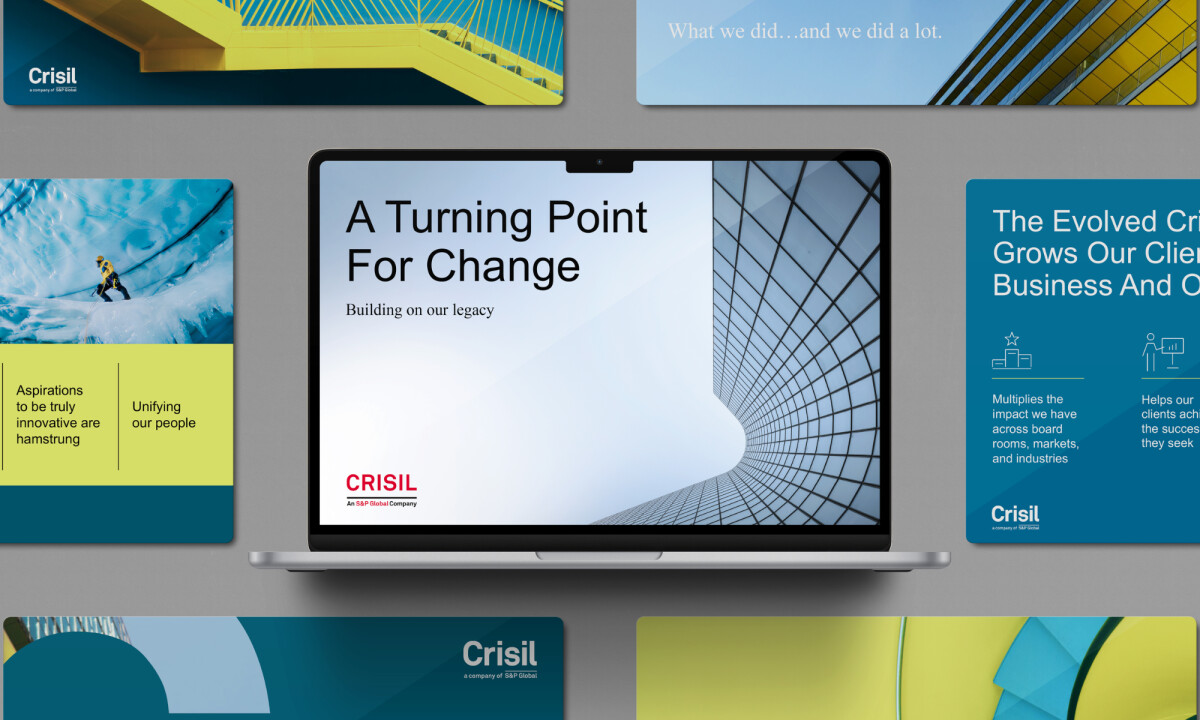
Crisil, a majority-owned subsidiary of S&P Global, reached a turning point as its global presence expanded across ratings, analytics, intelligence, and advisory services. Its website no longer reflected the clarity or confidence expected from a leading analytics organization.
Starfish redesigned the site to unite six business units under one master brand and translate complex offerings into a clear, scalable digital platform.
Website Design Analysis
When I review professional services websites built around data, risk, and decision making, I look for restraint, structure, and confidence over visual flourish.
Crisils’s redesigned site succeeds by treating clarity as the core design goal, using hierarchy and discipline to build trust at every leve
- Concept & Brand Translation: I like how the design turns the idea of the Coefficient of Confidence into a system rather than a message. Content is framed in a measured, consistent way across pages, which reinforces CRISIL’s role as a steady source of insight. The experience feels deliberate and composed.
- Graphic Structure: The oversized “C” device works as spatial framing throughout the site. I appreciate how scale and cropping are used to guide layout without pulling attention away from content. It becomes a recognizable anchor while staying secondary to information.
- Data Presentation: Metrics are presented with clarity and restraint. Large numerals, clean spacing, and minimal labeling make scale easy to absorb at a glance. This approach fits how decision makers typically read and compare data.
- Flow & Content Progression: Vertical layouts and sectioned content guide users through information in a steady sequence. I like how this creates rhythm without turning the site into diagrams or timelines. It helps users absorb context as they move through the pages.
- Typography & Hierarchy: Typography does most of the work across the site. Headings feel confident without being forceful, and body copy stays readable even in dense sections. Subtle serif usage in purpose-driven pages adds weight without disrupting the system.
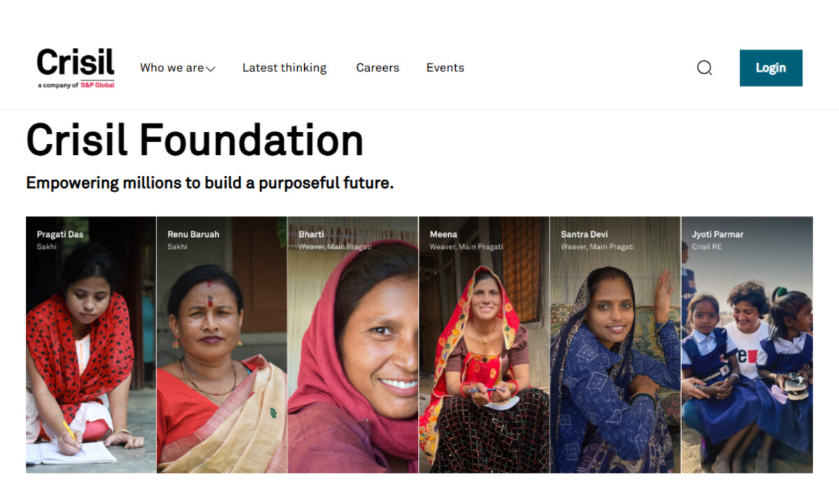
Impact & Recognition
- Unified six business units into a single, cohesive global brand platform.
- Simplified a complex analytics ecosystem into a clear, scalable digital experience.
- Strengthened confidence in mission-critical decision-making across global audiences.
What Brands & Agencies Can Learn from Crisil
1. Confidence Is Built Through Structure, Not Noise
Clear hierarchy, spacing, and restraint often communicate authority more effectively than visual intensity, especially in high-stakes, data-driven industries.
2. Let Brand Ideas Become Systems
Abstract concepts gain credibility when they’re translated into repeatable design structures rather than surface-level messaging.
3. Design for How Decision-Makers Actually Read
Metrics, typography, and flow should support fast scanning and deep engagement, respecting the realities of professional audiences.
About DesignRush Featured Designs
At DesignRush, we review hundreds of agency projects each month. The featured designs stand out for creativity, relevance, and execution.
Only the most compelling work progresses to our Monthly Design Awards, recognizing excellence across the industry.
See more creative projects across categories:
- Best Website Designs
- Best App Designs
- Best Logo Designs
- Best Print Designs
- Best Packaging Designs
- Best Video Designs
For a full list of design agencies and related services, see our Agency Directory.