Team Behind the Design
The Decept10 website immediately communicates urgency, intelligence, and control. With its dark interface, glowing gradients, and high precision visuals, it presents cybersecurity not as a mystery but as something navigable, monitored, and protected.
The redesign transforms dense technical information into an experience that feels approachable, fast, and credible, giving businesses confidence that Decept10 can detect, deceive, and defend against modern cyber threats.
Web Design Analysis
A cybersecurity website must achieve two things at once. It must convey deep technical expertise while making that expertise understandable to users who may not be security specialists.
Decept10’s site manages both with a clear, structured design language that reinforces reliability and intelligence.
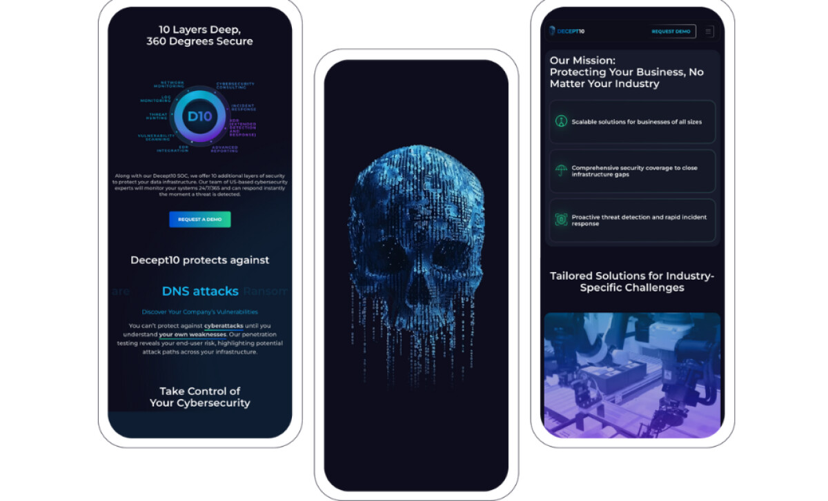
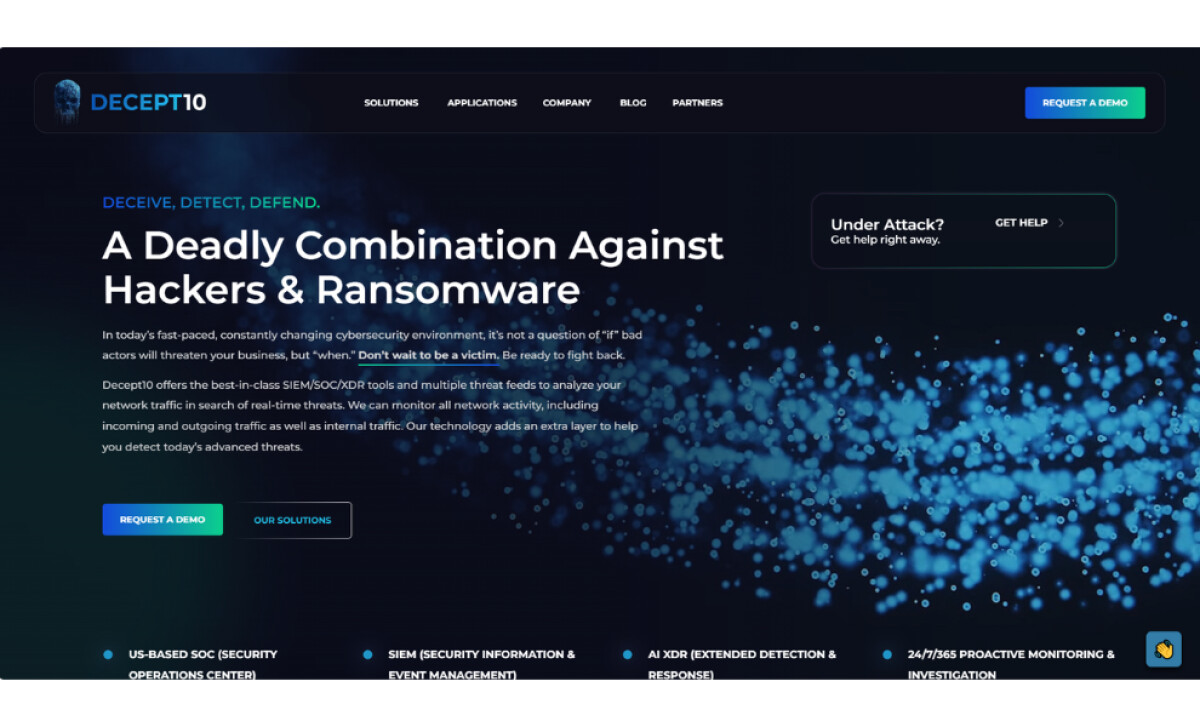
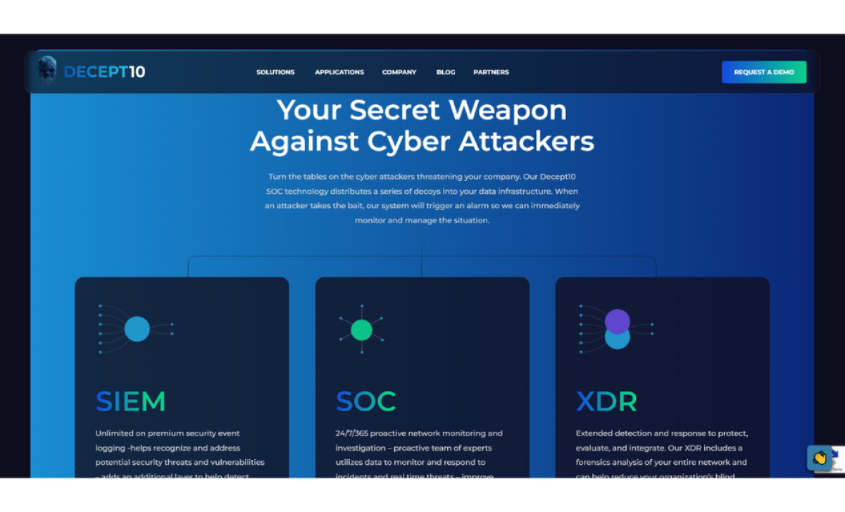
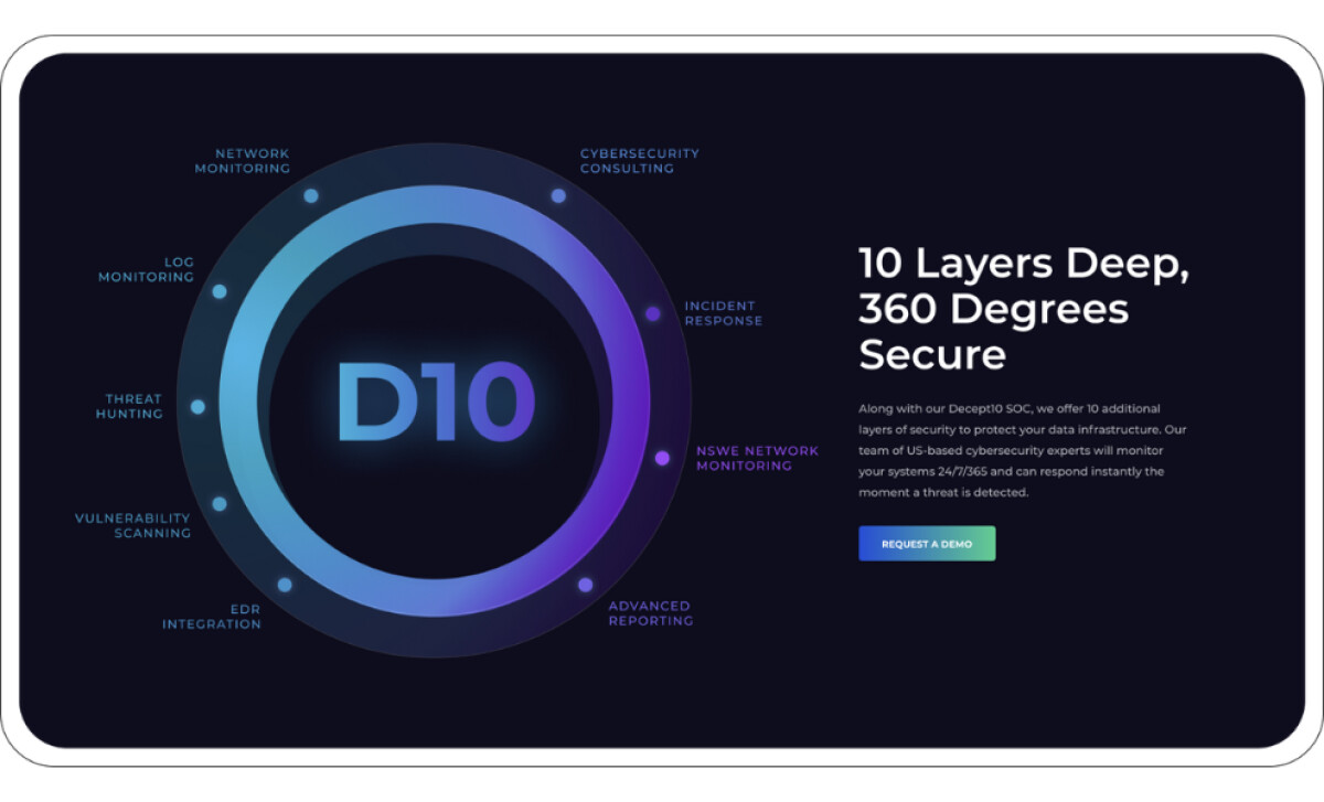
- UI Creativity: I immediately notice the atmosphere of the interface. The deep blues, neon greens, and subtle particle effects create a visual vocabulary that feels advanced and protective. The design communicates a high stakes environment without overwhelming me with noise. Large typography and clean spacing make the messaging feel bold and urgent, which fits the nature of cybersecurity.
- UX Design: From my perspective, the flow of the site feels guided and intentional. Each section breaks down Decept10’s offerings in a way that reduces cognitive load. Users can easily move from high level benefits to detailed service explanations such as SIEM, SOC, and XDR. I appreciate how the site continually reassures the user that threats can be understood, monitored, and controlled.
- Typography and Color: The use of bright accents on dark backgrounds gives the brand a striking visual presence. The bold typography feels assertive and confident, which strengthens the message of protection and expertise. The palette supports both readability and emotional tone, creating an environment that feels technical but never intimidating.
- Brand Expression: The messaging throughout the site reinforces empowerment. Statements like “Your Secret Weapon Against Cyber Attackers” and references to real time detection anchor the brand as a proactive defender. I like how the site balances fear avoidance with reassurance. It acknowledges danger but also provides a clear path to security through their SOC technology and decoy systems.
What Brands & Agencies Can Learn from Decept10
Decept10’s website shows how a cybersecurity brand can communicate urgency and trust without overwhelming the viewer. It is a focused study in turning complex technology into a clear and confident digital narrative.
1. Let Atmosphere Shape Understanding
The dark palette, glowing accents, and subtle motion create a sense of vigilance. The environment sets the emotional tone before any words appear, helping visitors understand the seriousness of the service and the steadiness of the team behind it.
2. Turn Technical Depth into Clear Paths
The structure breaks information into digestible sections, guiding users through threat detection, SOC services, and security layers at a comfortable pace. This approach allows the audience to grasp complexity one step at a time.
3. Use Messaging to Strengthen Assurance
The copy speaks with calm authority. Each statement reinforces the idea of active protection and real time awareness, helping business owners and IT teams feel supported rather than overwhelmed.
About DesignRush Featured Designs
At DesignRush, we review hundreds of agency projects each month. The featured designs stand out for creativity, relevance, and execution.
Many go on to be recognized as winners of our Monthly Design Awards.
Explore more here:
- Best Website Designs
- Best App Designs
- Best Logo Designs
- Best Print Designs
- Best Packaging Designs
- Best Video Designs
For a full list of design agencies and related services, see our Agency Directory.