Standout Features:
- Deep, trustworthy dark teal and orange color scheme
- Bold, geometric typography with clear hierarchy
- Structured layout with purposeful content grouping
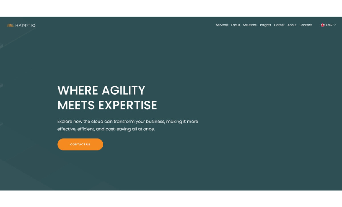
When you need a reliable guide for cloud transformation, happtiq offers expert consulting. RegenBlau had a hand in crafting its website to reflect this. It’s designed to communicate happtiq’s deep technical knowledge while making their support feel approachable for businesses seeking efficient cloud solutions.
The color palette here is quite striking. A sophisticated dark teal covers most sections, establishing a sense of stability. Then, a lively orange is used sparingly for things like buttons, making them stand out. This creates a serious yet inviting look, with clear white text for readability.
You'll find the typography is clean and geometric. Strong, bold sans-serif fonts are used for headings, making them easy to spot. The body text is a lighter weight, with good spacing, so it doesn't feel crowded. This clear difference helps users follow the information smoothly.
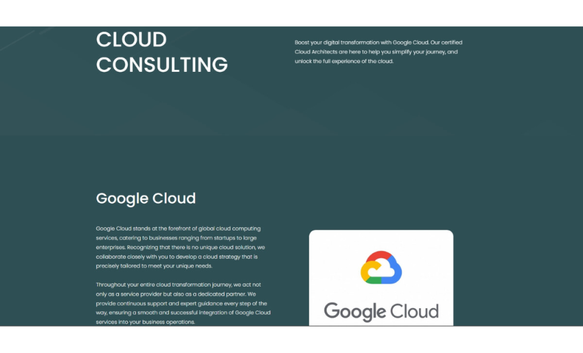
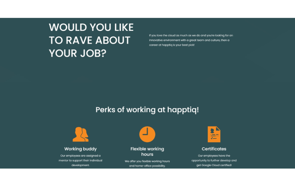
This tech website is laid out very neatly, using a clean, left-aligned grid. There's lots of white space, so nothing feels squished. Plus, content is broken into easy-to-manage blocks, often pairing short bits of text with relevant pictures or icons. This is a notable advantage, as 84.6% of web designers find business sites are often too crowded.
In the end, happtiq's website effectively presents a compelling brand for cloud consulting. The trustworthy dark teal, pops of orange, strong typography, and organized content blocks create a clear and user-friendly experience. RegenBlau has designed a site that truly reflects happtiq's mission to simplify cloud tech.


-preview.jpg)