
Higher Ground is a (pardon the pun) high-end restaurant that focuses on delivering artisan culinary experiences to an upper echelon of consumer. They want to instill their core values of luxury and baroque with their site.
This homepage is well crafted to do this with both its graphic overlay and underscoring image. The mountain in the background pierces the sky, pushing forth an evocation of high experience or even drama. It’s sublime, it tells users that if they check out this restaurant then they are surely in for some sort of extreme experience. Additionally, the graphic overlay acts as a sort of crest, instilling a sense of legitimacy and style. This level of class tells users that they’re in for a pampered and artisanal dining experience when attending this restaurant.
Combining these two ideas informs the complete look of this home page, and a complete synthesis of the Higher Ground brand. It’s a restaurant living on the edge, holding nothing but a silver spoon for balance.
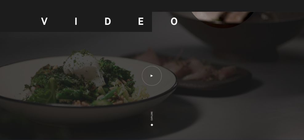
This video page demonstrates how multimedia embedding can be implemented in web design to reinforce a specific brand. When the video is initiated, it doesn’t break the façade of the experience by sending users to an external video streaming site, but rather keeps viewers within the carefully composed space of Higher Ground’s site.
What’s more, the video itself is a filmed exploration of Higher Ground’s menu. This again reinforces the luxury and baroque evocations of the site thus far. Higher ground is such a high level establishment that its menu requires cameras to fully capture its majesty.
This separates Higher Ground’s site, and subsequently Higher Ground itself, from any other restaurant in existence. It isn’t a common enough kind of restaurant to simply give you a textual menu. But it is an audacious enough of a restaurant to give you one in video. This is an example of how you can use simple UX mechanics, in new contexts, to create never before seen web design.

To conclude, let’s examine this largely unassuming, but undeniably uncanny menu design. While this somewhat minimalistic UI might seem to betray the otherwise consistent values of Higher Ground, it in fact only further reinforces them, simply by tilting it on its side.
By creating this very simple yet enigmatic access point, the power of the site’s other pages’ designs really pops. The mountain from the home page, for example, pierces the sky with even more fervor. This is a great example of how you need to create a variety of experiences within one UX to best compound the impact of the experience all together. Sometimes taking a pause from the density of an experience makes the entire experience so much more impactful.
Higher Ground Melbourne is a beautiful website design in the Food & Beverage industry.


