
This bright and playful website utilizes the lifestyle genre of blogging to elevate a kosher diet. The website, dedicated to making eating kosher, healthy and fun, features photography and videos as the main design elements.
One of the first things that grabs your attention on the home page is the logo in the upper left-hand corner. The playful, sans serif typeface says, Kosher.com, but the o’s are chat bubbles. A bite taken out of one of the chat bubbles adds a spirited, lighthearted element. Beneath the logo is the text “Let’s Talk Food,” clearly defining what the literal goal of the website is, blogging about food, and mirroring the talking imagery from the logo.
To the right of the logo is a transparent navigation bar. Drop down features allow for more navigational tools on the web page without distracting from the content.
The home page hosts a large slider as the center of the focus. The slider conveys the featured posts of the moments, some of them blog posts, some of them videos. Despite the high-resolution images, the purple is the brightest color on the page, attracting the eye directly to it. Encouraging users to utilize the search function draws them deeper into the web page, reducing bounce rate.
Scrolling downwards, recipes are the main attraction. They appear in symmetrical rows, creating a clean, organized aesthetic. The images of the recipes are the center of attention, with copy being used only for titles.
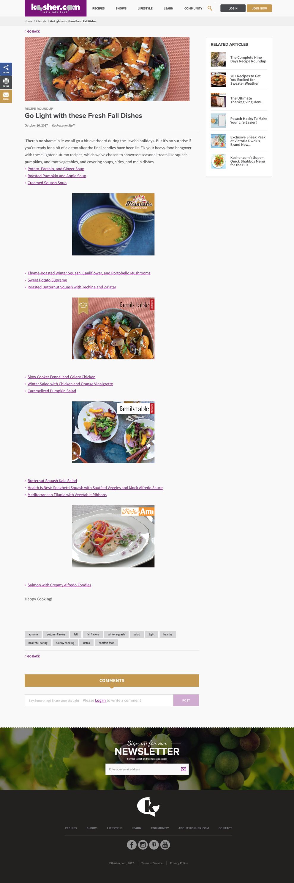
The home page also features seasonal recipes, a great way to cater to the needs of the user and capture the holiday spirit. Like the home page, in the blog posts, the recipes are expected to sell themselves. Images are central with text being kept to a bare minimum. The titles of the recipes in the blog post also serve as backlinks. Not only does this make things easier for the user, it also encourages them to look at more pages.
Minimal copy allows the brand’s logo and content to remain the center of attention. With user friendly features and photographs that are this tasty, users are sure to keep coming back for more.
Kosher is a beautiful website design in the Food & Beverage industry.


-preview.jpg)


-preview.jpg)
