A Minimal Design Aesthetic Gives The Hims Brand A Modern Edge Online
Hims is a men’s wellness brand that specializes in normalizing and curing baldness and erectile dysfunction. But this e-commerce platform also offers other products for skin and oral care — its main objective, however, is to normalize these topics and conversations so that everyone can feel more comfortable throughout the process.
It’s a progressive, millennial brand and you can see that from its products alone. But it’s also embedded into the overall layout and design of its website.
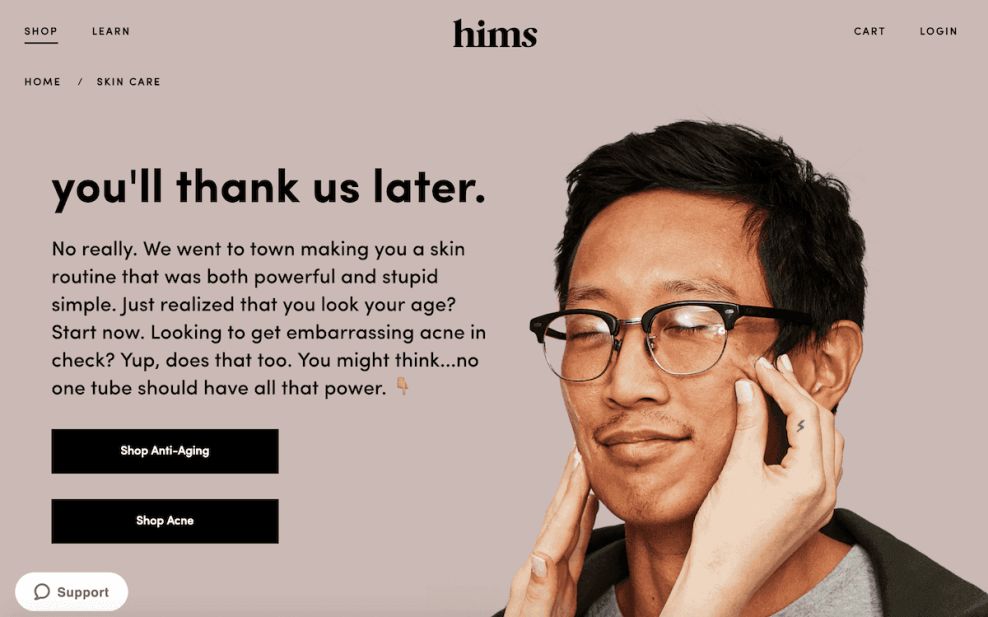
Made up of an extensive amount of negative, empty space, bold images and minimal, yet poignant, text, this is a stunning visual design that screams modernity and youth. The color scheme is a mix of subdued pastels in blue, coral, orange and more. It’s colorful, yet cool and relaxed which really grabs the personality of the audience this brand is hoping to attract.
Products are clearly displayed and pages are cleanly oriented, with a focus on a simple, streamlined process to get users from point A to point B with ease.
Millennials love minimalistic designs — they love fluid websites with creative elements but an overall one-stop-shop feel. And this website promotes that elegantly, while still holding onto the credibility and integrity that makes it trustworthy.
This brand knows its audience and created a design that attracted it.
If you are looking to create a responsive website, check these top-rated responsive web design companies.

Hims' Web Design Enables Effortless Navigation Through Clear Calls To Action
On top of a clean, sophisticated and straightforward design aesthetic, the Hims site also utilizes minimal navigation tools and CTAs to make it clear to consumers how to access certain areas of the site to buy products and learn more about the company.
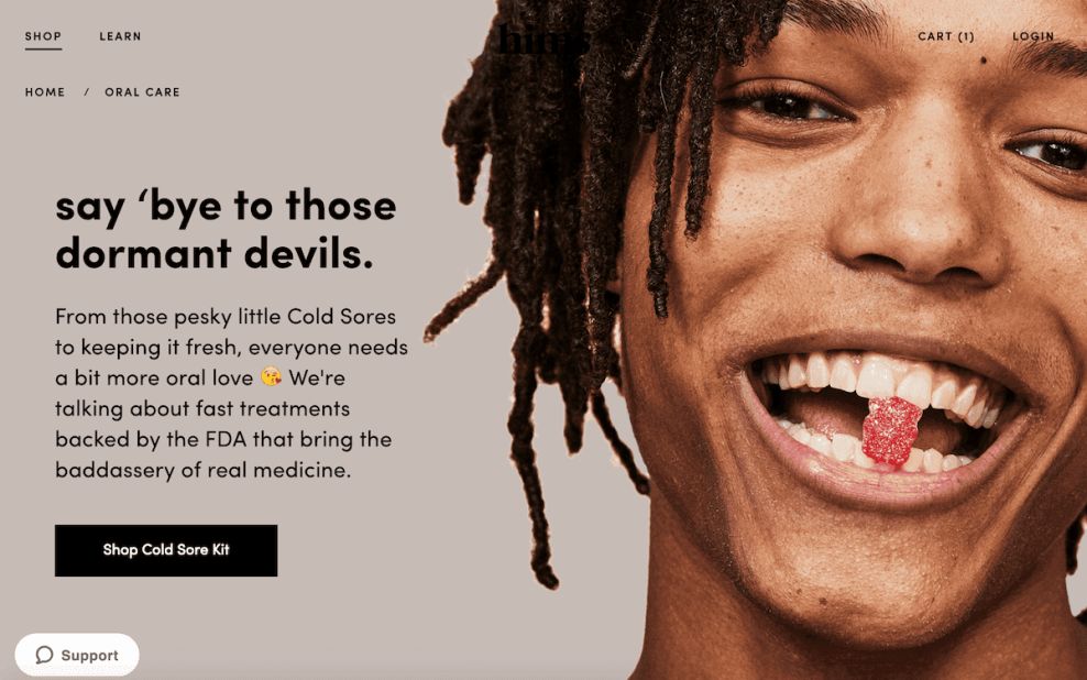
CTAs sit in clean, bold black boxes overlaid onto images that pop. These CTAs are direct, engaging and take you immediately to the product page where these particular products live.
And it’s so simple and blunt that you’re given no time to think, you just have to act and make your purchase.
In a similar fashion, there are four options on the top of the screen that can take you to other areas of the site. On the left are the words “Shop” and “Learn.” On the right are “Cart” and “Login.”
This makes it a breeze to get to any area of the site in the blink of an eye. And when you click either of the words on the left, you’re provided with a handy slide-in menu that lists the product categories, or ways to learn more about the site.
These options are kept to single words or minimal phrases to streamline the process and make it more efficient. And it adds to the overall minimal and modern design theme of the brand and its layout.
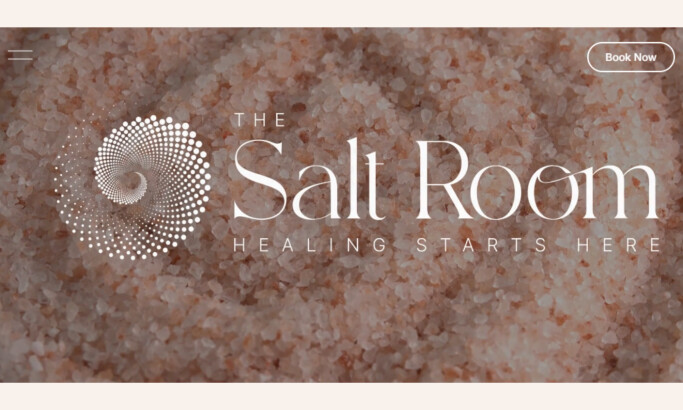
Creative Product Pages Show Consumers That The Hims Brand Is Different From Other Men’s Wellness Companies
Another extremely creative and exciting element of this design that helps it stand out as an e-commerce site is the product pages.
These aren’t your normal products pages with a clean layout that comprises a grid-like menu of product images. That wouldn’t work for this design because the brand only has a handful of quality products to offer.
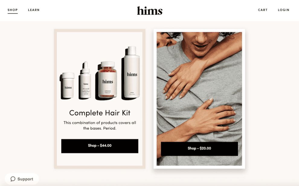
In total, there are five product pages — and each is divided by theme. There is a page for haircare, skincare, sexual health, oral health and merchandise. That’s it — just five to choose from.
And in each section, there are only a few products, or maybe just one, to choose from. So the pages can have some fun and play around with imagery, typography and a strong, vertical layout that each answers one piece of the puzzle.
Each product is shown in action and with an accompanying image of a man that could potentially be using it.
Then as you continue scrolling, you see a more traditional grid for the products fit with clear CTAs.
And then there's more playfulness and easiness. This website doesn’t want to look like the competition. It doesn’t want you to feel like you’re buying a product from a corporation that’s trying to be like everyone else.
It wants to be its own identity and wants you to experience that.
These product pages are ingenious, and fit in with the brand beautifully. We wouldn’t have it any other way.
Rollover Effects & Moving Images Add A Playfulness To The Brand Identity
Outside of the main aspects of this design, there is the addition of a few playful elements that really bring the design full circle and alleviate any stresses men might have as they scroll through the site.
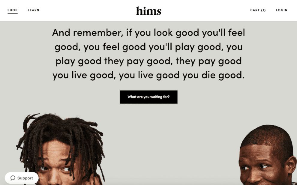
One of the first things that pop out is the moving gifs of men and these products. They are fun and intriguing and cool.
And then there are the powerful rollover effects. Rolling your mouse over certain images causes them to change — whether it’s from a product to a person or it’s a tree with falling leave. Either way, with your mouse you can interact with this design making it more memorable, causing the brand itself to stick with you longer than if it didn’t have these interactive and engaging elements.

Clever Messaging Brings Humor To The Wellness Site
A huge part of this brand’s success is its overall approachable, chill and relaxed identity. It is progressive and modern, with a goal of being a brand that men can trust and turn to in their hour of need.
But instead of beating people over the head with lengthy reasonings and heartfelt messaging, the Hims brand went in a humorous direction.
All across the site, clever, quippy and witty language points out problems in an approachable, joking way that is easier to digest. And considering these topics include early baldness and erectile dysfunction, going with a more laid-back and comedic approach was definitely the way to go when reaching a millennial audience.
Here’s a taste from their website:
for whatever reason, us guys are allergic to doctors. so we made it easy. like stupid easy. within minutes a doctor can prescribe you the stuff you need and ship it overnight. simple as that. no doctor's appointment. no waiting rooms. no awkward conversations. oh, and while these products usually cost $100 to $300 per month at the big guys, we changed that. at hims, we cut that price in half. and then we slashed it in half again. the point of it all—and the message that’s most important to us—is making sure you realize this one specific thing: having an issue isn’t weird. not dealing with it is weird.As you can see, Hims wants to play it cool, while still letting men know that this is something that they can and should be seeking out. And it’s effective.

The Site's Checkout Page Simply Slides In, Creating A Serene User Experience
The last experience a user will have with an e-commerce site is with the checkout page, and with Hims, the checkout experience is extraordinary.
Instead of popping up in a new window or taking users out of their experience by changing pages, the checkout here just slides in from the right to keep the experience cohesive, consistent and serene.
Hims doesn’t give consumers time to think. They take them right to the checkout and walk them through the process of signing in, finalizing their order, purchasing it and filling out all the necessary info.
And at the top of the page, a little timeline bar shows you how many steps you have left so that you never get frustrated or confused!
What Is Hims?
Hims is an e-commerce men’s health and wellness startup launched in 2017 and based in San Francisco, California.
It’s a quickly growing, millennial brand that specializes in men’s sexual health, providing a Viagra-like pill to help with erectile dysfunction. But the brand also offers other wellness products for skin, hair and oral care.
This is an online-only, direct-to-consumer brand that has already sold over $10 million dollars worth of product to consumers in the year it’s been available.
The brand aims to make the topics of baldness and erectile dysfunction more normal and less taboo.
Hims is about personal wellness. You should look and feel your best all the time. Our job is to make that easy and affordable. We hope to enable a conversation that’s currently closeted. Men aren’t supposed to care for themselves. We call bullshit. The people who depend on you and care about you want you to. To do the most good, you must be well.The brand is extremely modern and body positive. And its digital presence promotes that.
If you are looking for designers in this region, check out our list of the best Los Angeles web design companies.
Why The Hims Website Is A Successful E-Commerce Platform
Hims is a successful, millennial brand. And it built a serene and engaging online interface to interact with its male audiences. And most importantly, it’s a website that sells.
The brand infuses a minimalist, exciting and enthusiastic aesthetic into its clean and simple platform. Made up of bold images, simple, lowercase typography and clear CTAs, this website was built with a purpose — to inform, empower and promote its product in a way that made men feel comfortable.
There’s a creativity and a playfulness in this design that comes from dynamic gifs, cool rollover effects and captivating images that put the products, as well as real men, on display. And the messaging is so clever and succinct that it’s impossible not to relate to instantly.
The website as a whole is extremely user-friendly, with navigation simple and menu bars scarce as to streamline the buying process. And the checkout is equally intuitive, with the screen sliding in from the right. There are no pop-ups, and there’s no jarring screen change. It’s subtle and effortless and it keeps you from having any doubts as you fill in your information and click “buy.”
This website is comfortable. This website is cool. It’s modern, fresh and inspiring. It takes the clinical out of these health products and aligns the brand as a laid-back, casual bro that you can talk to about these problems.
And it creates a relaxing openness in consumers that encourages them to purchase.