Giorgio Armani’s "Frames of Life" campaign, celebrated for its evocative storytelling and immersive digital presentation, has found a new home on the main Armani website. This integration unifies the brand’s online presence, retaining the campaign’s design elements — its captivating storytelling, multimedia, and refined aesthetics — while expanding its reach and engagement.
Key Insights for Brands:
- Integrating older campaigns into a main website strengthens brand identity and simplifies the user experience
- High-quality imagery and multimedia boost audience engagement
- Consistent design across sub-brands reinforces brand value
Giorgio Armani Revitalizes "Frames of Life" by Integrating It Into Their Main Website
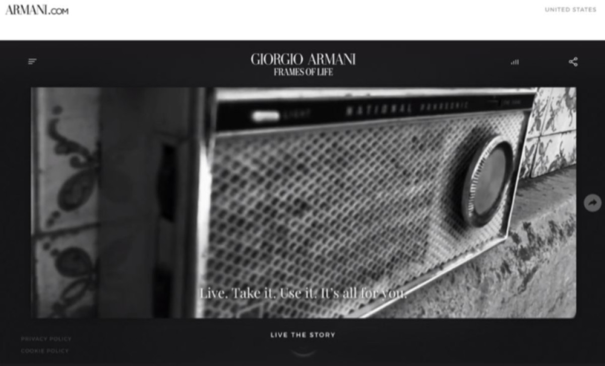
The "Frames of Life" campaign, initially introduced as a standalone digital experience, offered a masterclass in visual storytelling and multimedia presentation. Launched to showcase Giorgio Armani’s eyewear collections, the campaign successfully blended artful cinematography, evocative imagery, and engaging narratives that transported users into diverse, relatable moments viewed through Armani’s stylish frames.
Over time, Armani transitioned the campaign to its main website, signaling a strategic shift toward a cohesive digital ecosystem. This move aimed to simplify the user journey while preserving the campaign’s aesthetic and emotional resonance.
While the standalone "Frames of Life" site was retired, its spirit thrives within the eyewear section of Armani’s main platform. The design maintains the campaign’s signature visual appeal, including classic layouts and rich storytelling. With this, it continues to captivate audiences and reinforce Armani’s dedication to timeless sophistication.
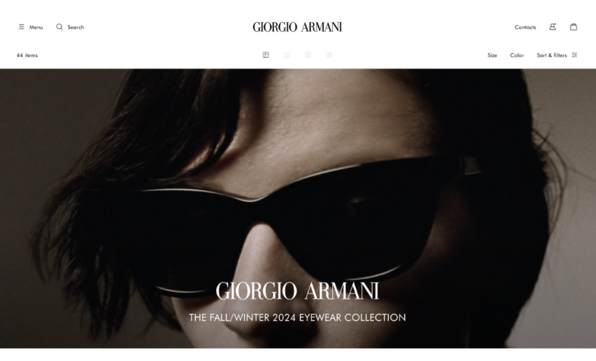
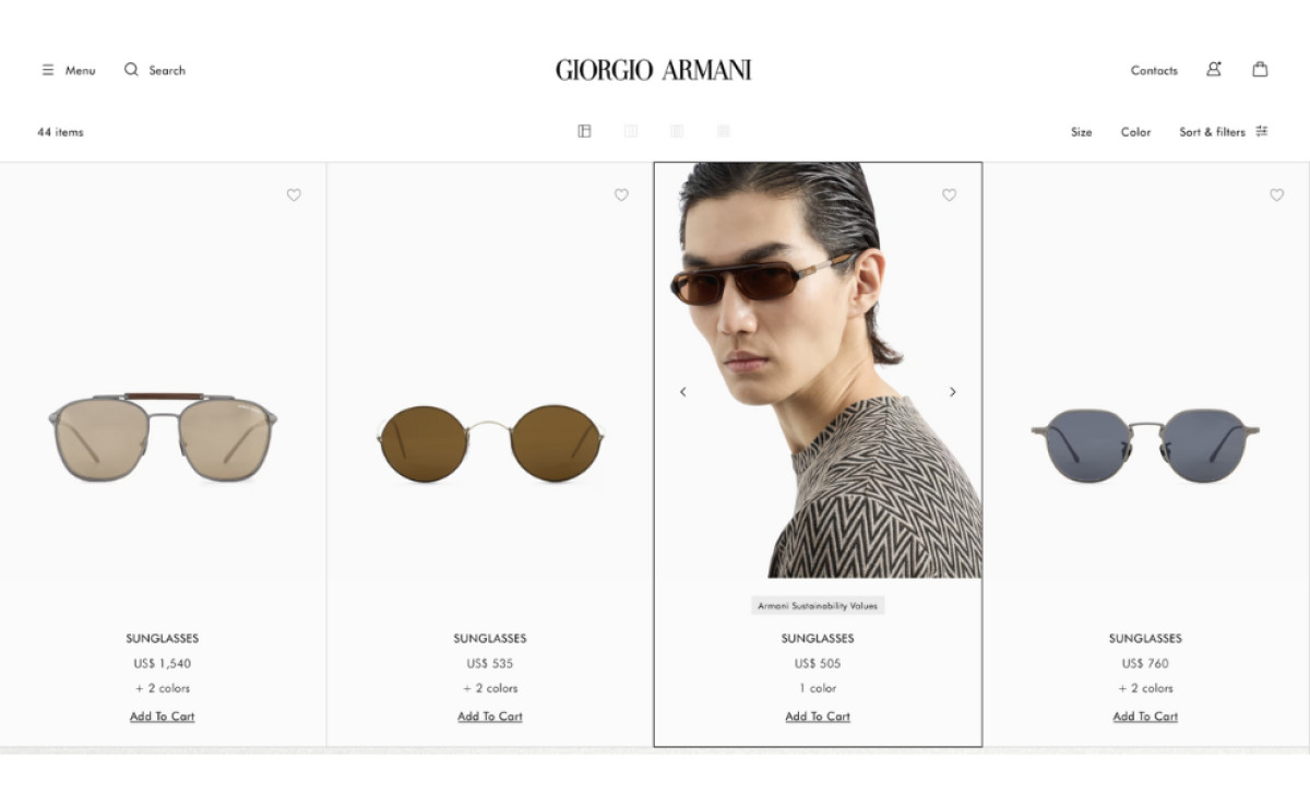
The Giorgio Armani Website Elevates Its Eyewear Collection Through Seamless Visuals and Navigation
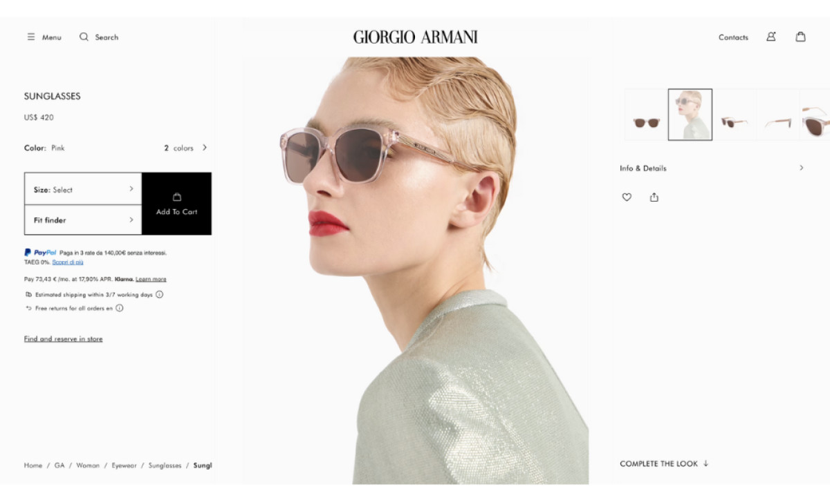
Armani’s main website masterfully upholds the visual storytelling pioneered by the "Frames of Life" campaign, using effective visual communication strategies to help captivate audiences and drive its message home. For instance, high-resolution imagery highlights the intricate craftsmanship of each eyewear piece, while product descriptions provide context and allure.
The user experience is further elevated through streamlined navigation and accessibility. Visitors can now easily explore Armani’s diverse offerings without leaving the primary platform, ensuring a cohesive journey.
Moreover, intuitive design choices, such as clearly segmented categories and responsive menus, ensure a smooth transition between the eyewear collection and other product lines.
This thoughtful integration exemplifies how brands can enhance digital usability while retaining the emotional appeal of their campaigns.
Check out the top user-friendly web designs featuring intuitive layouts and seamless navigation.
Giorgio Armani Reflects Its Brand Diversity Through Strategic Website Organization and Product Specialization
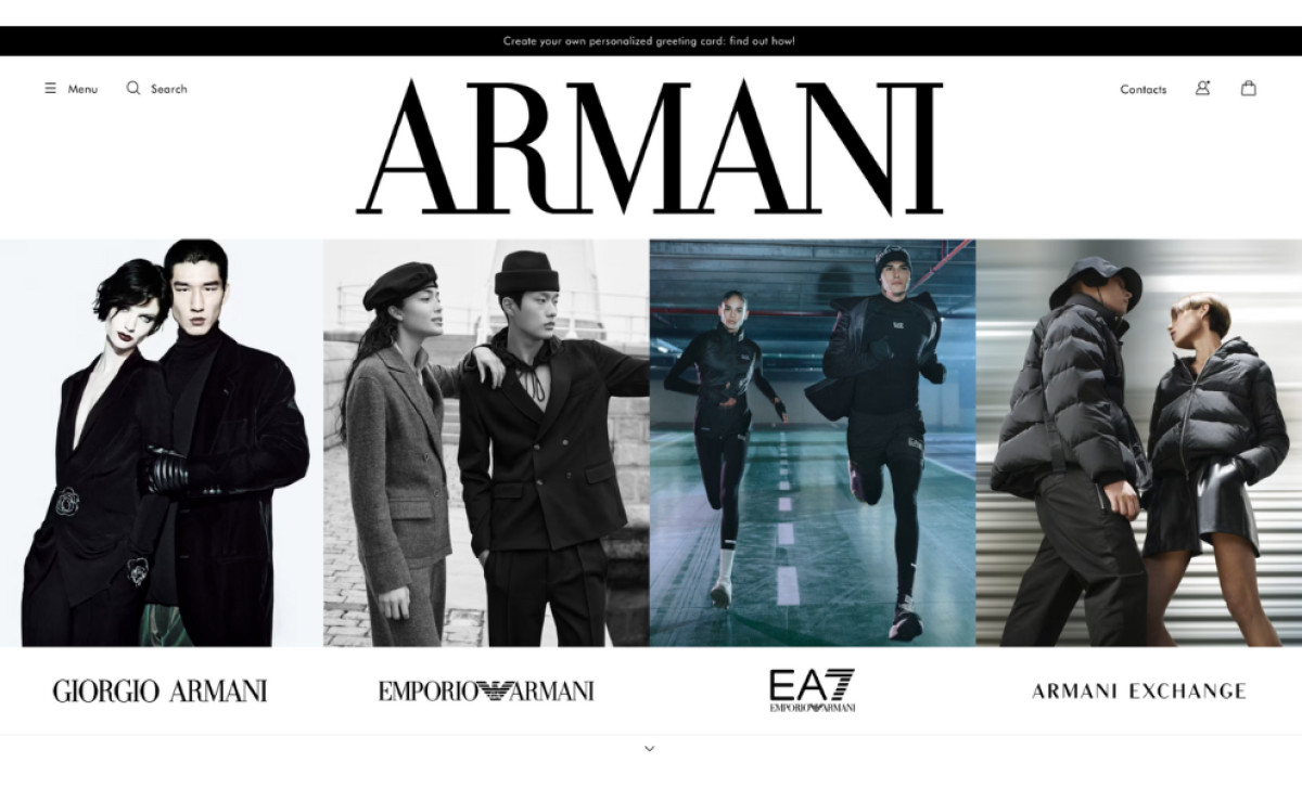
The Giorgio Armani website meticulously organizes sections to reflect the brand’s diverse portfolio and audience. Divided into Giorgio Armani, Emporio Armani, and A|X Armani Exchange, the platform caters to distinct customer bases while maintaining a unified brand identity. Each segment delivers tailored content and products, ensuring visitors find offerings aligned with their preferences.
Armani has methodically categorized its products within these segments, delineating apparel, accessories, and eyewear. This structure, often a mark of expert web designers, enhances discoverability and creates a more enjoyable browsing experience.
For instance, a user exploring the eyewear collection can easily pivot to related accessories or apparel, enriching their journey and increasing the likelihood of cross-category purchases.
Finally, a consistent minimalism and luxury design language unites all the website’s sections. This uniformity reinforces the brand’s identity and ensures a seamless user experience, regardless of the product category or audience segment.
Giorgio Armani’s Website Captivates Users With Timeless Elegance and Cohesive Design Features
Giorgio Armani’s website exudes elegance. The minimalist grid layout, enhanced by generous white space, offers a luxurious, uncluttered browsing experience that highlights high-quality visuals. This not only ensures every product is showcased with maximum impact but also guides customers in finding the right item for them.
Armani’s site is a prime example of how websites can effectively use space and typography to craft a clean, intuitive user experience. Its typography, featuring a mix of serif and sans-serif fonts, strikes a balance between readability and prestige, reflecting Armani’s commitment to luxury and functionality.
This sophisticated presentation is further enriched by a color scheme of neutral tones —black, white, and shades of gray. These elements reflect Armani’s timeless aesthetic and reinforce its identity as a leader in high fashion.
Integrating the "Frames of Life" campaign into the main Armani website is a seamless fusion of form and strategy. Now, the campaign’s dedicated section — recognized as one of the best website designs — harmoniously blends storytelling, intuitive navigation, and interactive features into a cohesive platform. The result is increased engagement and a reinforced perception of Armani’s refined and innovative branding.
For brands looking to elevate their digital presence, Armani’s strategy underscores the importance of cohesive design, audience-centric layout, and meaningful visual storytelling for impactful online experiences.


