This site takes a unique spin on the classic, old-style trolley by bringing it back to modern day and urban cities.
Hometown Trolley showcases its history all the way into the 21st century through the use of asymmetrical design and animation. The main banner balances nicely between image and content; it separates them as stand-alone components, yet ties them together as a cohesive unit with a line treatment. A high-contrast image divides the banner, separating a dark background on the left and a clean, white background on the right. This creates a powerful treatment that is captivating for the brand and sets them apart from other sites, which normally have traditional full banner images splashed across the entire page.
The way the site addresses their video is unconventional as well -- instead of using another panel and large image, they employ a simple, elegant play button with the Call to Action “Watch Video,” keeping it very straightforward for users.

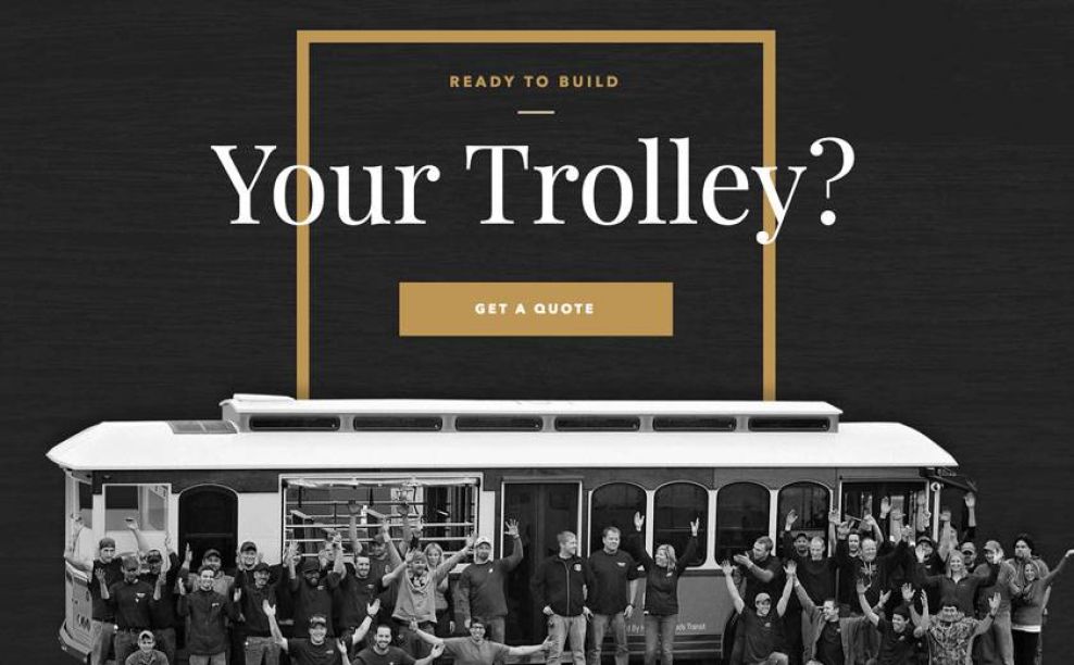
The site has a touch of classic, old-timey feel, particularly due to the large titles in serif font contrasted by a modern sans serif in the body copy. Hometown Trolley takes their online destination to another level when the form reading “Get a Quote” slides out from the right sight of the browser. While it bucks tradition, the form is easy to use and responsive. Overall, this site takes a unique approach to design that helps boost the appeal of trolleys in modern times.

As users scroll down the site, they are engaged through parallax effects of shifting images and box outlines in an unorthodox grid.
Hometown Trolley is a great website design in the Automotive industry.


