
Replace the lyrics with John Lee Hooker’s famous song Boom Boom with “Vroom Vroom Vroom, Bang Bang Bang,” you have the theme song for Vroom’s phenomenal website. From the high-resolution photographs to the simplicity of the design makes this site scream off of the page.
Vroom's user interface is fantastic as it personalizes the page based on a person’s IP location. The homepage is eye-catching with the banner wide image, subtle menu bar, and search box in the middle.
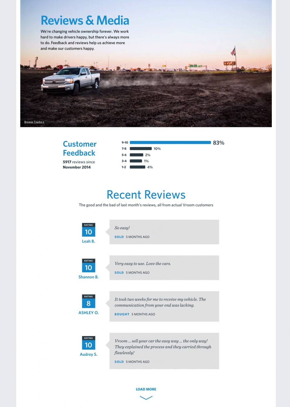
The review page is a gold mine, as most first time visitors use it to scope out the company’s reputation. Vroom’s page takes advantage of that by using dark speech boxes with individual review quotes about the company. The white backdrop does two things -- first, it makes the speech boxes pop and second, it draws attention to the chat bubble on the bottom right corner.
Vroom’s use of large, mid-sized, and italicized typography keeps up with the sites minimal theme. Using blue on the page isn’t overbearing or distracting, in fact, it uses the color hex as a subtle call-to-action.

The instruction page is like a fraction in its simplest form. The open call to action box has three simple instructions, “shop, buy, drive.” Each section has a slim amount of action that packs a punch. It’s useful and makes the point.
Using an orange “Find My Next Car” call-to-action button is ingenious because it drives attention to the live chat bubble on the right corner. Everything about this page is clean and the asymmetrical view doesn’t take away from the simplistic value of the website.
Vroom has outdone itself and other designers should take note - less is best. As Vroom continues to drive website traffic and see an uptick in sales, their website is transparent and useful which is something that viewers can appreciate.
Vroom is a clean website design in the Automotive industry.


