Standout Features:
- Southwest‑inspired color palette
- Clean typography
- Scroll-triggered animations
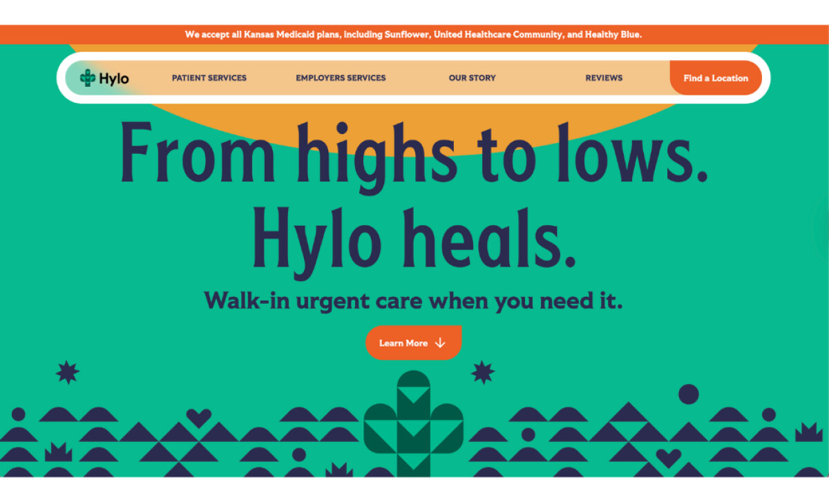
Designed by MindandMakr, Hylo Urgent Care’s website immediately shifts away from traditional medical website designs by featuring a comforting palette of greens and creams reminiscent of Kansas landscapes.
This soft color palette reinforces the brand’s message of approachable, affordable care in place of intimidating ER experiences. Subtle cactus and cross motifs blend seamlessly into the visual system without overpowering the interface.
The typographic system relies on clean fontswith generous spacing and gentle curves. Headlines are clear and confident, while body text remains warm and highly readable, well-suited to conveying healthcare information without clinical detachment.
Layout and navigation are intentionally structured for clarity.
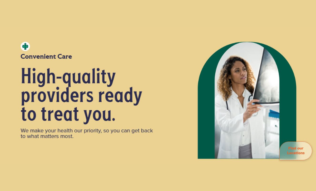
Primary CTAs like “Find our locations” and “Learn more” appear prominently, while page sections are organized through changing colors and supported by icons and concise explanations.
Adding to this, scroll-triggered animations gently guide the user’s journey. Content cards fade in, sections slide into place, and section colors change as the user scrolls, creating a dynamic yet non-intrusive flow.
These thoughtful touches enhance user engagement while maintaining a calming rhythm throughout the browsing experience.
By ensuring every movement has purpose, the page sustains interest without overwhelming visitors. These animations are also lightweight and performance-conscious, so the page speed isn’t compromised across devices.
After all, a page that loads in just a second has a conversion rate five times higher compared to one that takes ten seconds.
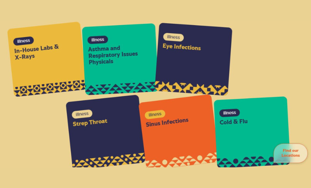
Patient testimonials, service descriptions, and booking prompts are presented in well-spaced content cards that gracefully animate into visibility.
This use of motion helps maintain attention without sacrificing readability or speed — striking the ideal balance between aesthetics and usability.
Given all these, the Hylo Urgent Care website design is a strong example of digital branding done right in the healthcare industry. With a warm yet professional aesthetic, intuitive navigation, and performance-conscious development, the website removes common pain points associated with healthcare websites.
Every design element works in harmony to deliver a welcoming experience that reflects Hylo’s values and mission, making it not just a well-designed website, but a valuable extension of the care it promises.
Who says healthcare websites have to feel cold and clinical? With a soothing color palette, clear layout, and purpose-driven motion, this site proves otherwise.
That’s why brands turn to expert partners, and our team has ranked the best agencies worldwide to make finding them simple.
Visit our Agency Directory for the Top Web Design Companies, as well as:
We also recognize design work that balances simplicity with precision. Visit our Awards section to explore the best & latest in web design.


