
Chewpod is a company manufacturing a chewable tablet that provides a beneficial effect on concentration, energy, and the ability to recover from illness.
The technology used allows consumers to adapt their mindset according to how they feel, at the exactly needed moment.
It is an efficient and easily absorbed product that seeks to optimize the potential of consumers in every aspect of their lives, encouraging them to live their lives to the fullest. Chewpod’s website accurately represents this brand identity.

The website opens to a homepage with a clear and engaging header image. The words “Chew & Be More You” are printed against the image, providing an accurate and concise description about what Chewpod is.
The homepage is highly scrollable, and each scroll provides a different visual design in different, bright, eye-catching colors like red, mustard, and blue.
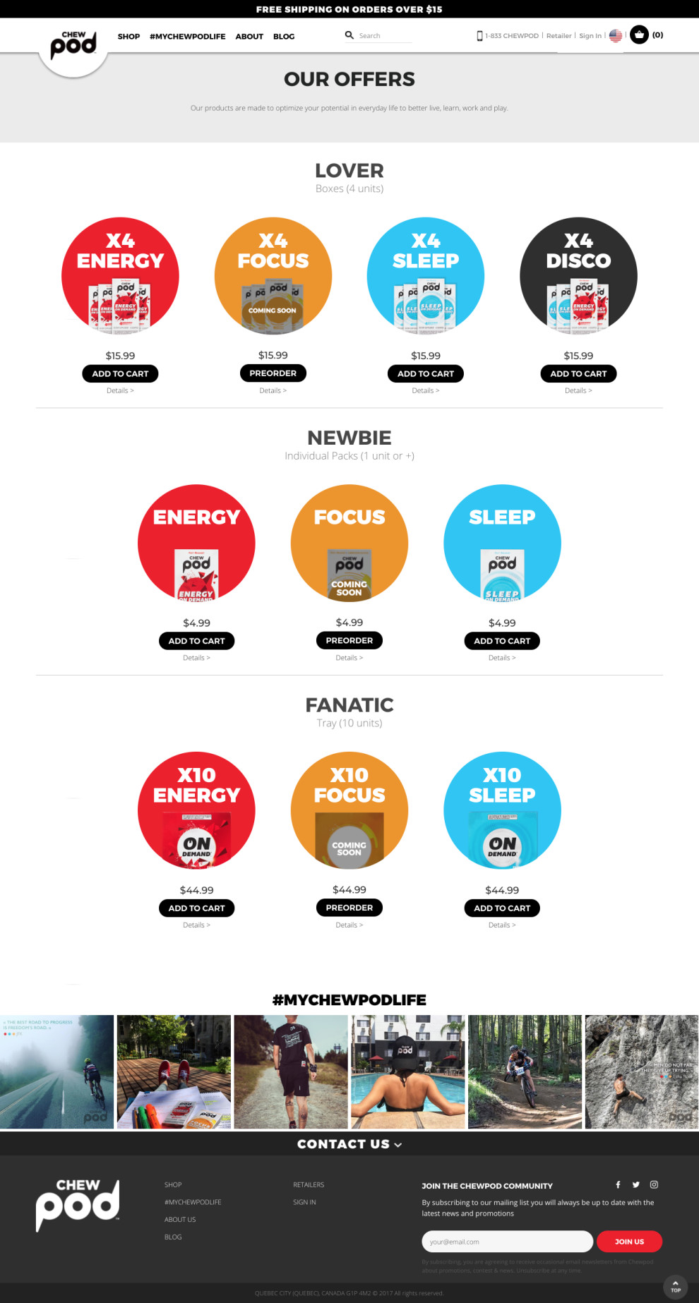
These different designs are used to describe the three different kinds of tablets offered by the company- tablets for energy enhancement, for better focus towards enhanced cognitive function, and for sleep.
The font used is plain white, easily readable, and well-spaced, adding to the elegant design of the website. There are also images representative of what each type of tablet does, placed to the right of the descriptions. The content is comprehensive, informative, engaging, and easy to navigate, making for great user experience. There is also a link to the insider's community, where consumers share their stories (there's a link to share your own story, and also a link to the Chewpod blog) that has relevant and engaging content.

The online shop is also neatly and aesthetically organized, adding to the visual design as well as to the user experience. It provides several different options to buy Chewpod tablets, and effectively uses design to engage the audience.
Overall, the Chewpod website does a great job of representing its brand identity: energy, enhancement, and potential. The use of bright colors and a good layout greatly enhances the design, and the engaging content is pertinent and on-brand.
Chewpod is a colorful website design in the E-commerce & Retail, Food & Beverage and Medical & Pharmacy industries.


-preview.jpg)


-preview.jpg)
